Обзор лучших ресурсов по разработке бренда, разработке упаковки
contact us | ok@ohmycode.ru
contact us | ok@ohmycode.ru
Opinion by Richard Baird.
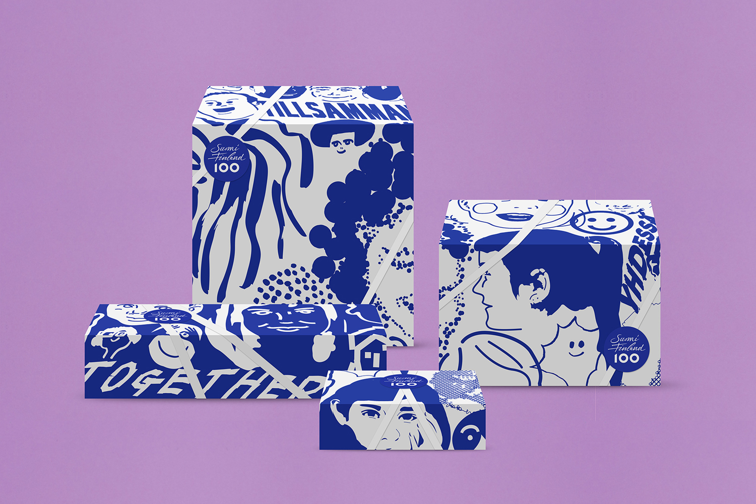
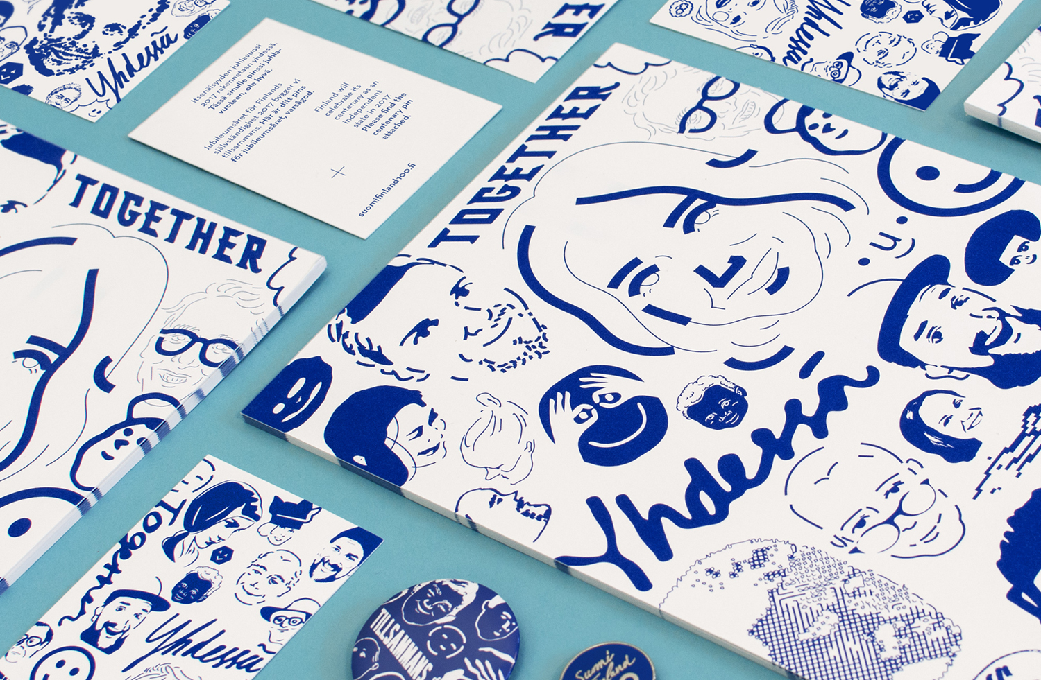
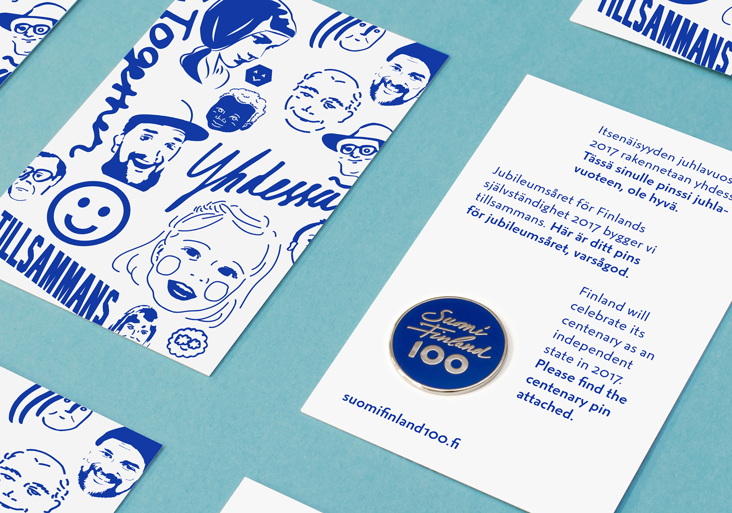
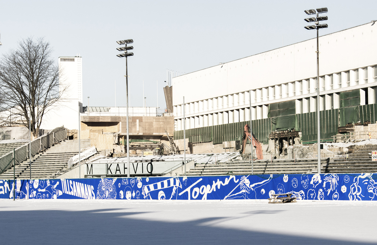
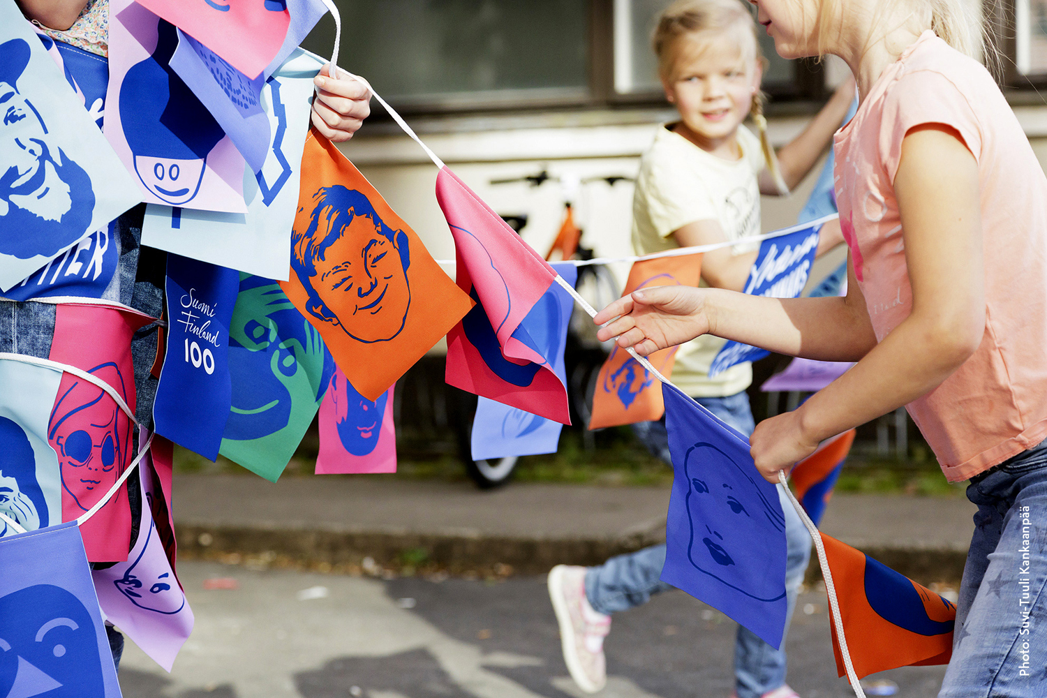
This year Finland celebrates its centenary and will mark the occasion with a broad programme of events created and supported by a wide range of stakeholders. Based around the theme of “Together”, and with the intention of creating a cohesive and useful system to unite events and initiatives from local councils and independent organisations and businesses, Scandinavian design studio Kokoro & Moi created “Finland’s Faces”, a brand identity made up of an extensive and diverse library of faces, drawn in a variety of styles.
With a desire to be inclusive Kokomo & Moi also developed an online platform and complimentary app with developer Great Apes as a strategic part of brand identity. This invites Finns and friends of Finland to participate and edit selfies into unique cartoons, to share these via the social media or submit these to be part of the ‘Finland’s Faces’ collection. These will be used as part of event communications throughout the year.
Alongside print communications and packaging, Kokoro & Moi also developed advertising and several other projects that make up Finland 100. These included product, spatial and interactive design, working in collaboration with Miltton Creative.
It is a simple yet ambitious concept that intends to work together a series of designed assets and those that are participatory, generated algorithmically and on-the-fly. The initial launch features images created by the studio. These move between the contemporary and more traditional, from the literal to the abstract, the detailed to the reductive and the hand drawn to those that are vector-based.
The diversity of illustrative style is effectively held together by an appropriate use of blue and white, and a good eye for composition, visual weight and texture. The desire to be broadly inclusive and satisfy a need for cohesion is a difficult balance to achieve. Occasionally it is at the expense of a consistent aesthetic pleasure, there are some fairly awkward forms and styles in there, but Kokoro & Moi have wrangled these into something with a clear unifying quality and plenty of character, with visual impact and plenty of detail up close.
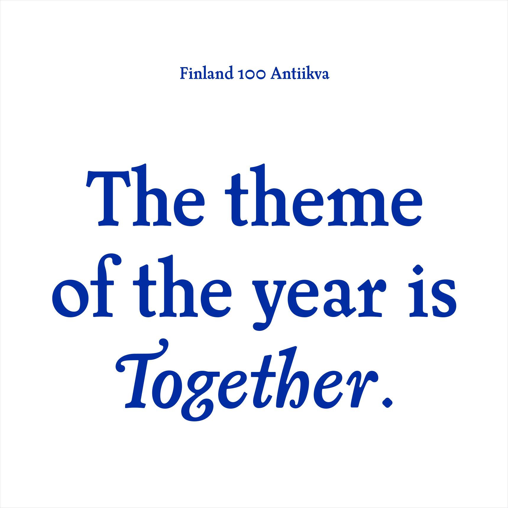
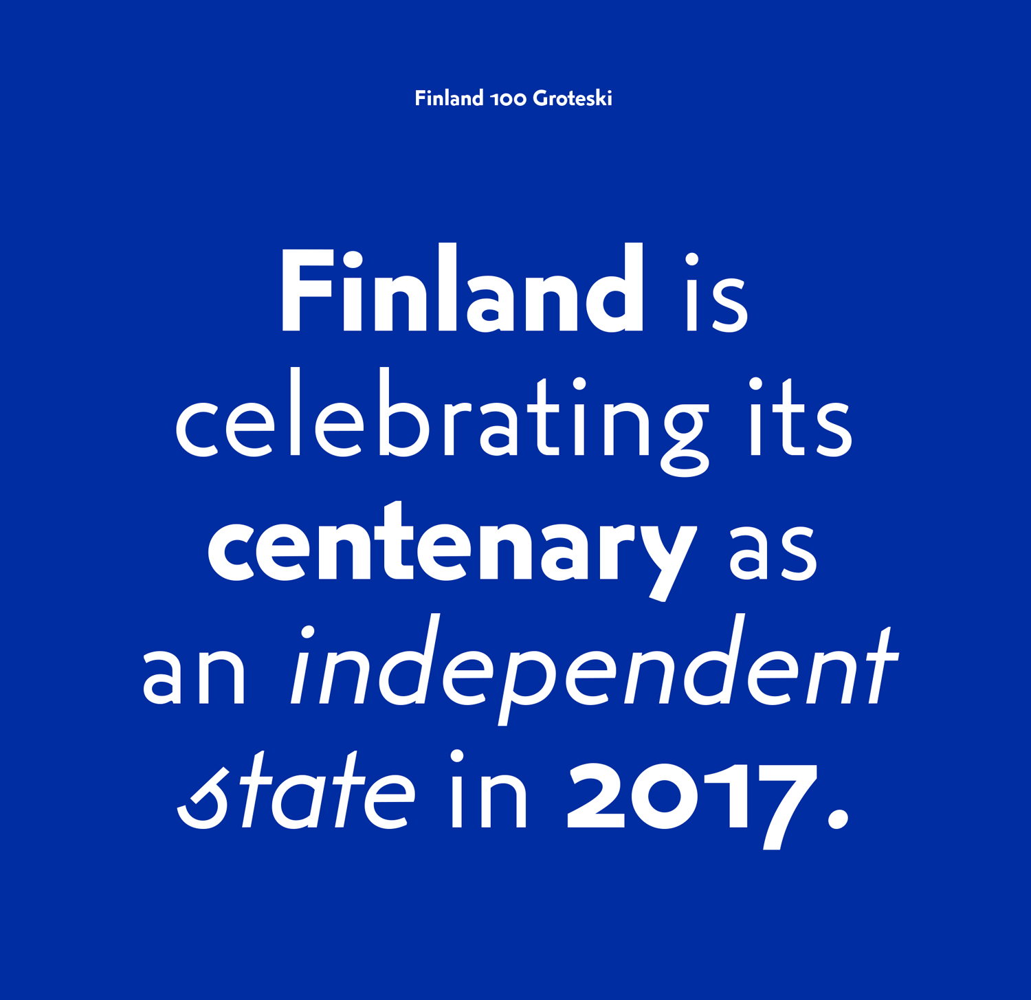
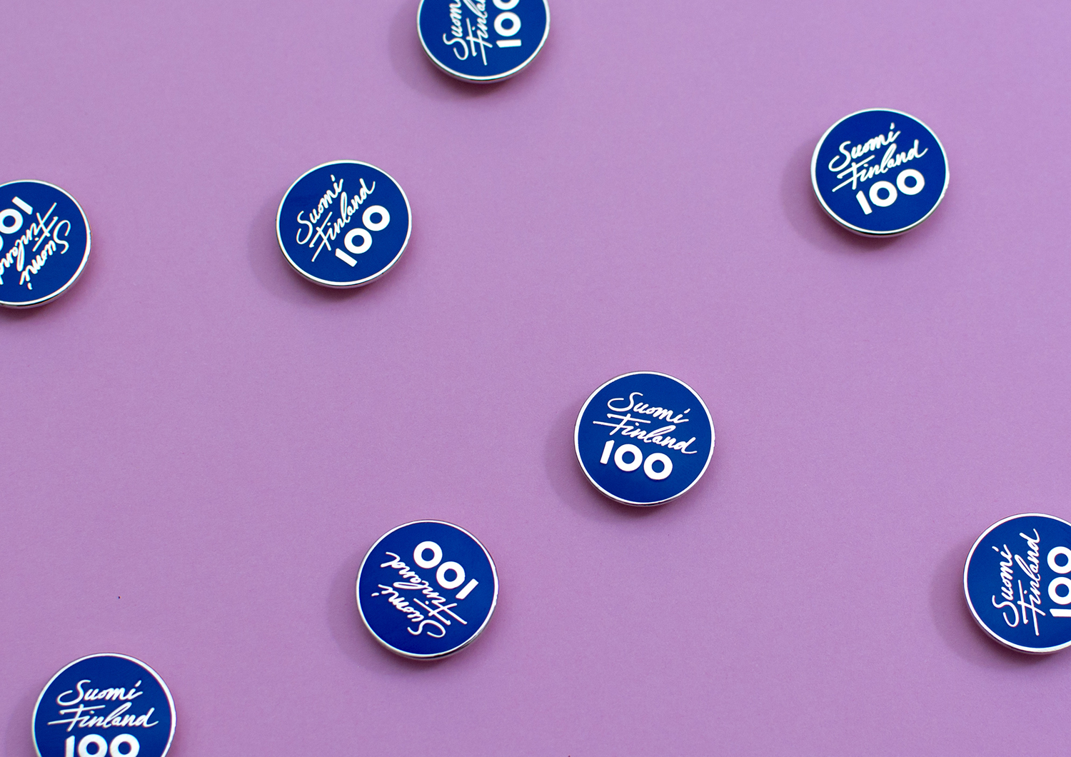
Bespoke type functions as period bookends, neat within the context of a centenary, and as a frame for the rich illustrative approach, pairing the very current qualities of Finland 100 Groteski, with the more traditional flourishes of Finland 100 Antiikva. Both have plenty of character and share moments of subtle commonality and strong contrast. This contrast, and its communicative intentions continue through to logo, which brings together the personable qualities of a flighty script and the robust qualities of bold sans-serif.
The Finland 100 programme is made up of a wide range of stakeholders. From cities to the organisations and businesses who communicate and advertise their projects by themselves. To encourage these to create materials using the brand identity elements designed by Kokomo & Moi, bespoke fonts are shared for free and the Finland’s Faces illustration concept is available for anyone to use, backed up by comprehensive guidelines.
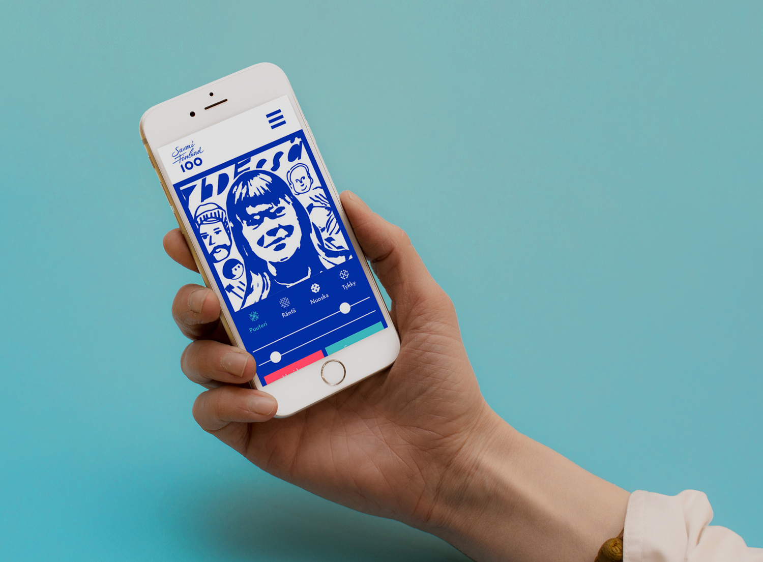
In conjunction with an online platform, the app, developed in collaboration with Helsinki-based Great Apes, feels like a relevant and appropriate expression of progress, the development community and a move towards inclusivity. It is a smart idea within the context of a centenary, marking the passage of time and cultural development, and a programme built around the theme of “Together”. How well this works, its sensitivity to different skin tones and the time and skill required to implement these will likely define its success, and its ability to be truly representational.
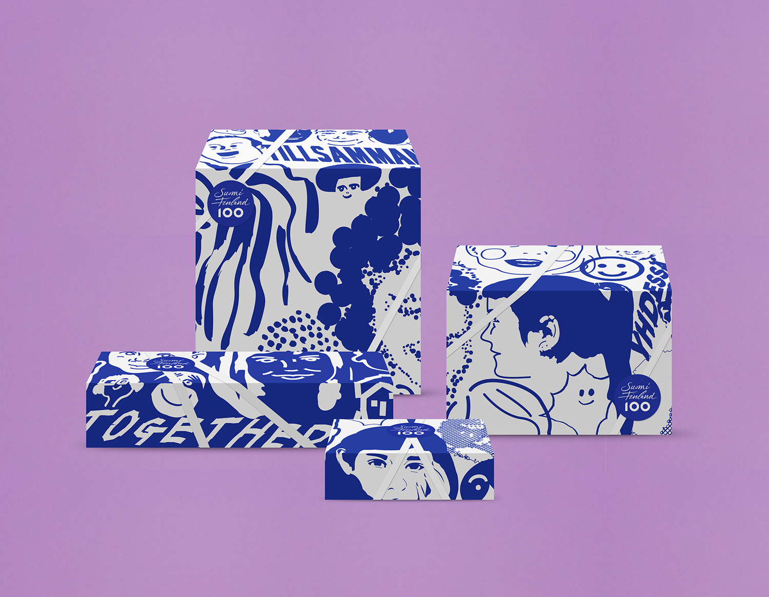
Illustration works well across small and large surfaces, cropped and running over the edges of boxes (with something of a graffiti / graphic novel-like quality that feels modern and expressive). These occasionally feature an element of the contextual, changing to meet the tone and function of different locations, be that through additional images or using a secondary palette of bright colour inspired by Finland. More work by Kokoro & Moi on BP&O.
Design: Kokoro & Moi. App Dev: Great Apes. Opinion by Richard Baird.
What do you think of Kokoro & Moi’s work for Finland 100? Share your thoughts in the comment section below or get the conversation started on Twitter.

 Новости Союза дизайнеров
Все о дизайне в Санкт-Петербурге.
Новости Союза дизайнеров
Все о дизайне в Санкт-Петербурге.