Обзор лучших ресурсов по разработке бренда, разработке упаковки
contact us | ok@ohmycode.ru
contact us | ok@ohmycode.ru
Opinion by Richard Baird.
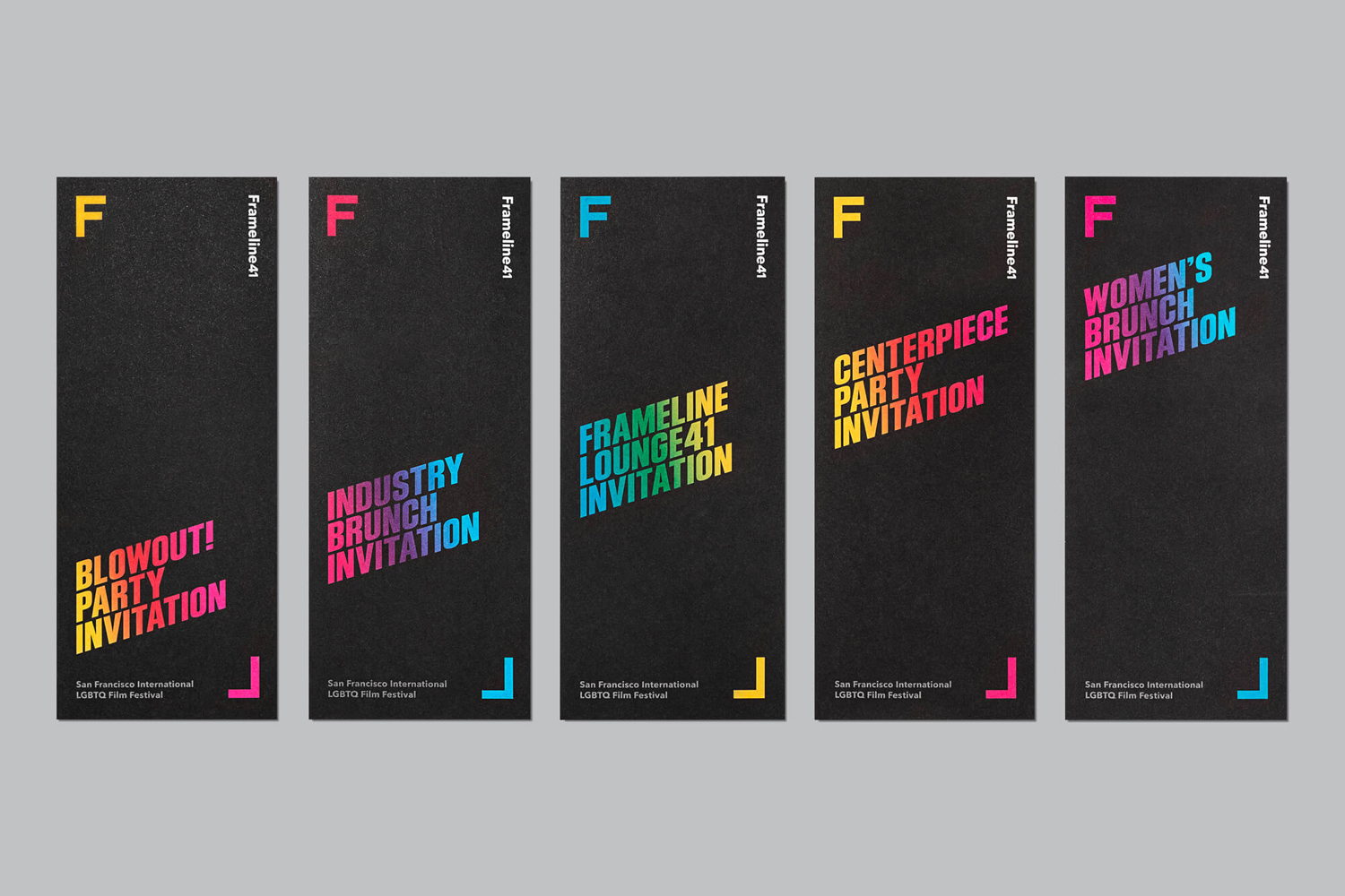
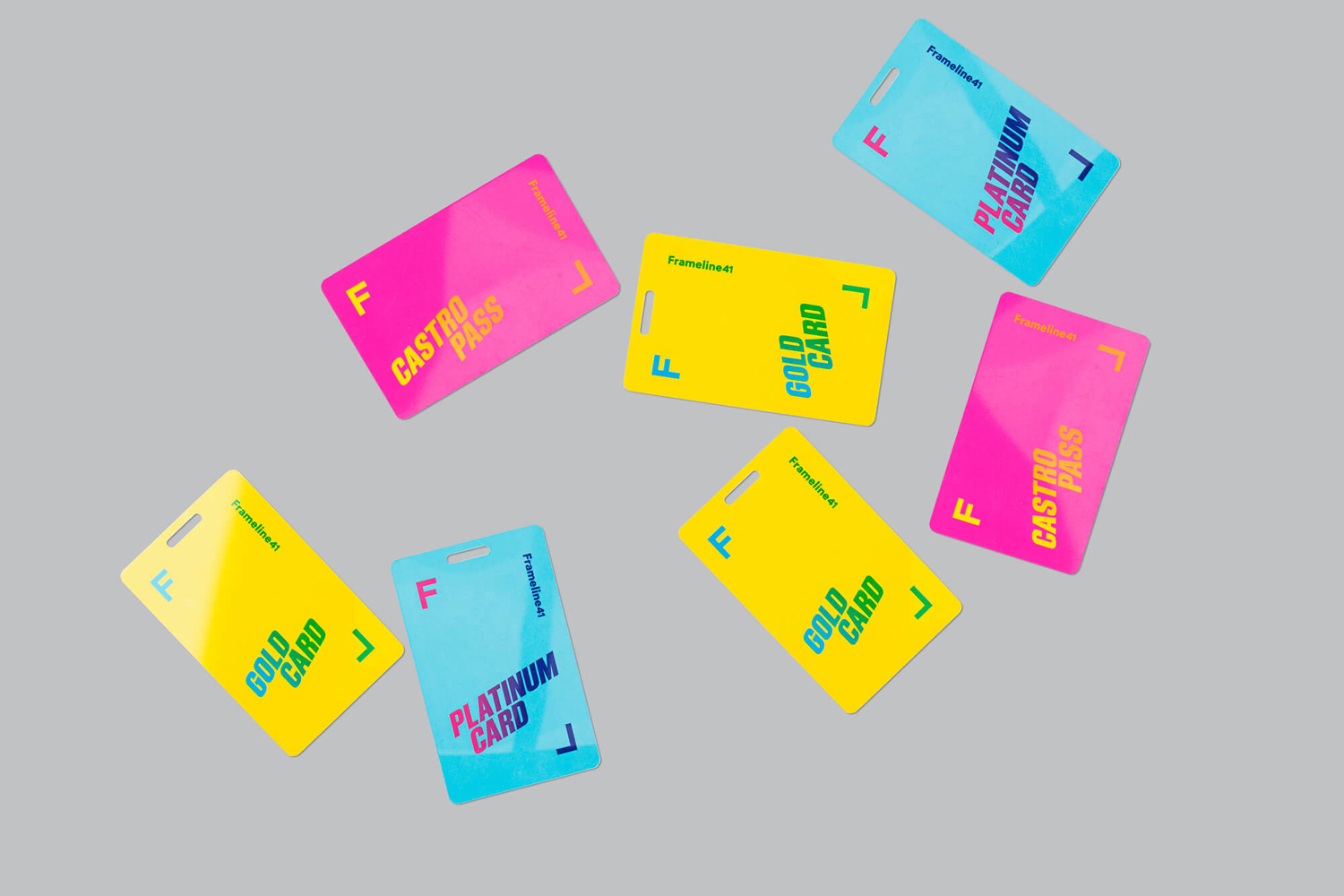
Frameline is an American nonprofit arts organisation and the world’s longest running LGBTQ film festival. Frameline continues its mission, since its founding in 1977, to change the world through the power of gay cinema, and to connect filmmakers with audiences locally and internationally. Graphic design studio Mucho worked with Frameline on its visual identity and campaigns for its 40th and 41st LGBTQ film festivals, delivering a system based around a framing device. This links membership cards, stationery and business cards, as well as campaign specific materials such as individual event invitations, posters and tote bags.
![]()
Mucho’s work for Frameline is a mix of good observation and happenstance (in the right angles of the initials), and rationalisation (in the description of the backwards L as being “queer”). Although the framing device is a familiar and recurring graphic tool, it is, however, universal and relevant, and finds a comfortable meeting point between an expression of inclusivity and filmmaking whilst remaining simple. This was appropriately built on and communicated more explicitly through Frameline40’s use of image, held within the frame and tied to captions written by David Begler.
![]()
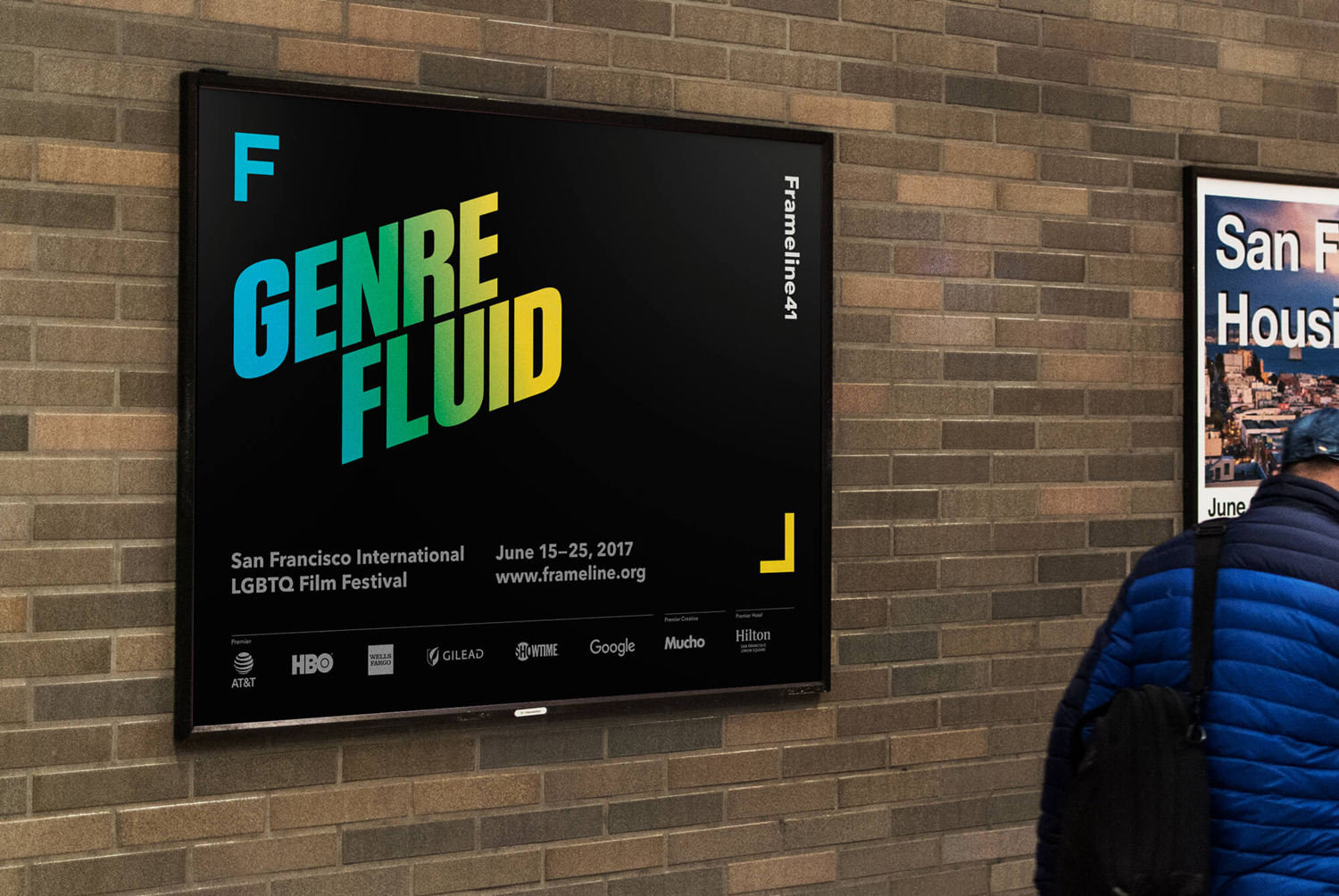
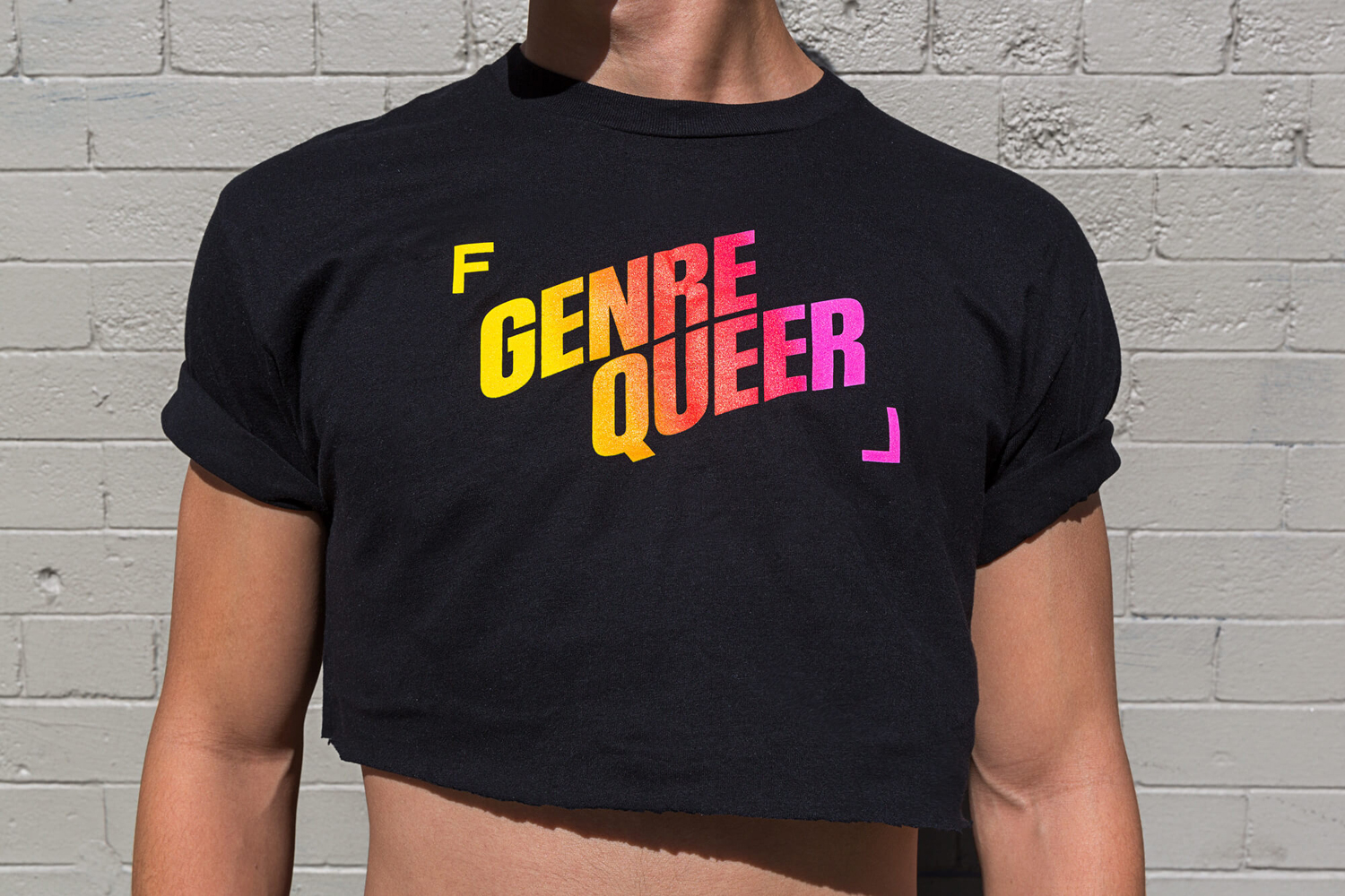
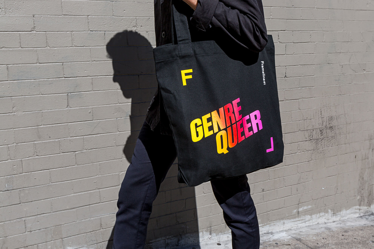
The logo functions well as a square asset, perfect for social media and totes, and expands and contracts within the context of flyers, posters, tote bags and t-shirts. This provides a visual variety and communicative flexibility, with a strong sense of continuity, which can be seen in this year’s festival campaign, Frameline 41.
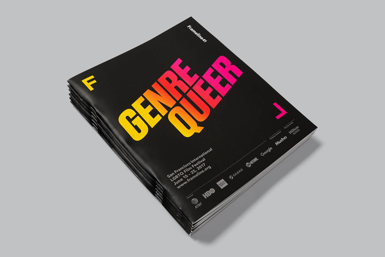
Frameline 41 continues to utilise the visual identity developed alongside the campaign for Frameline 40. However, rather than framing imagery, Frameline 41 focuses on a strong typographic approach, with copywriting by David Begler. This is described as playing on how people identify themselves within the LGBTQ community. The campaign evolves the phrase ‘Transgender’ to ‘Transgenre’, as a way to express the coming together of the LGBTQ community and film. This is is then expanded upon, leading to a twist on genres such as ‘Genre Queer’, ‘Genre Spectrum’, ‘Genre Equality’ and ‘Genre Fluid’.
Bold and condensed characters, and a slanted baseline, alongside bright colour and dark background provide impact from a distance, and a dynamic quality where the framing device is static and consistent. The dynamic and expressive quality of colour, form, direction and words feels right in line with film (both moving image and the vernacular of film posters) and the language of equality and pride.
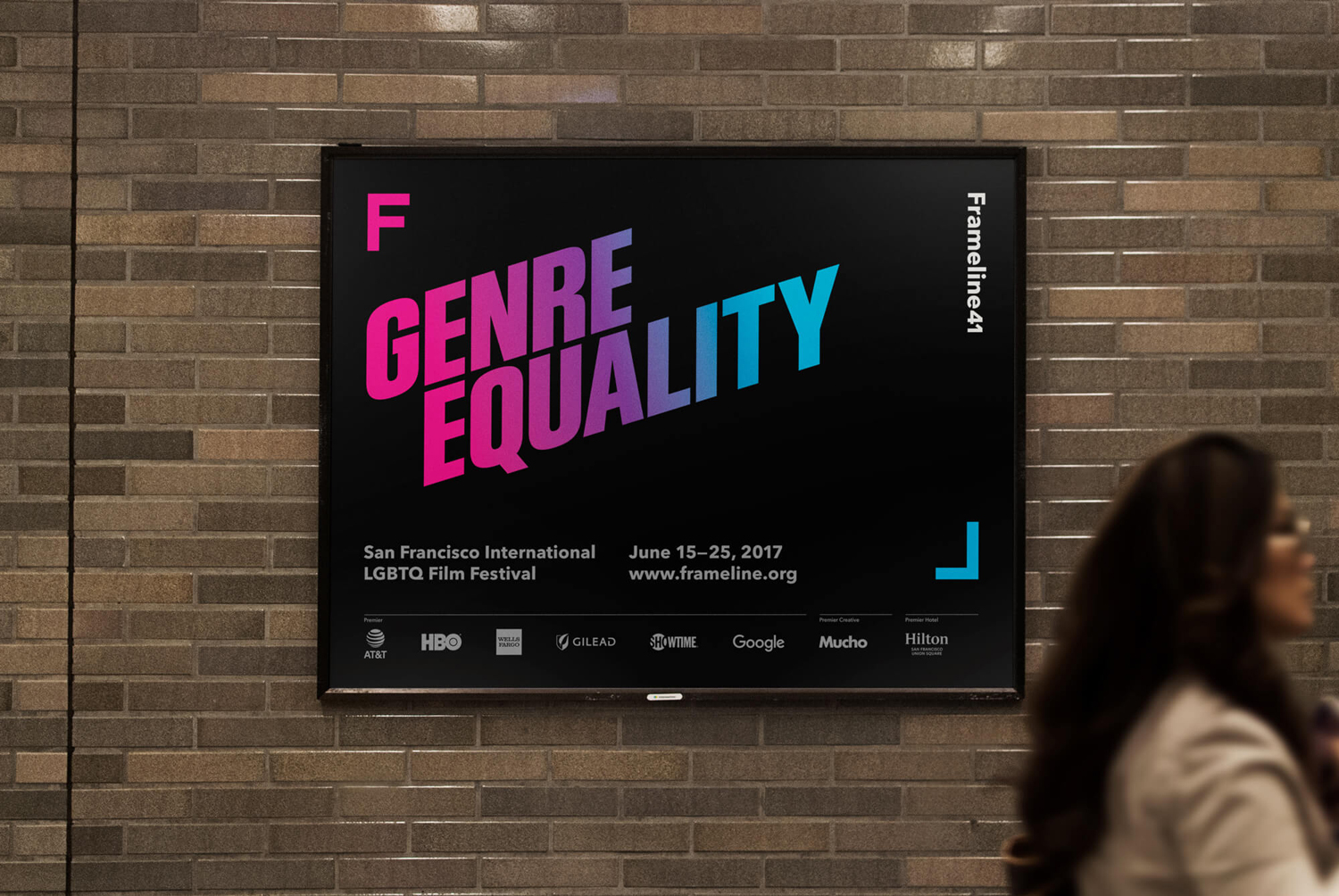
Colour, much like the logo, relies on a well-established association but manages to draw something of a more sophisticated quality from this. Rather than the solid colours used throughout Frameline 40, here, gradients, sampled from parts of the rainbow spectrum, find another elegant way to work in a universal and inclusive motif without being blunt or tired. The use of plenty of black space helps to both emphasis and temper this, and delivers contrast and breaks from the previous year’s visual identity which favoured white.
Secondary type choice, Avenir Next, provides continuity throughout campaigns and other Frameline activities. It does not stray too far from what is a generally accepted sense of modernity and accessibility. However, alongside logo, the layout of print communication, unique copy and colour palette, and within the context of a nonprofit organisational body, this appears professional and practical whilst avoiding the corporate. It is also used effectively to complete the frame created by expanding logo.
Although much of what Mucho draws on is familiar, the studio manage to create something smart and distinctive from their combination while also retaining much of their associative value. The direction feels restrained but well-suited to a professional organisation looking to engage with a diverse community, with room for creativity and a range of expressions in the image of Framline 40 and phrases in Frameline 41 that could be considered representative without being contrived. More from Mucho on BP&O.
Design: Mucho. Copywriting: David Begler. Opinion: Richard Baird. Fonts Used: Avenir Next.
What do you think of Mucho’s brand identity for Frameline? Share your thoughts in the comment section below or get the conversation started on Twitter.

 Новости Союза дизайнеров
Все о дизайне в Санкт-Петербурге.
Новости Союза дизайнеров
Все о дизайне в Санкт-Петербурге.