Обзор лучших ресурсов по разработке бренда, разработке упаковки
contact us | ok@ohmycode.ru
contact us | ok@ohmycode.ru
Opinion by Richard Baird
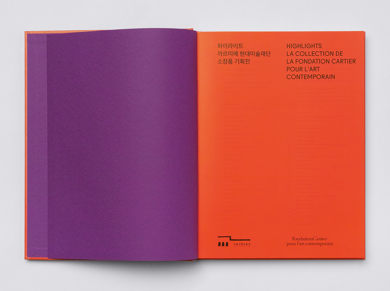
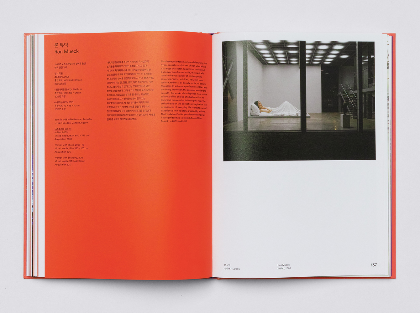
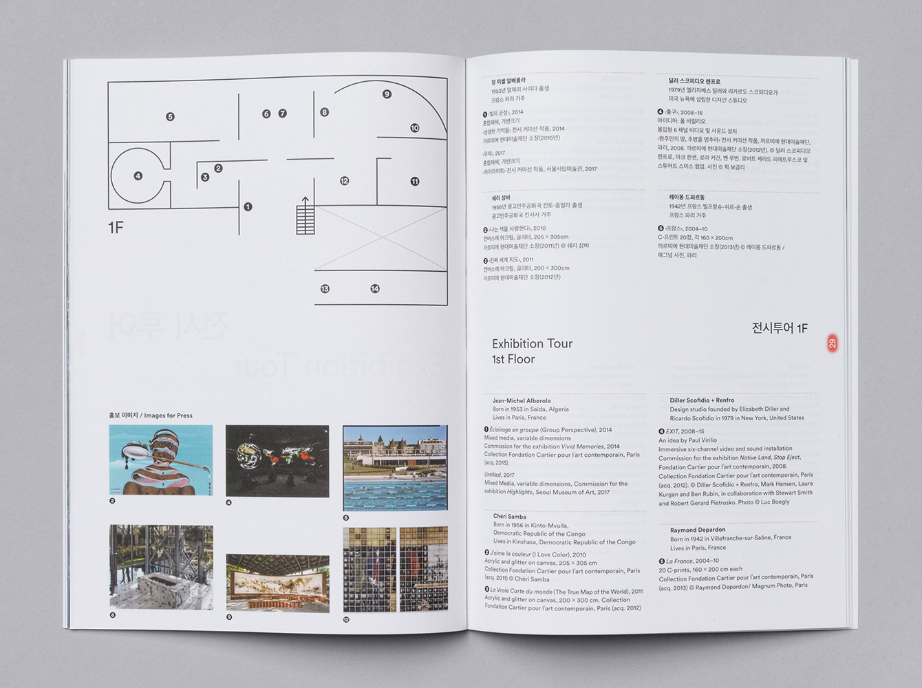
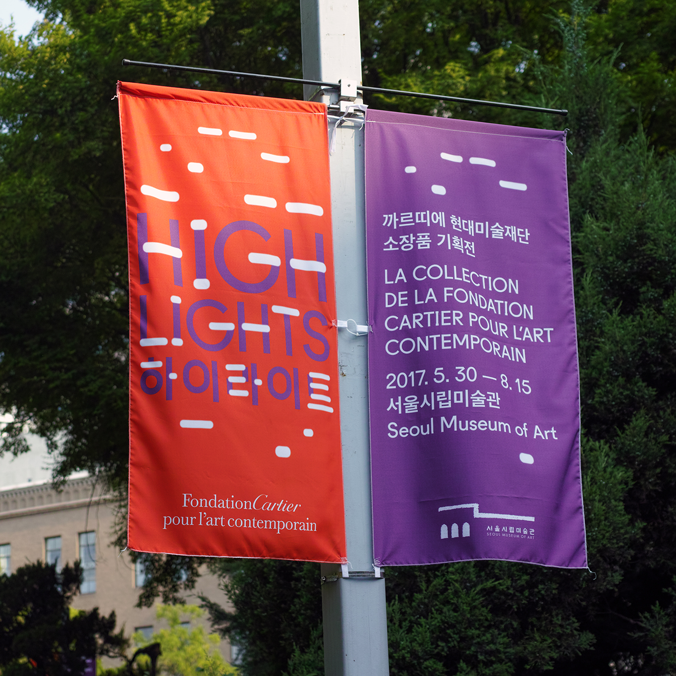
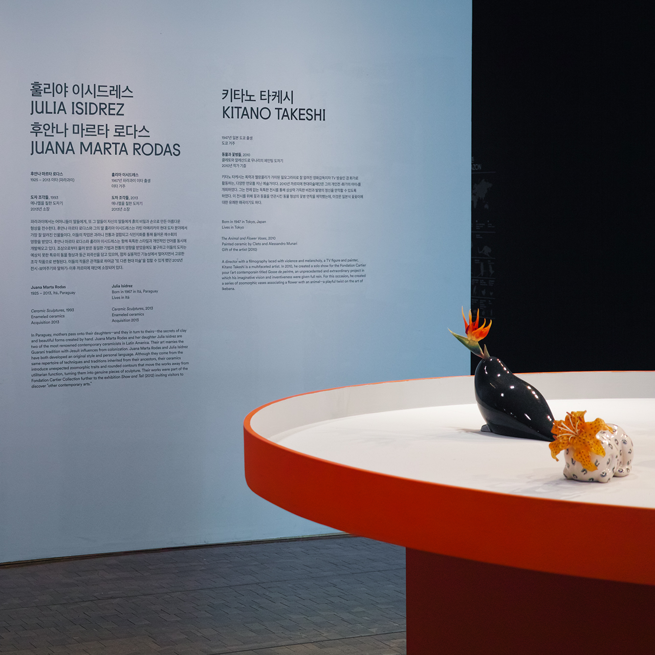
Highlights is an exhibition of works from French contemporary art museum The Collection of the Fondation Cartier pour l’art contemporain at the Seoul Museum of Art (SeMA). The exhibition runs from May 30th to August 15, 2017, features work by artists such as Ron Mueck, David Lynch and Sarah Sze, and also includes commissioned pieces and major artworks by Korean artists.
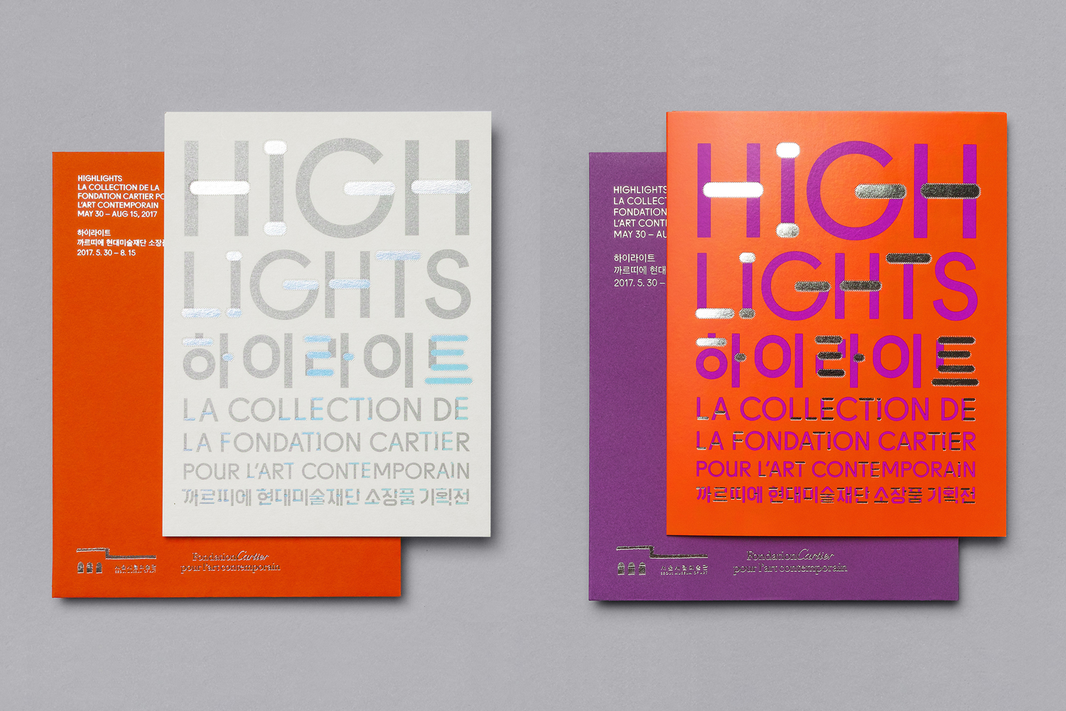
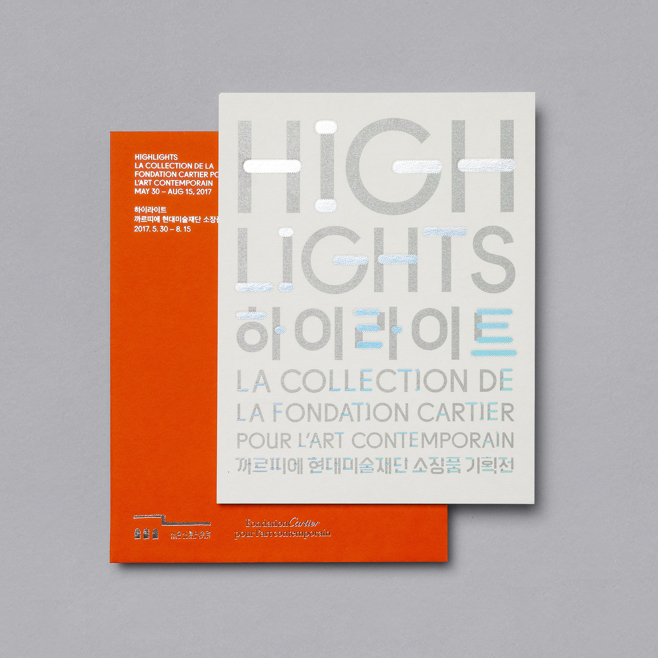
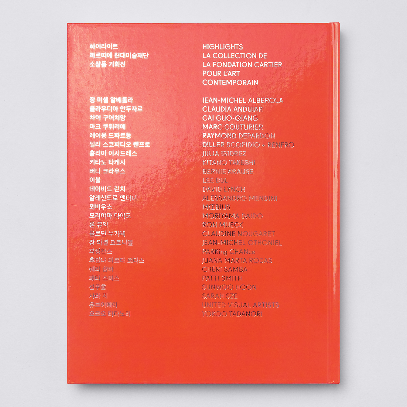
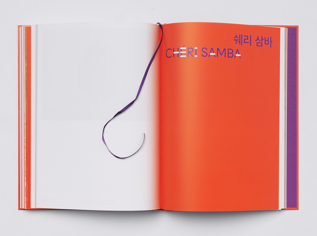
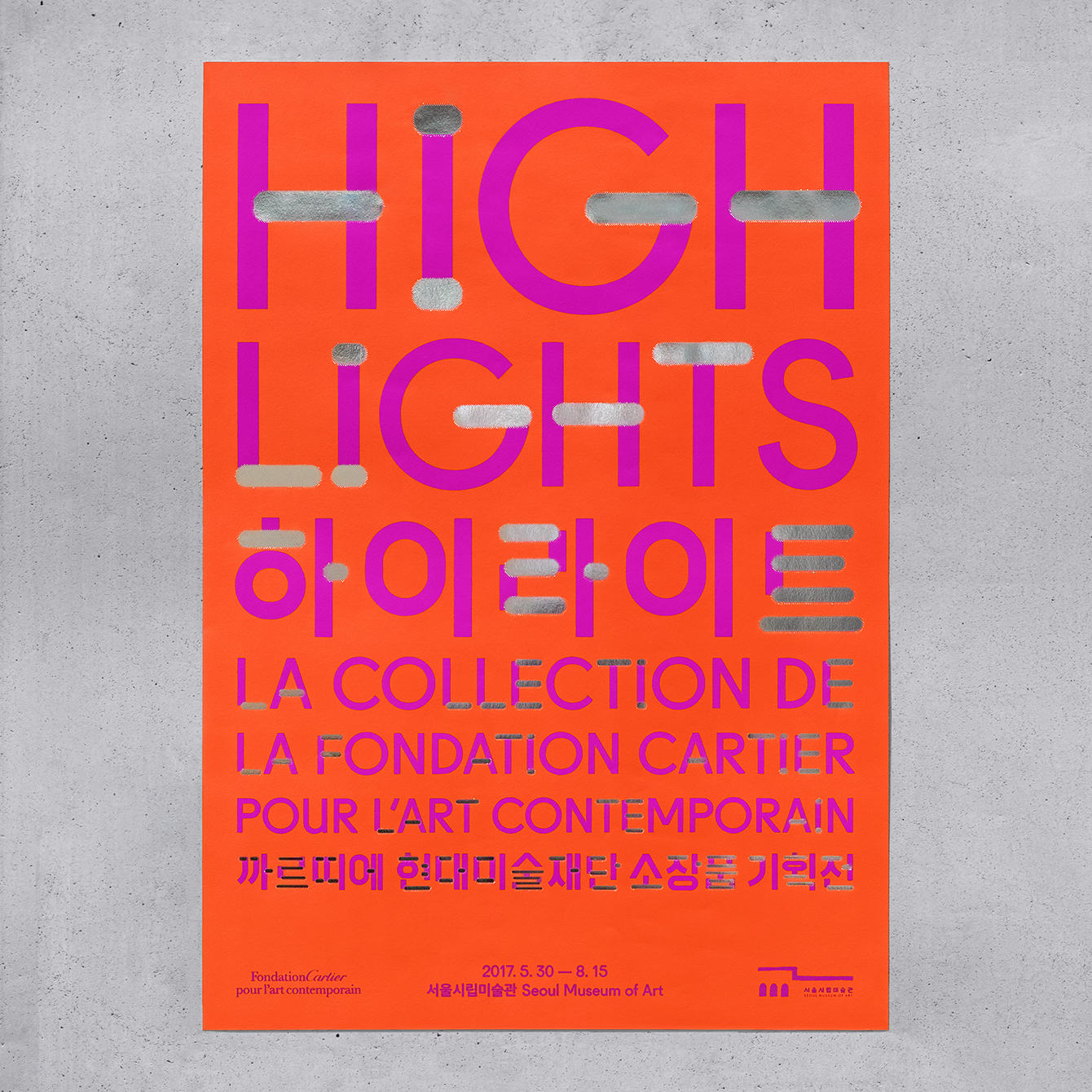
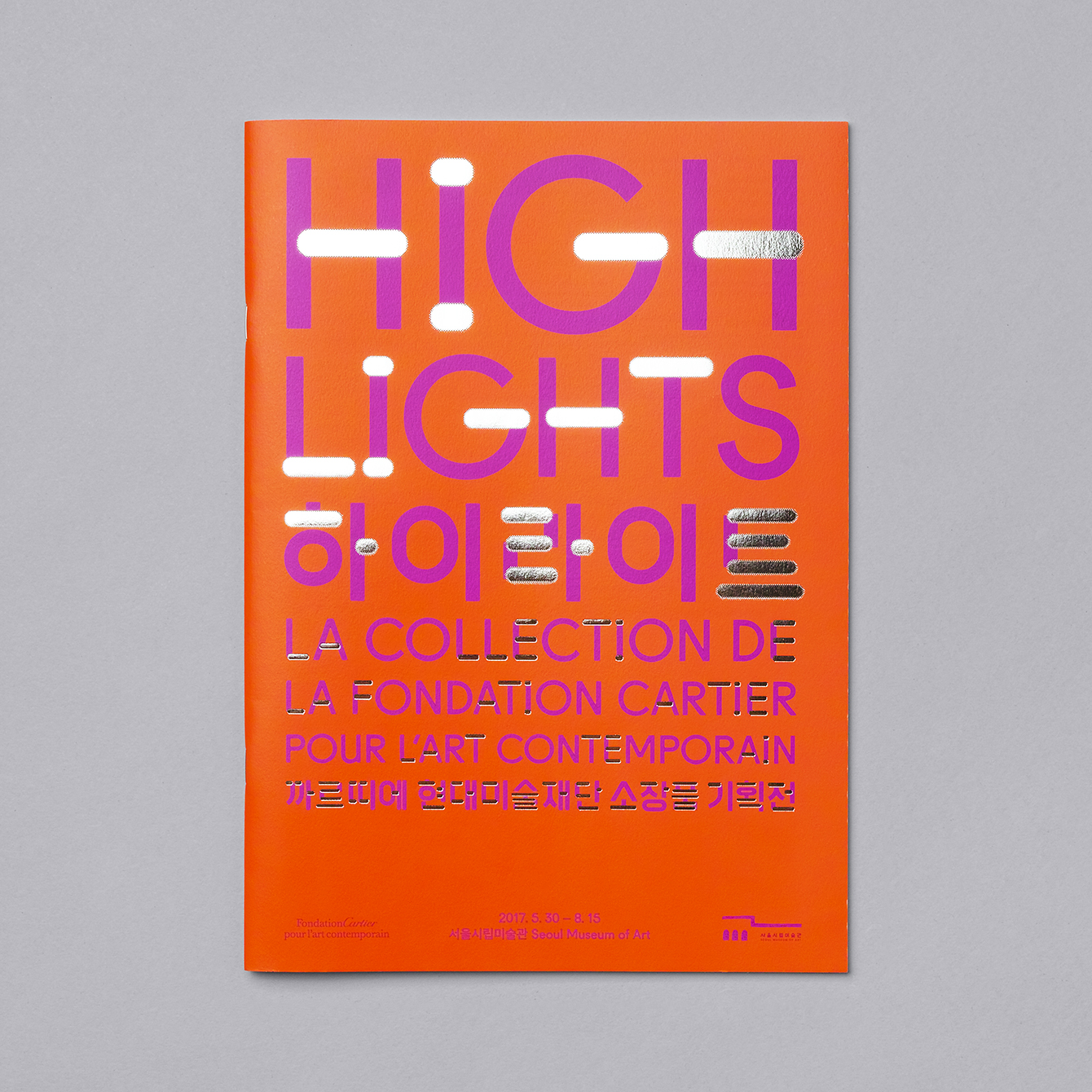
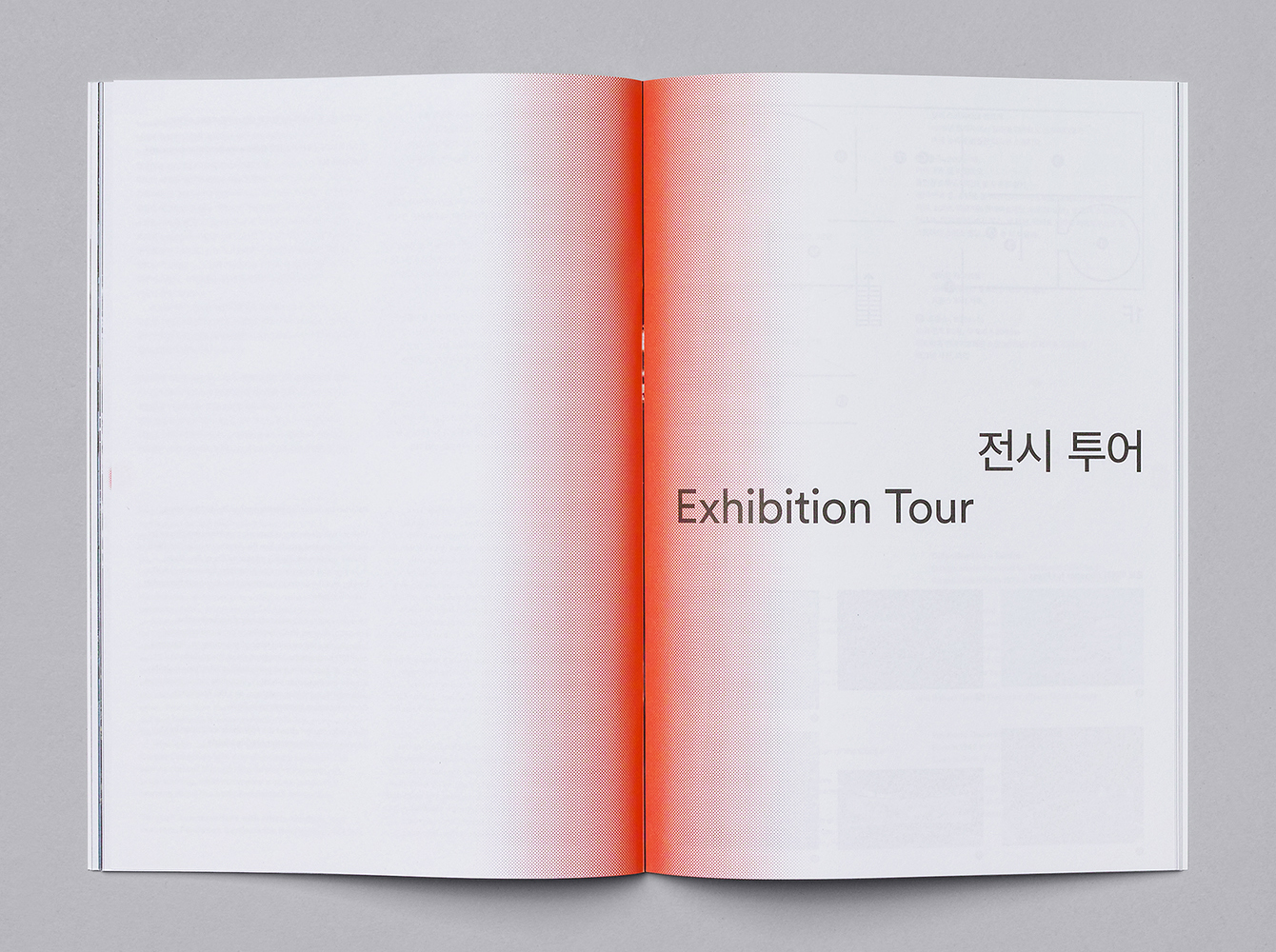
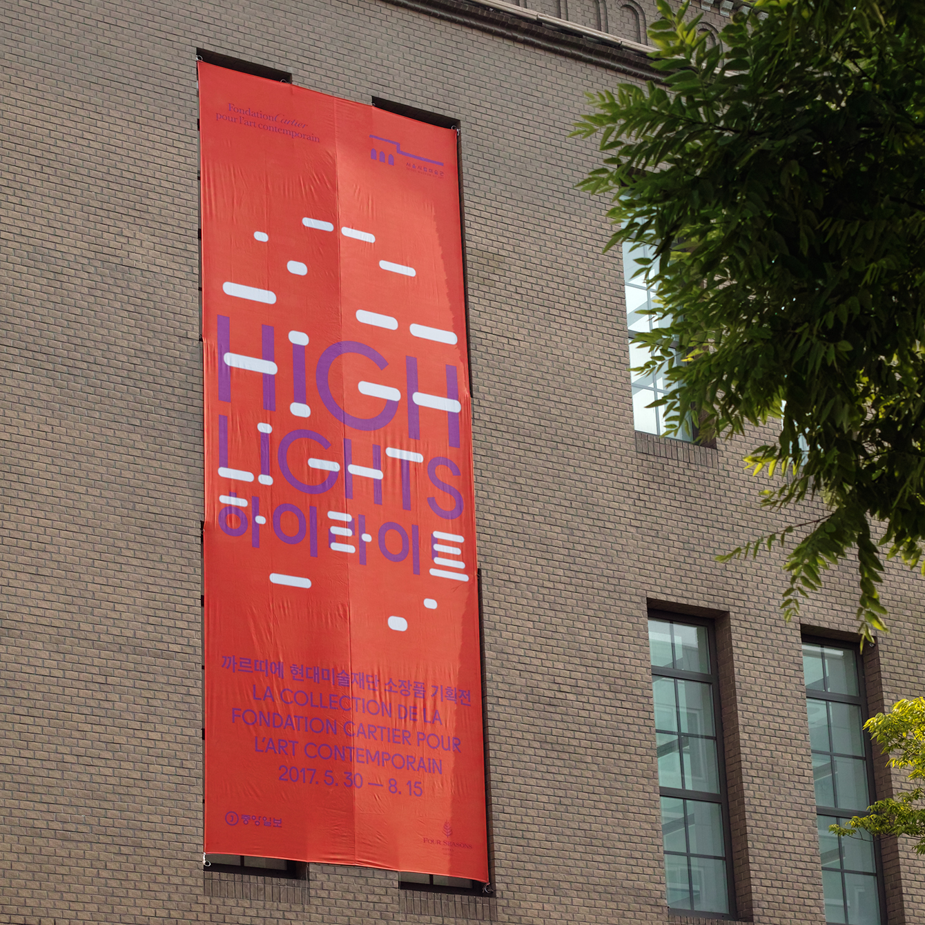
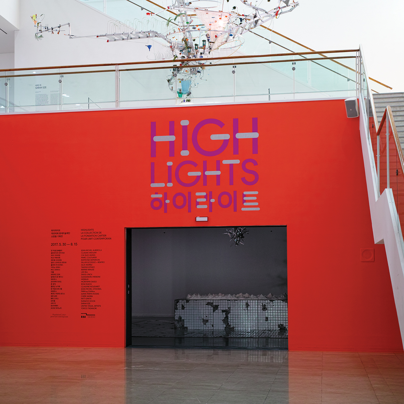
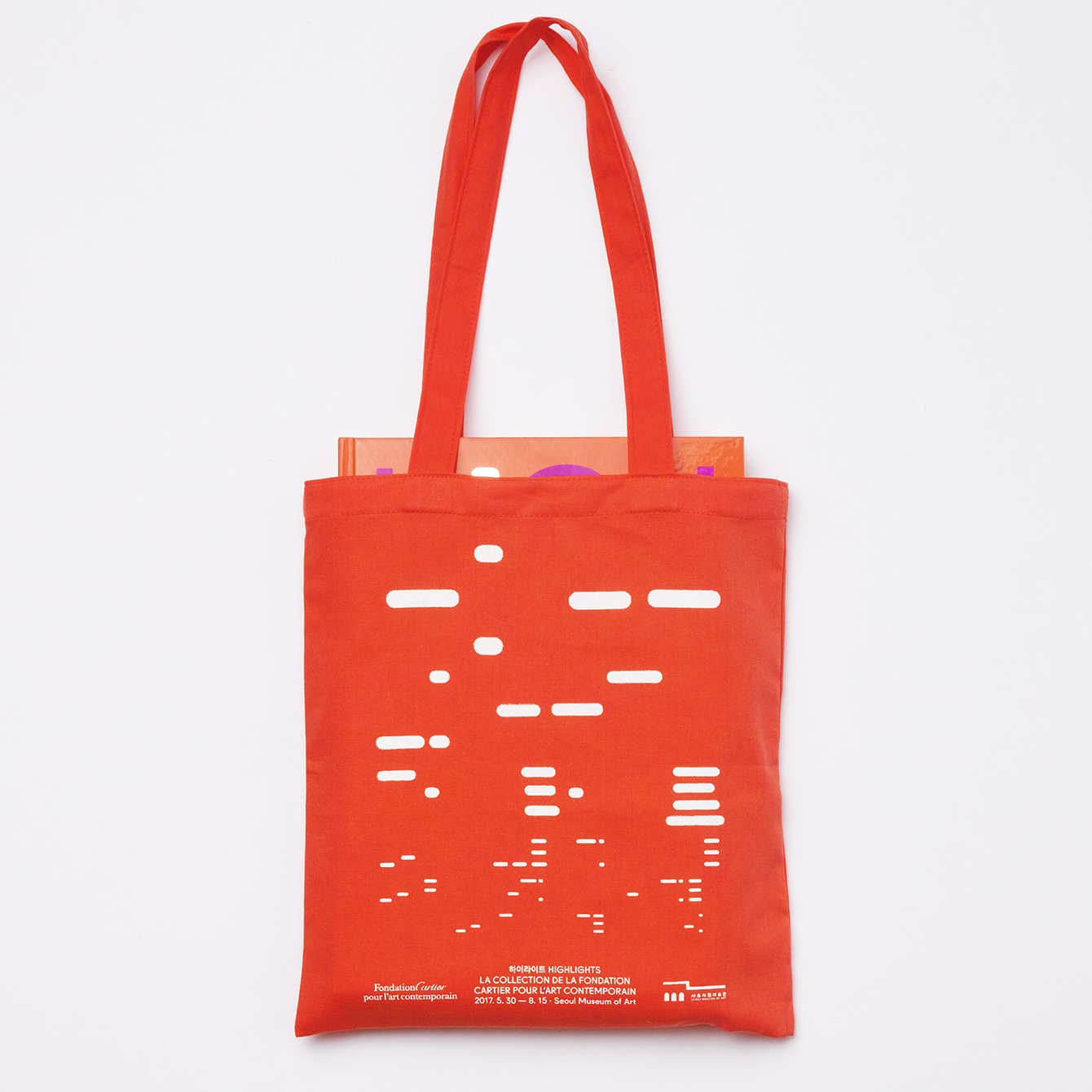
Highlights is curated by Fondation Cartier and SeMA, set over three floors with spaces for discovery, contemplation and wonder, and features a visual identity by South Korea graphic design firm Studio fnt. This is characterised by a mix of bright colour, silver block foil print finish and a linear graphic device that connects Korean and English. This is used to link posters and exhibition brochure, catalogue, banners, signage, super graphics and tote bag.
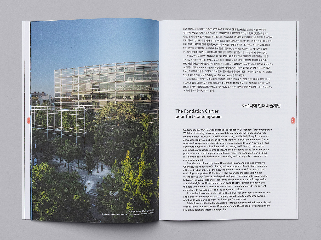
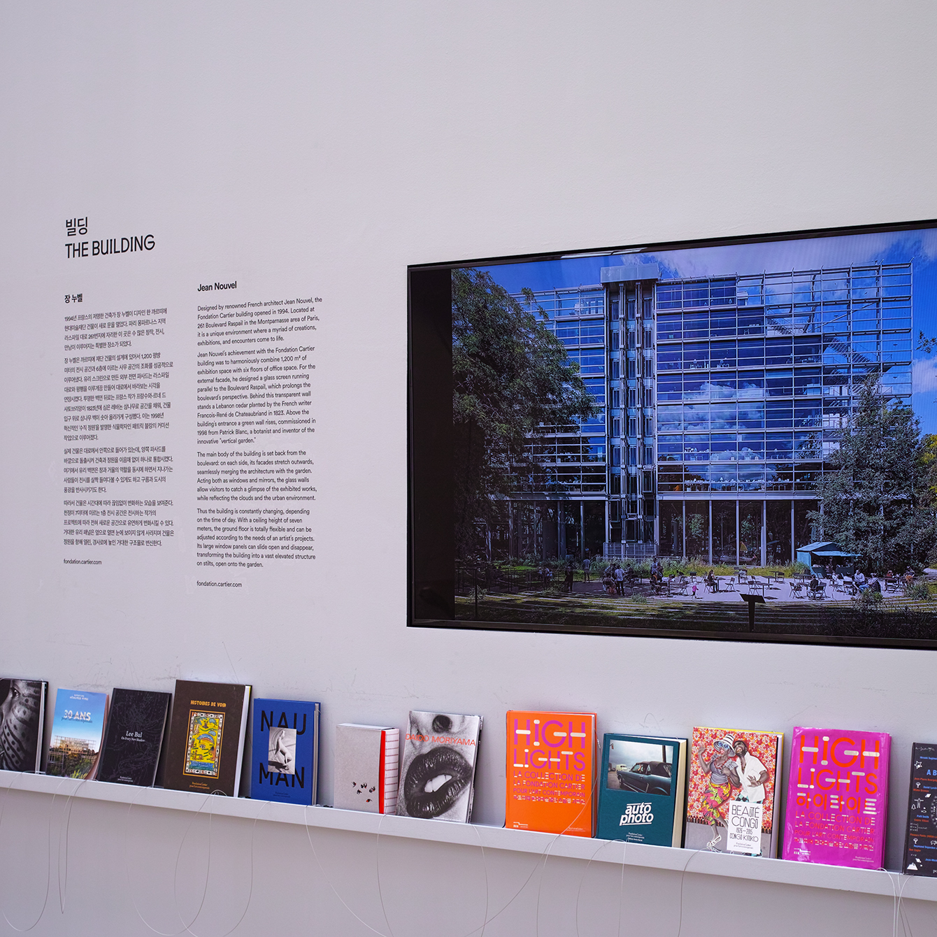
Fondation Cartier’s building, designed by renowned French architect Jean Nouvel and built in 1994, is celebrated for its interplay between structure and nature, and the transition from outside and inside, achieved by its distinctive and prominent steel frame and glass panels, which extend out past the building.
Studio fnt appear to have drawn on this structure. Using the way its design is rooted in connections to establish and and visualise a link between European and South Korean art galleries. Studio fnt are frequently challenged with working with two languages, and the commonality of horizontal bars within each written language, and the horizontal braces and panels of Fondation Cartier and the linear profile of SeMA, make for a distinctive, connective and bold expression.
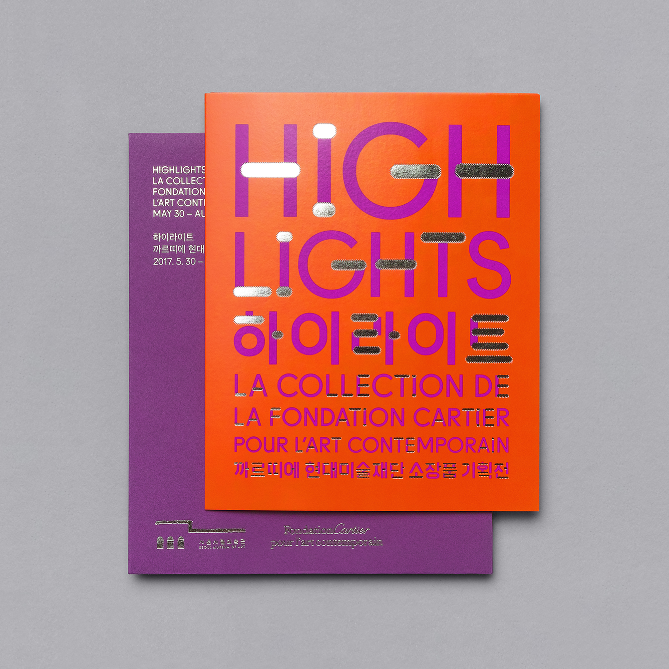
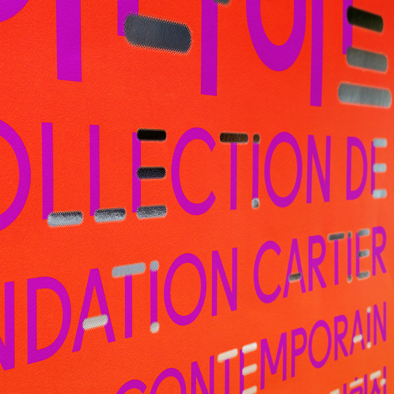
Just as Fondation Cartier makes a connection between inside and outside space, a reflective silver block foil draws something of the surroundings, its changing light and shadow, into posters, book cover and catalogue.
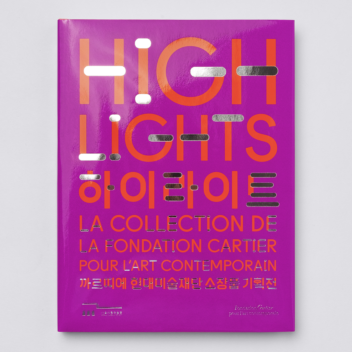
The approach challenges legibility. Words, in conjunction with low contrast colour and glossy finish become more image and structure rather than language. By pulling out every horizontal bar from each letter this occasionally causes some issues. In particular, the arms of the I, and some of the Hangul where there are multiple horizontal lines. It is, however, a recognisable and distinctive visual, whether you read it or see it as image, which is rooted in concept.
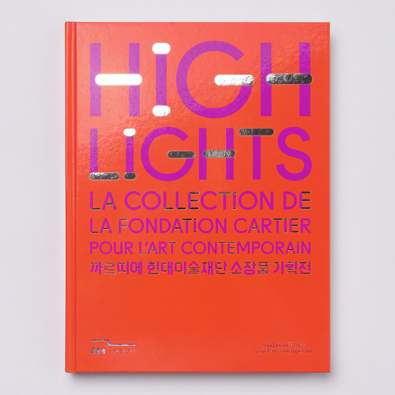
Colour and print finish is unusual. Where contemporary art galleries favour reduction, often framing image with plenty of white space, here there is a colour and material richness in dyed papers and print finish. This makes sense, within the context of Cartier International, with the approach having a touch of glamour to it.
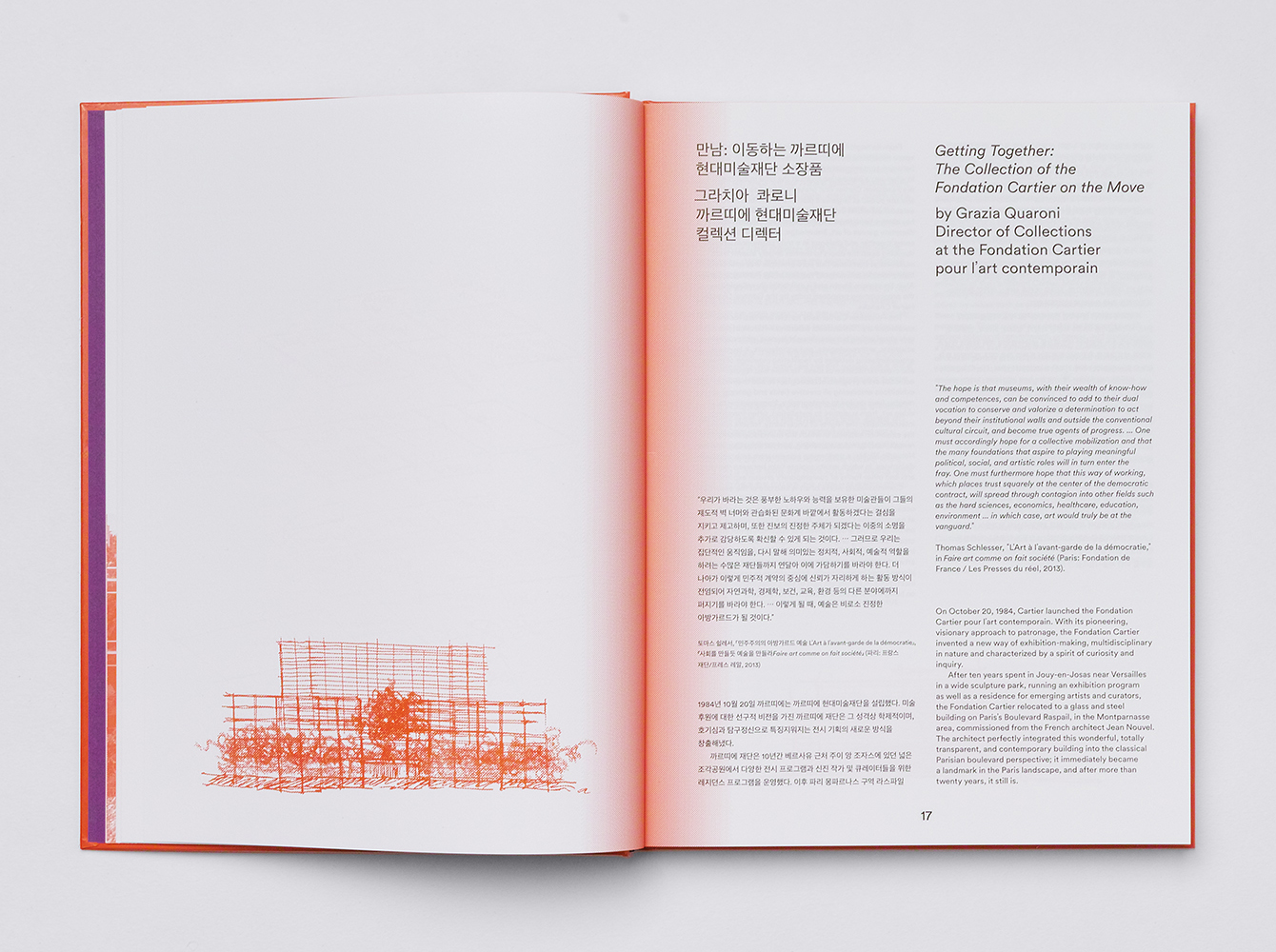
Other small details, which emphasise the connection between galleries, include language (Getting Together), sketches of and insight into the Fondation Cartier building, two colour contrast, and the use of a halftone transition between these colours.
Across banners and tote bags, and in the absence of exhibition name, see the above right, the linear links become simple callbacks, small aesthetic flourishes that, while occasionally feeling a little busy, establish a continuity and provide a touch of variation. More work by Studio fnt on BP&O.
Design: Studio fnt. Opinion: Richard Baird.
What do you think of Studio fnt’s visual identity work for Highlights? Share your thoughts in the comment section below or get the conversation started on Twitter.

 Новости Союза дизайнеров
Все о дизайне в Санкт-Петербурге.
Новости Союза дизайнеров
Все о дизайне в Санкт-Петербурге.