contact us | ok@ohmycode.ru
contact us | ok@ohmycode.ru
Opinion by Richard Baird
Kosmopolis is a five day literature festival that takes place in the city of Barcelona every two years, but also runs a programme of ongoing events in between. Kosmopolis intends to promote literature in its many different forms through workshops and by bringing together professionals from a variety of fields to discuss the key issues that concern literature today.
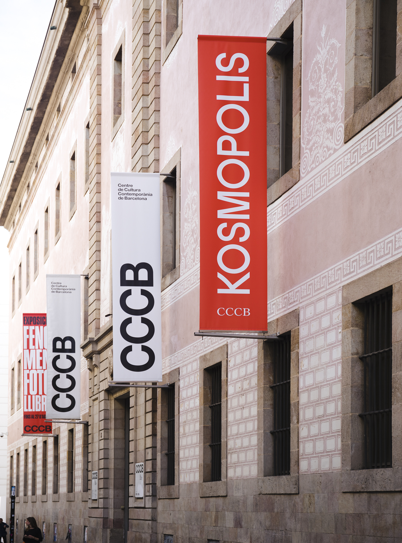
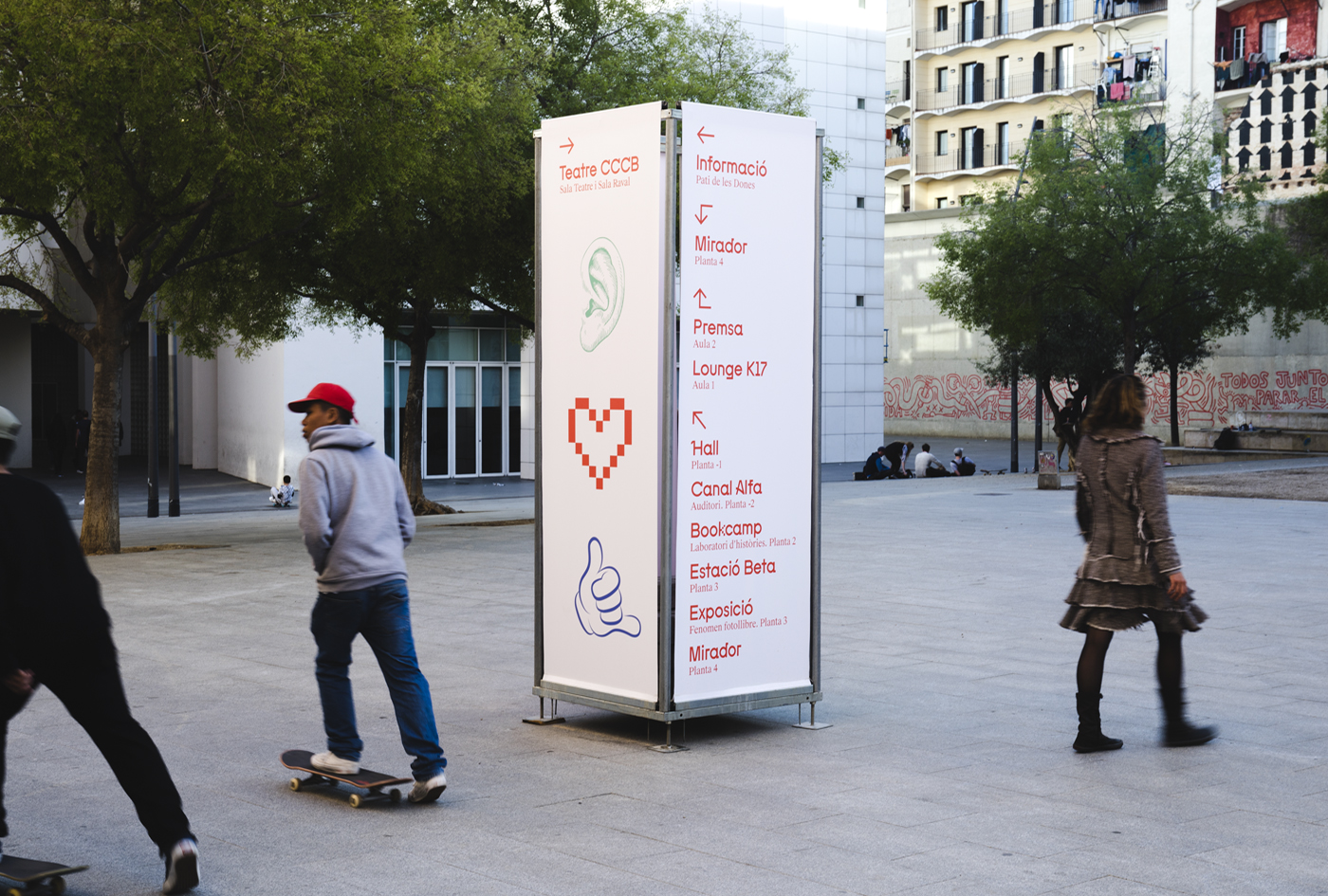
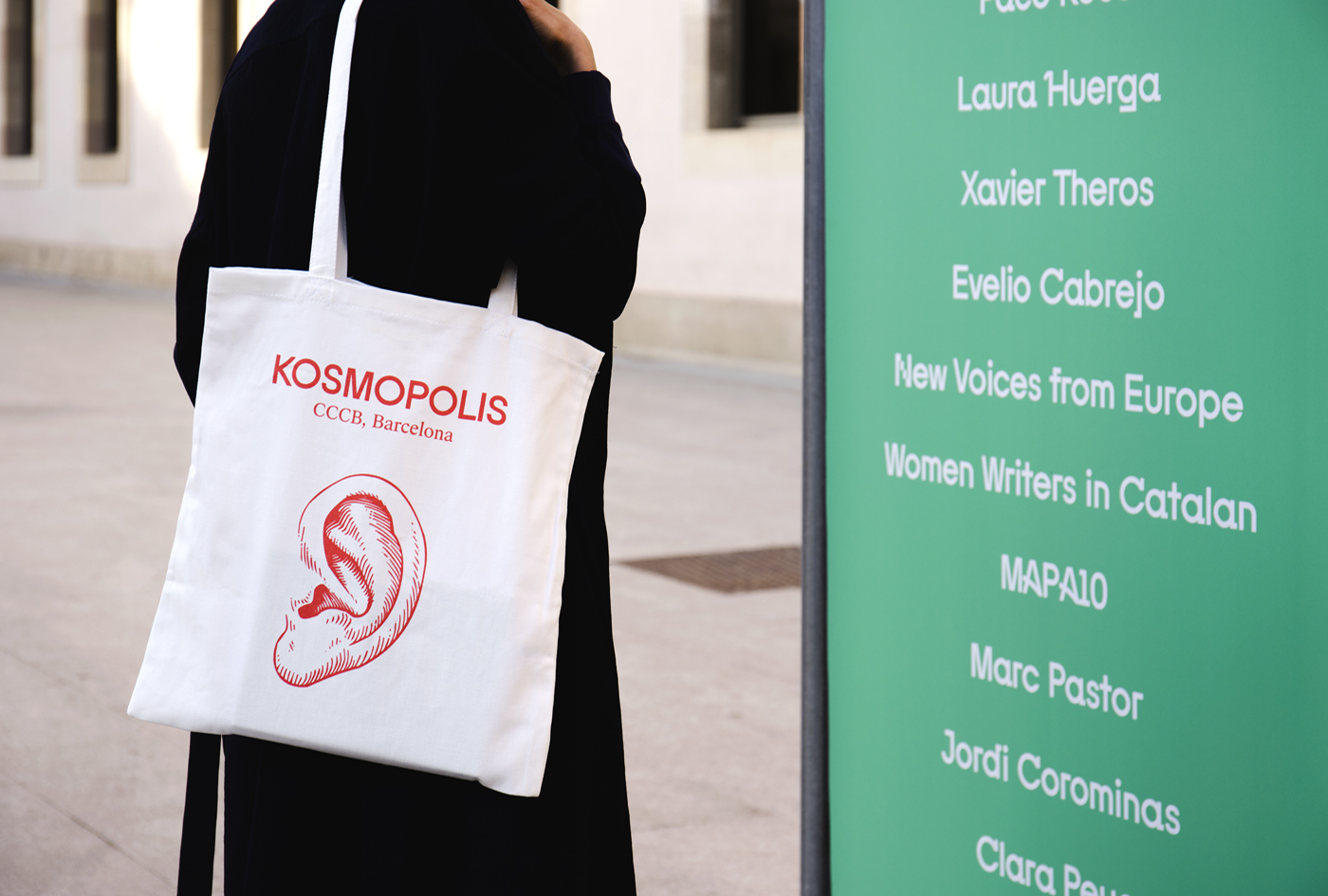
The festival, since 2002, has been organized by the Centre de Cultura Contemporània de Barcelona. The centre recently worked with Spanish studio Hey to develop the visual identity for the 2017 event. Hey use colour to establish continuity with previous events, but introduce a custom typeface that features characters informed by the digital, handwritten and painted word. This is complimented by a set of icons and used to link programme guide, banners, signage and merchandise.
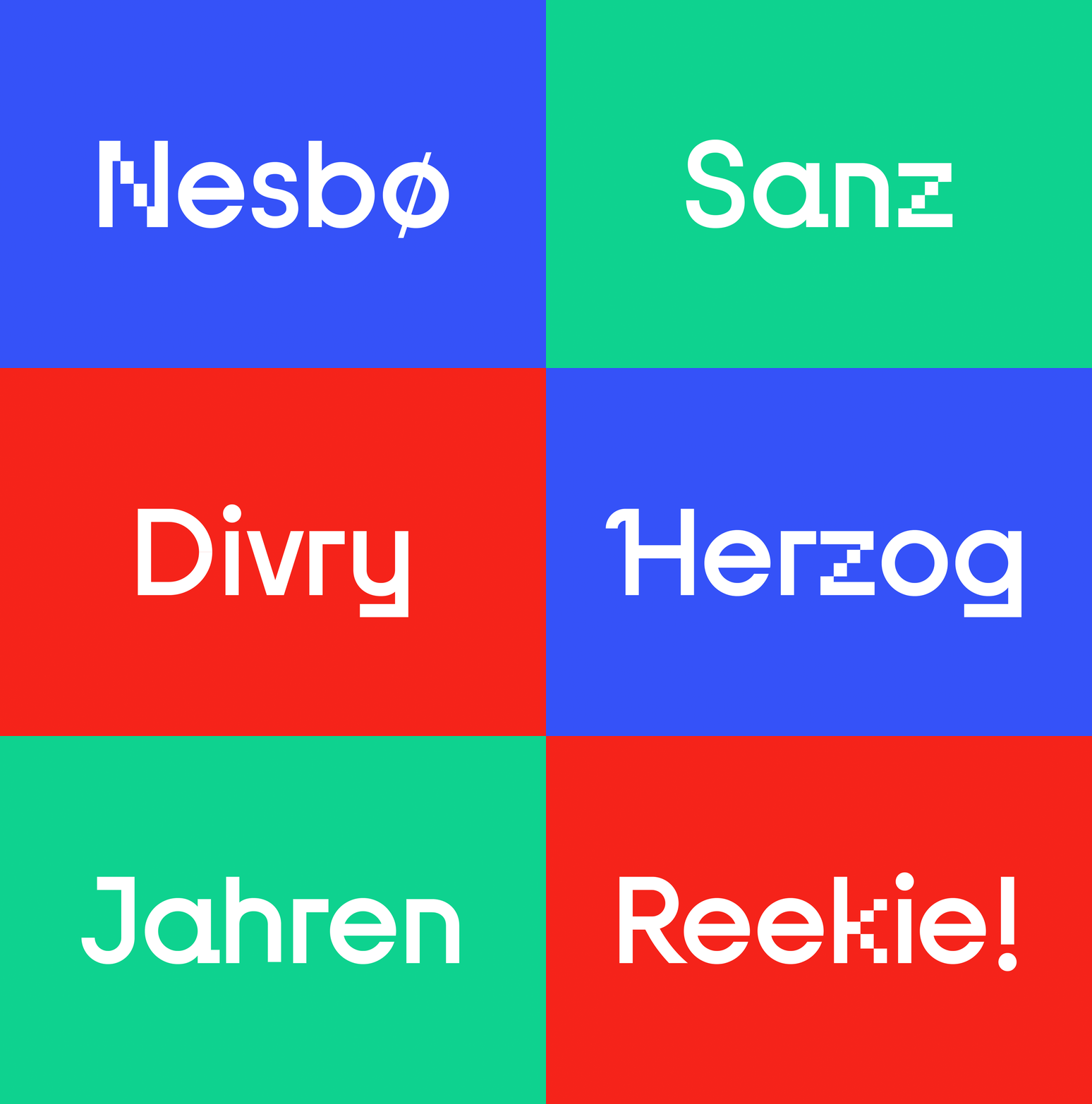
Custom typeface moves between the pixalised diagonals of the N, Y, k, z and 4, and the more subtle ornamental flourishes of the A, H and Q. From the architectural qualities of the F, a, d, f, g, j, r, j and y to the painterly curves of the K, R, and 7. There also moments of the generic and distinctive, and their intersection, where the curved and the linear meet. These are effectively unified by a monolinear stroke width, and as a complete and working digital typeface, establishes a continuity between printed assets such as posters, banners and programmes, and the event’s website.
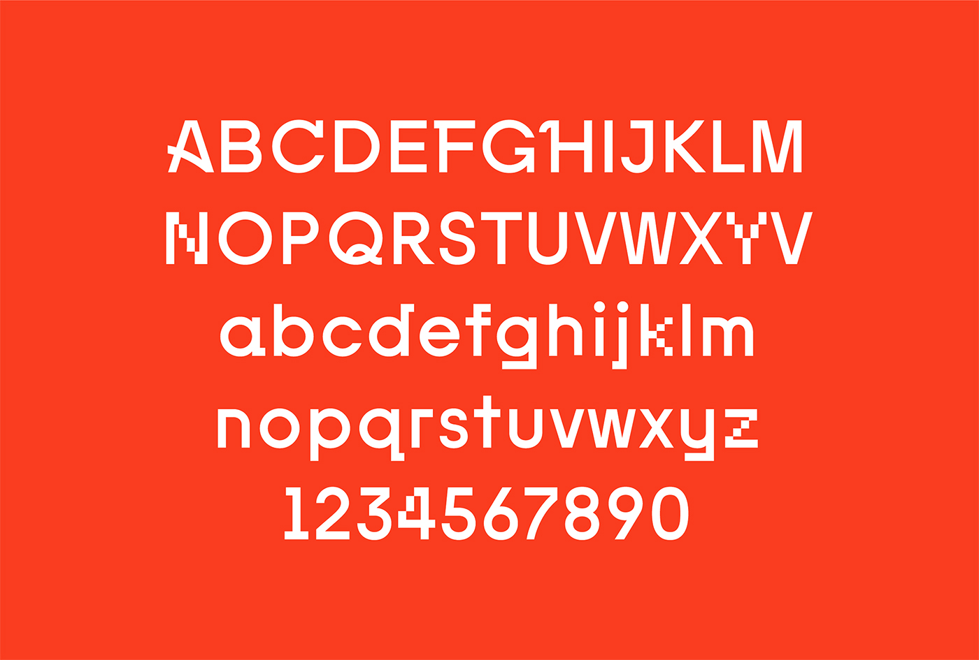
Individually, these small details are, for the most part, stylistically and conceptually subtle, and break few rules, but build to a greater whole. Custom typeface is accessible in its more conventional use of form, and cheerful and distinctive in its variations, which are grounded in concept.
The more familiar qualities of the pixelated diagonals act as a universal entry point, from which to divine and fully understand concept. This is helped by custom illustration which are more direct in their communicative intentions. These include hand-drawn ear, eye emoji and the sharp vector drawing of a pencil, as well as other motifs.
Look, listen, write and communicate are all touched upon in a manner that feels modern, cheerful and inclusive, and borrows something of Milton Glaser’s I ♥ NY.
![]()
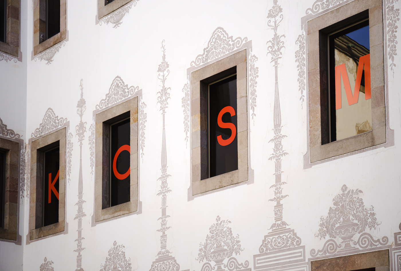
The work has a contextual awareness, with contemporary letterforms of the typeface being placed directly onto the windows of a historical building with an ornate exterior. Past and present, illustrative flourish and reduction, artistic expression and communicative utility intersect which feels well-suited to the festival.
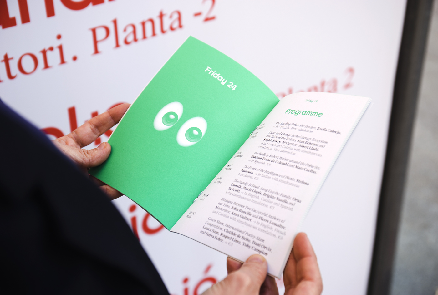
A single font family, but set in different weights and styles across the programme, establish a continuity of concept where a display face may undermine readability, while panels of solid colour and the use of image help to divide content in a straightforward but convivial manner. More work by Hey on BP&O.
Design: Hey. Strategy: Usted. Photography: Enric Badrinas. Opinion: Richard Baird.
What do you think of Hey’s visual identity for Kosmopolis? Share your thoughts in the comment section below or get the conversation started on Twitter.

 Новости Союза дизайнеров
Все о дизайне в Санкт-Петербурге.