Обзор лучших ресурсов по разработке бренда, разработке упаковки
contact us | ok@ohmycode.ru
contact us | ok@ohmycode.ru
Opinion by Richard Baird.
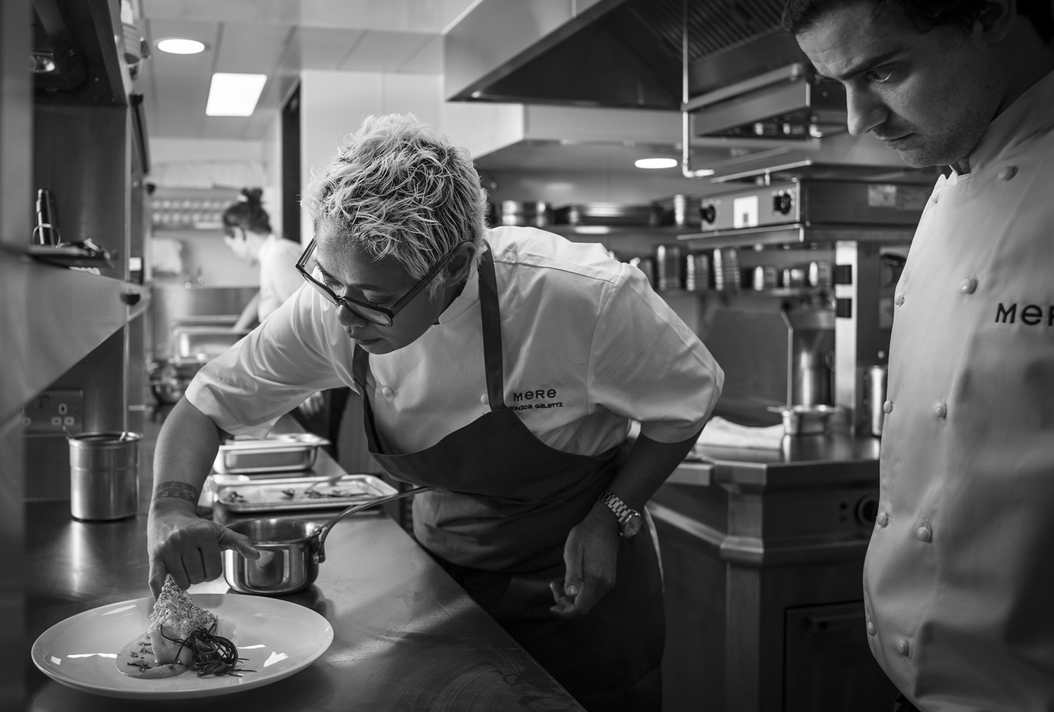
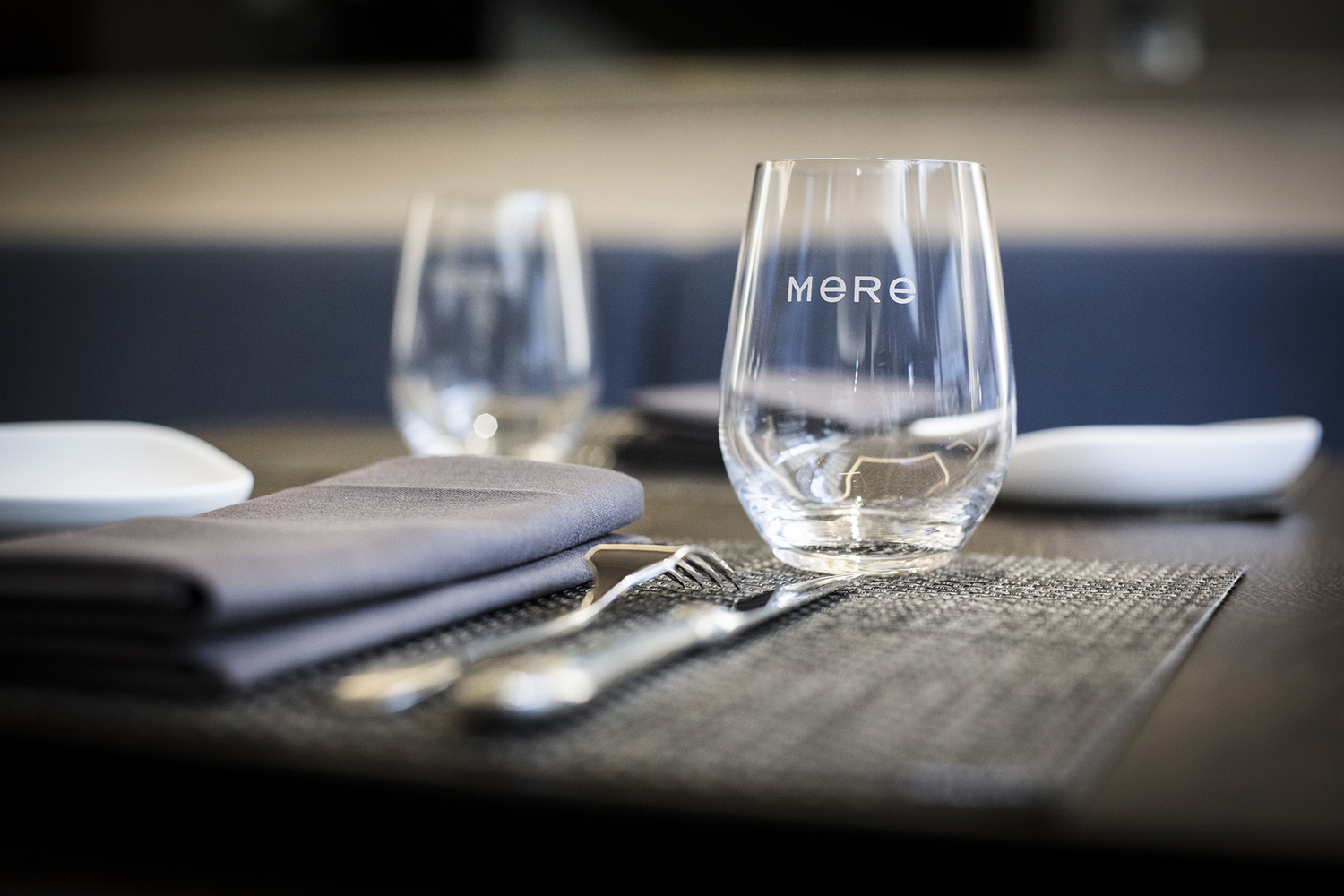
Mere–pronounced Mary–is a modern two-storey restaurant and bar, located in London’s Fitzrovia, developed by chef Monica Galetti and sommelier David Galetti, working in collaboration with Westbury Street Holdings.
The restaurant has a menu of simple dishes made from seasonal produce using classic techniques, and influenced by the French and South Pacific heritage of David and Monica, respectively. It also features a warm interior of rich material detail and pattern, created by Softroom.
Mere’s brand identity, developed by London-based design studio Bibliothèque, brings these interior details together and draws a sense of refinement, craft and character from the intersection of material and the use of unusual typographic detail across menus, receipt holders, business cards, cloakroom tags and signage.
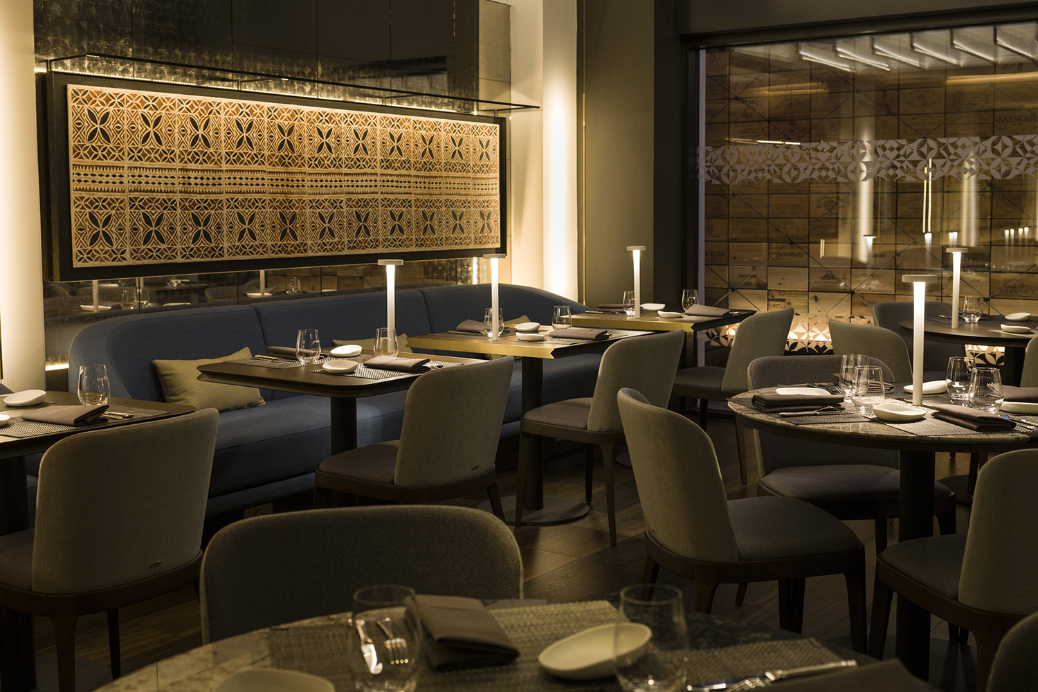
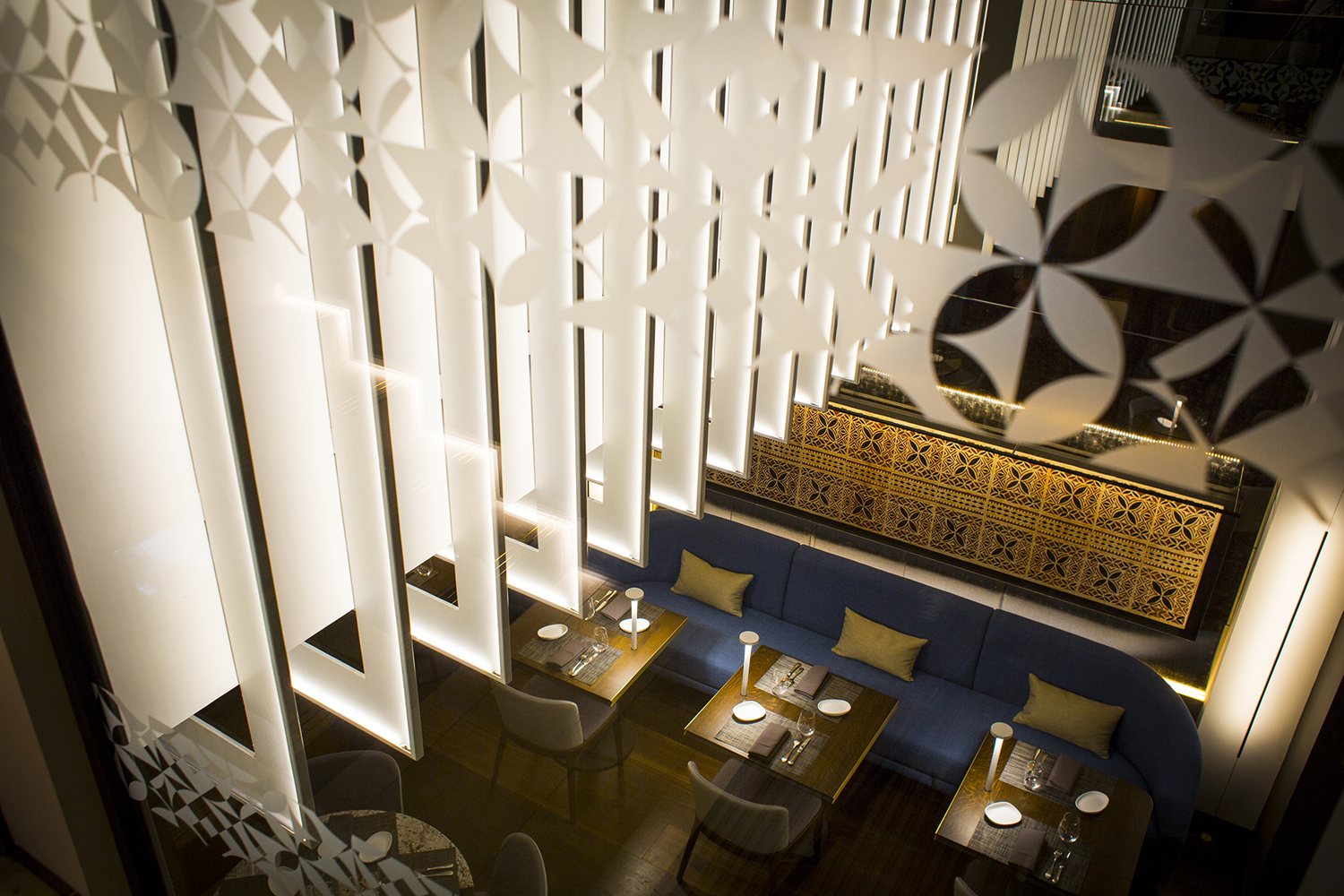
Mere features a distinctive interior design that brings together modern geometric lines, emphasised by lighting, intricate graphic patterns and plenty of material detail in the choice of wood and stone surfaces, upholstery, woven placemats, soft furnishings and metallic detailing.
Highlights include the pattern work. These move between the custom made Tapa Cloth or ‘Siapo’, which sits above a banquette in the main dining room, and the precise and geometric interpretation of this across glass partitions. Where one feels distinctly traditional and hand crafted the other is modern and reductive, with furniture, lighting and interior arrangement feeling somewhat transitional, sitting between and connecting these.
Interior design establishes a pleasant balance between comfort and modernity, Samoan and European heritage, and feels fittingly crafted, well-proportioned, inviting, distinctive, and well-suited to a fine dining venture helmed by two highly-skilled individuals.
Restaurant brand identities can often be divided into two. Those that favour contrast, introducing something new and unexpected into environment, or favouring continuity, sharing a clear and unmistakable commonality with space. Often the latter is somewhat impressionistic. Here, Bibliothèque build visual identity from a very literal translation of interior, derives distinction through the unusual intersection of its materials, and a draws a parallel with culinary craft and process in its production.
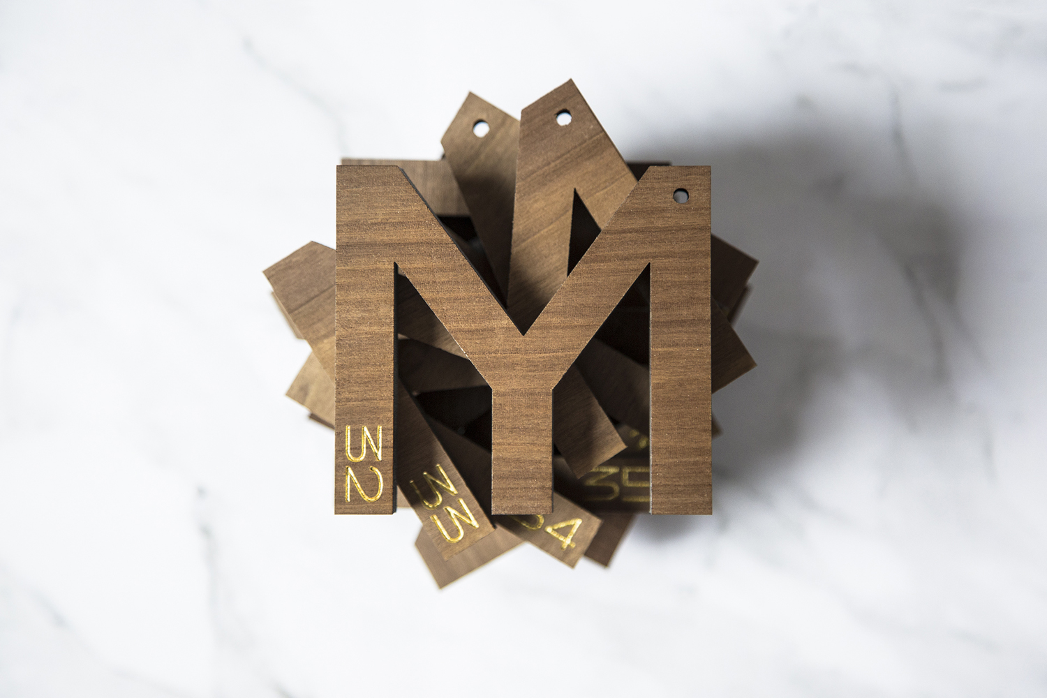
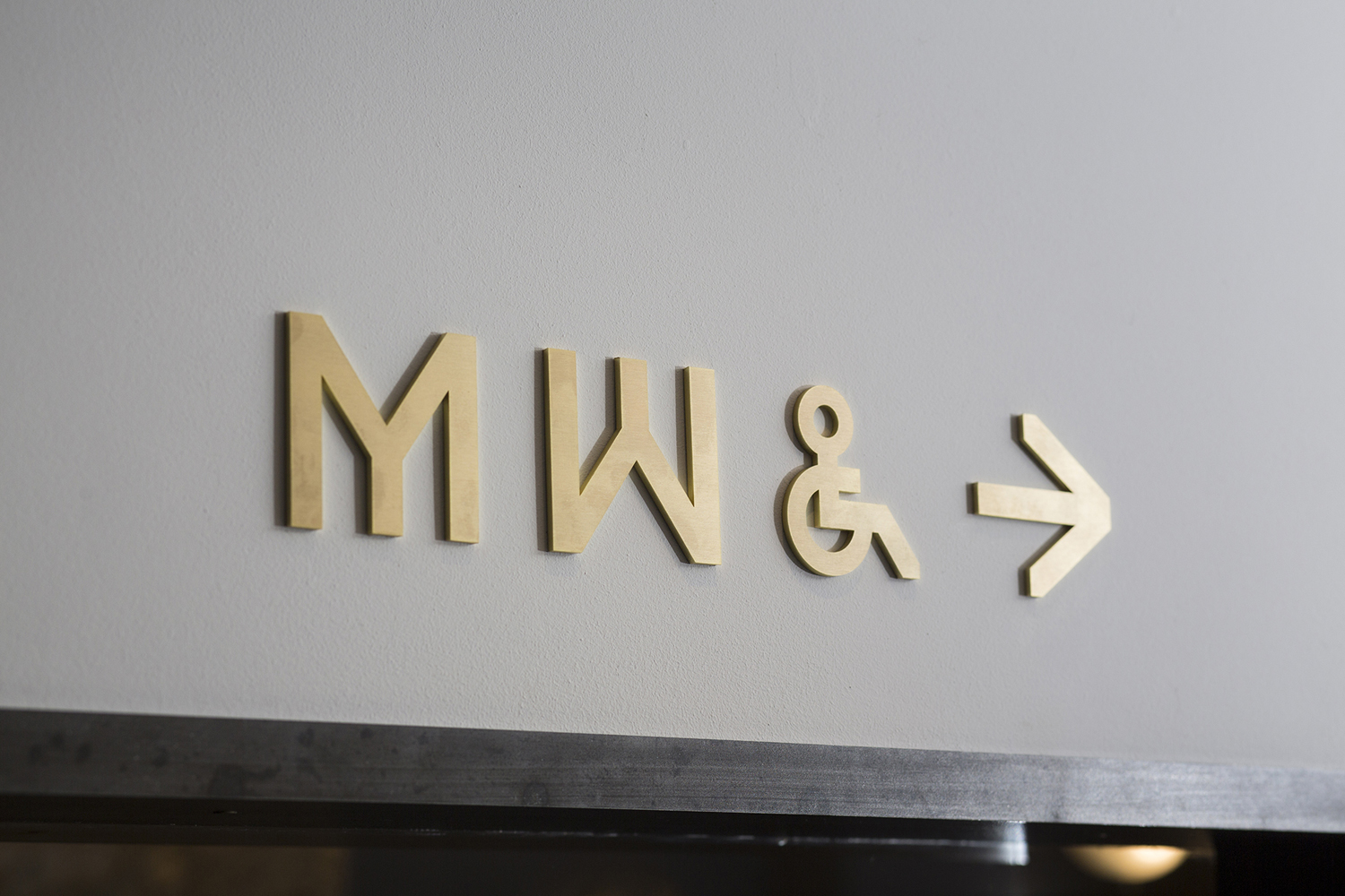
Brand identity can be broken down into to two key components, the rich, tactile material qualities of menus, receipt holders and business cards and the reductive but idiosyncratic graphic expression of type. The way these intersect as cloakroom tags and interior signage, much like the patterns of interior linking tradition, heritage and European modernity, form a neat and tangible connection between these two components.
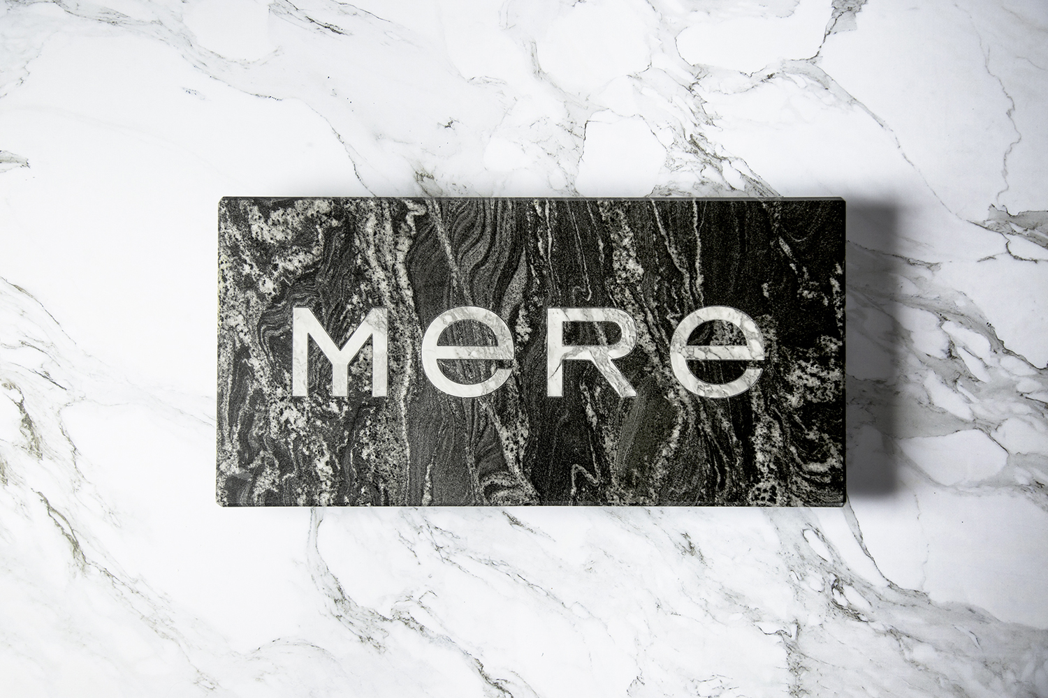
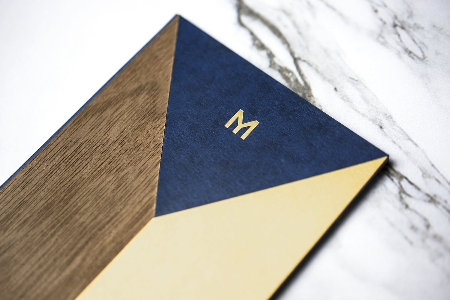
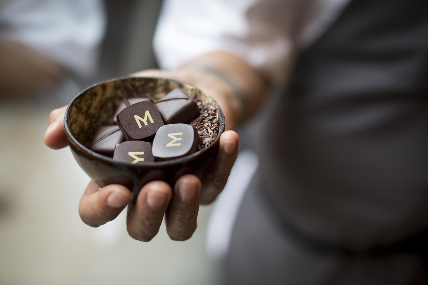
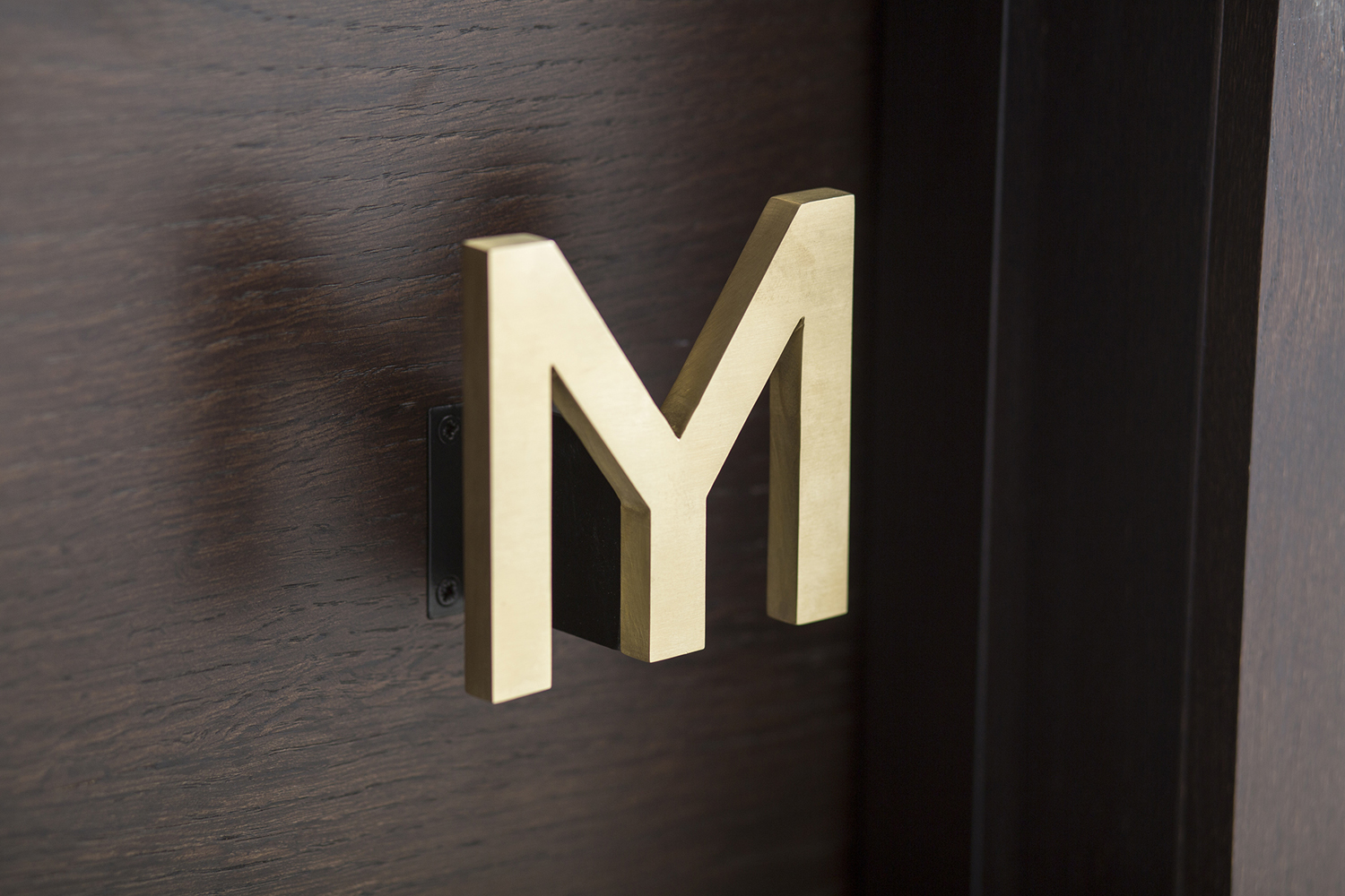
The name Mere was inspired by that of Monica’s mother, and the letter M of the Mere logotype draws on an element of Monica’s Samoan family tattoo. As naming and tattoo symbolises members of Monica’s family, logotype and supportive typeface has its own individual qualities drawn from a bespoke cut of Clement Rouzaud’s typeface Ratio. Monolinear lines and geometric proportions effectively hold together an incongruous combination of upper and lowercase characters.
Logotype and typeface have something of a dual nature, finding an contextually appropriate balance between the conventional and the unconventional, technicality and character, the very personal legacy element of the M (which goes on to inform the way material meets across menus), and a modernity and restraint that sits well within the context of rich material detail.
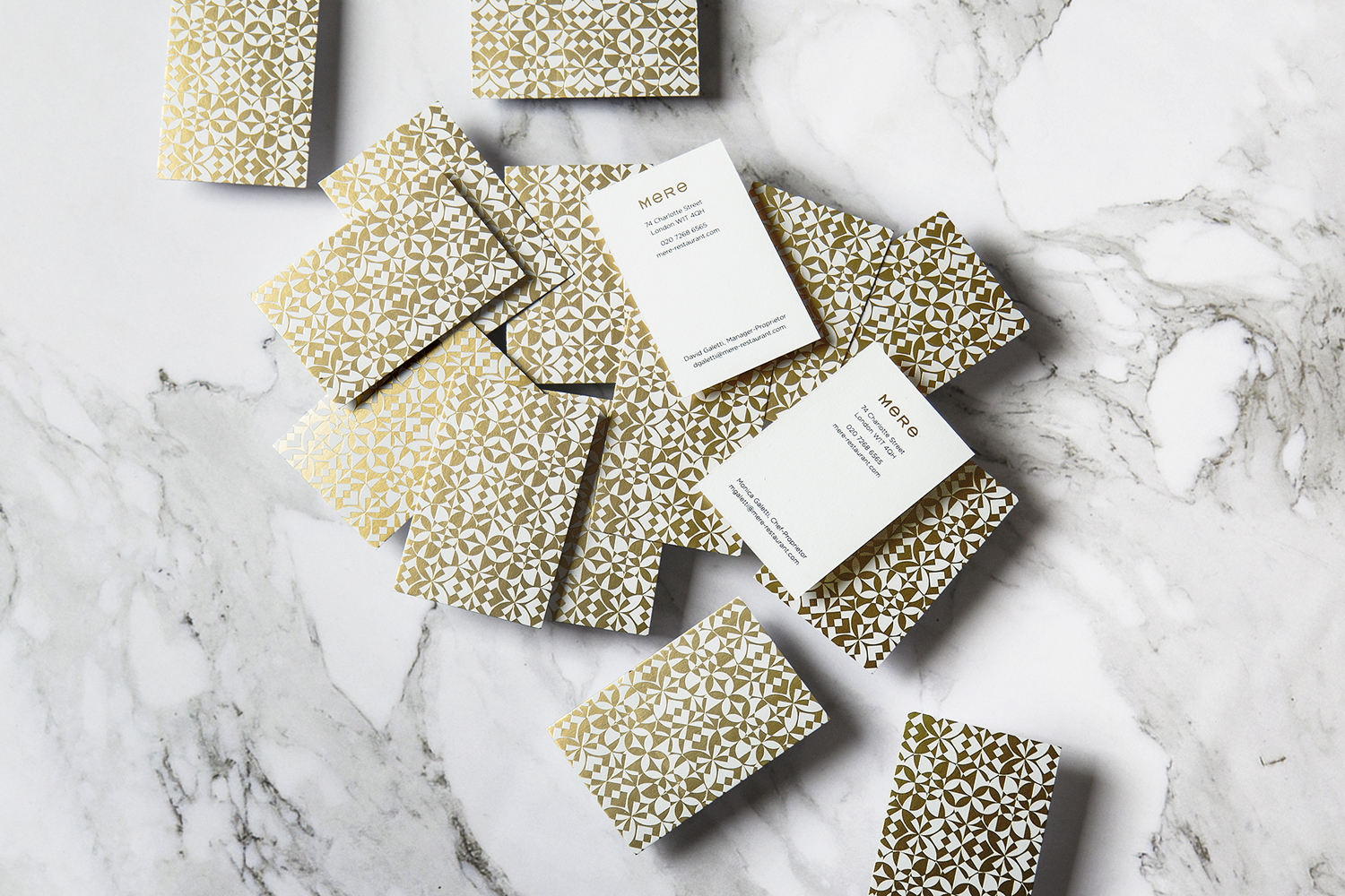
Business card pattern make a literal connection with interior. These appear distinctive, draw on and give precision to the hand drawn intricacies and forms of Samoan art, yet, in their implementation as small flourishes within interior and within the context of the business card, feel modern. It is a neat heritage reference and a neat contemporary interpretation, that acknowledges the partnership that underpins the venture, and the need to find and articulate the resteruant’s own identity without leaning two heavily into one cultural background.
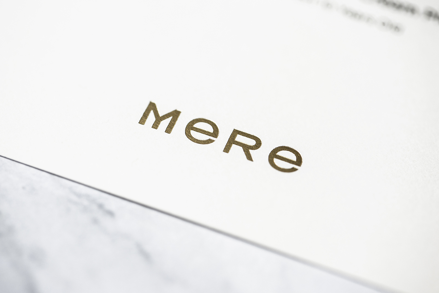
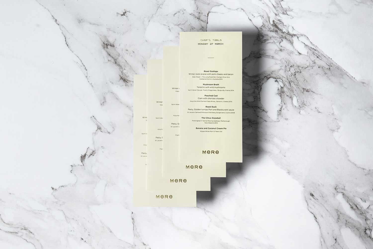
Typography, particularly online, and considering its idiosyncratic qualities, feels rather conservative in its implementation. This is used, for the most part, at small sizes, inline with what you might expect from fine dining. There is a bit tension between its character, which is crying out for more of a presence, and the way its is scaled down, but this makes sense when considered within the context of menu covers.
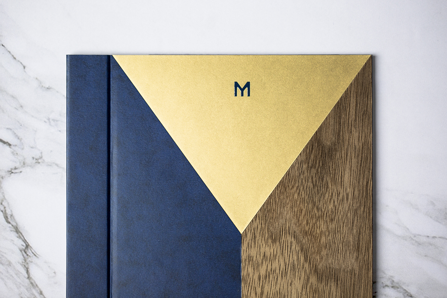
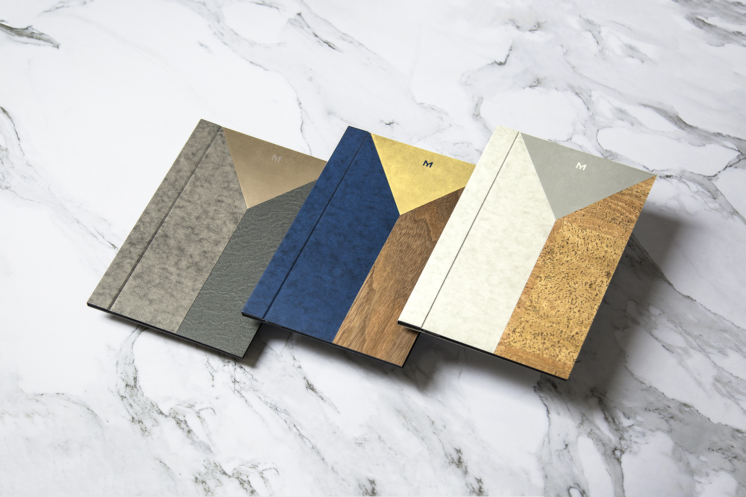
Bibliotheque worked with Parisian atelier Imprimerie du Marais on menus and receipt folders. These feature, after an extensive period of experimentation and prototyping, a combination of three inlaid materials. These, drawing on interior design, bring together a variety of materials, this include cork, marble, wood, mottled and metallic surfaces.
There is a technical and material finesse to menus and receipt holders, a lovely balance of design thinking in their articulation of cultural intersection, artistic culinary craft in the process of material prototyping, the restaurant’s interior in materials and in the channelling of the personal origins and distinctive form of the M in composition.
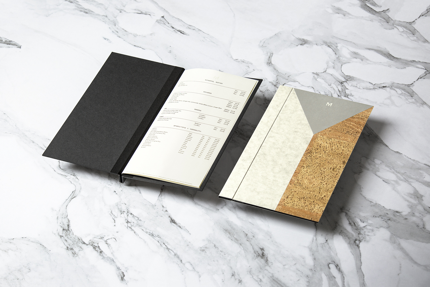
Menus, as an expression of identity, effectively balance concept, craft and a beautiful aesthetic visual character. They contribute to interior design in an interesting and expressive way, and go further by introducing variety rather than leaning on repetition.
Thought has been given to the fine dining nature of the restaurant, and the profile of its owners. Where many restaurant’s need to externalise experience to draw in patrons, Bibliotheque’s brand identity is very much about contributing to experience. As such, the creation of feature pieces feels well-intentioned and sophisticated, and the idiosyncratic qualities of type, while played down online and in print, is discernible and well-founded.
Design: Bibliothèque. Menus & Receipt Holders: Bibliothèque & Imprimerie du Marais. Interior Design: Softroom. Opinion: Richard Baird. Fonts Used: Ratio.
What do you think of Bibliothèque’s brand identity for Mere? Share your thoughts in the comment section below or get the conversation started on Twitter.

 Новости Союза дизайнеров
Все о дизайне в Санкт-Петербурге.
Новости Союза дизайнеров
Все о дизайне в Санкт-Петербурге.