Обзор лучших ресурсов по разработке бренда, разработке упаковки
contact us | ok@ohmycode.ru
contact us | ok@ohmycode.ru
Opinion by Richard Baird
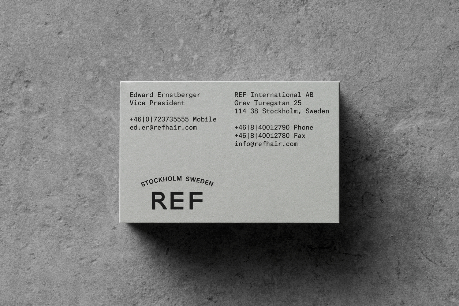
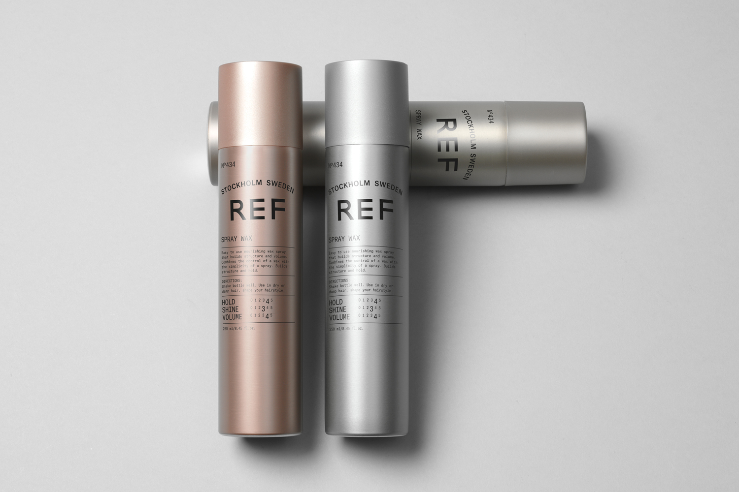
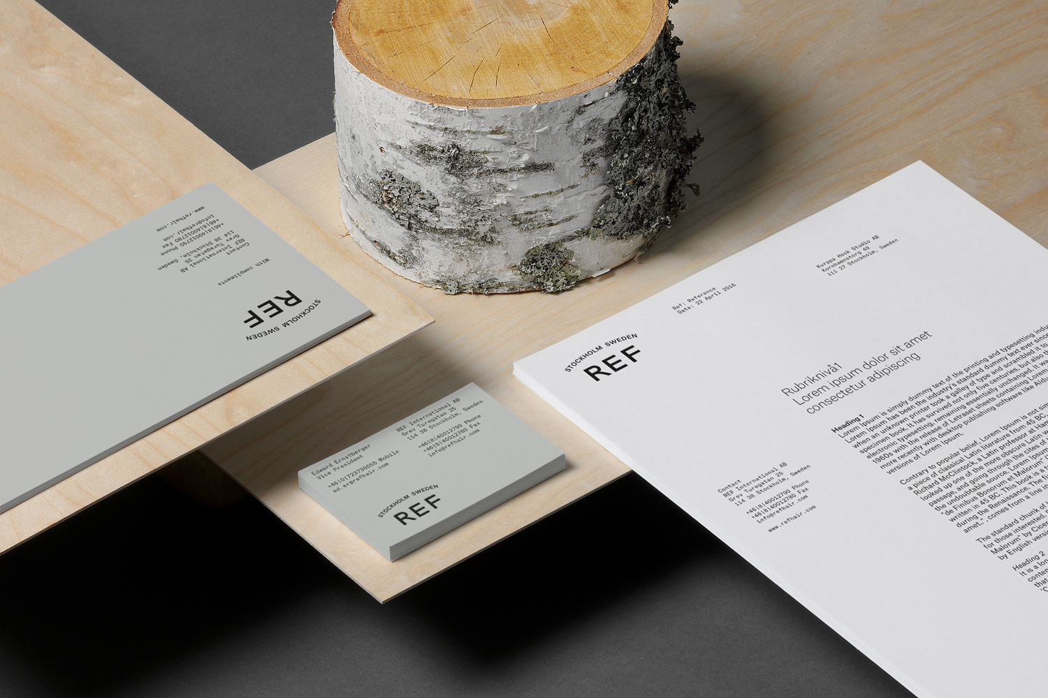
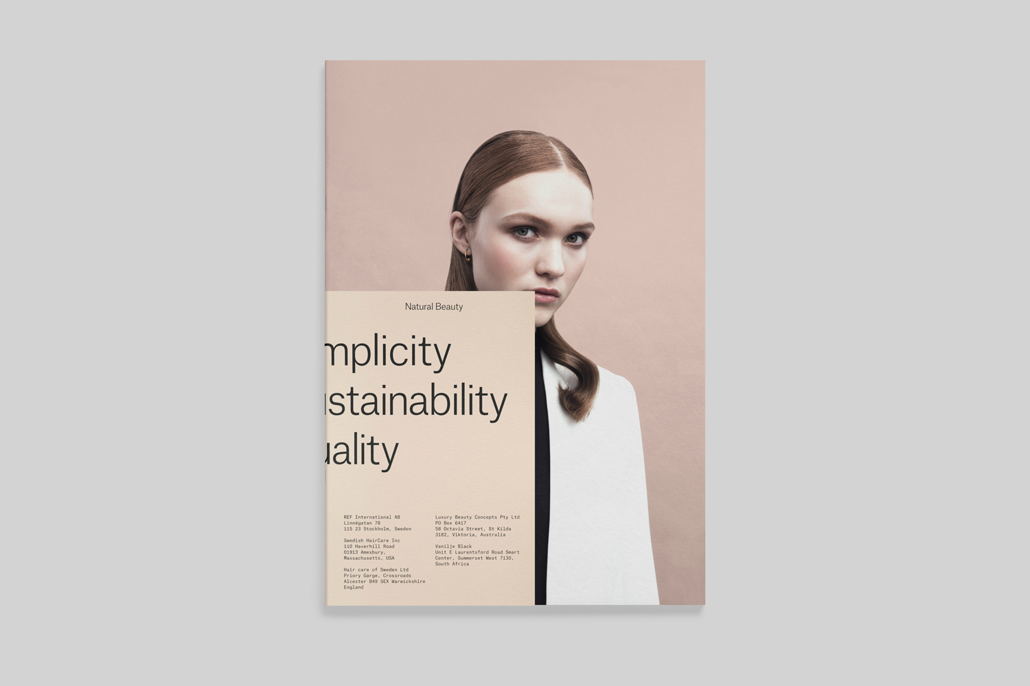
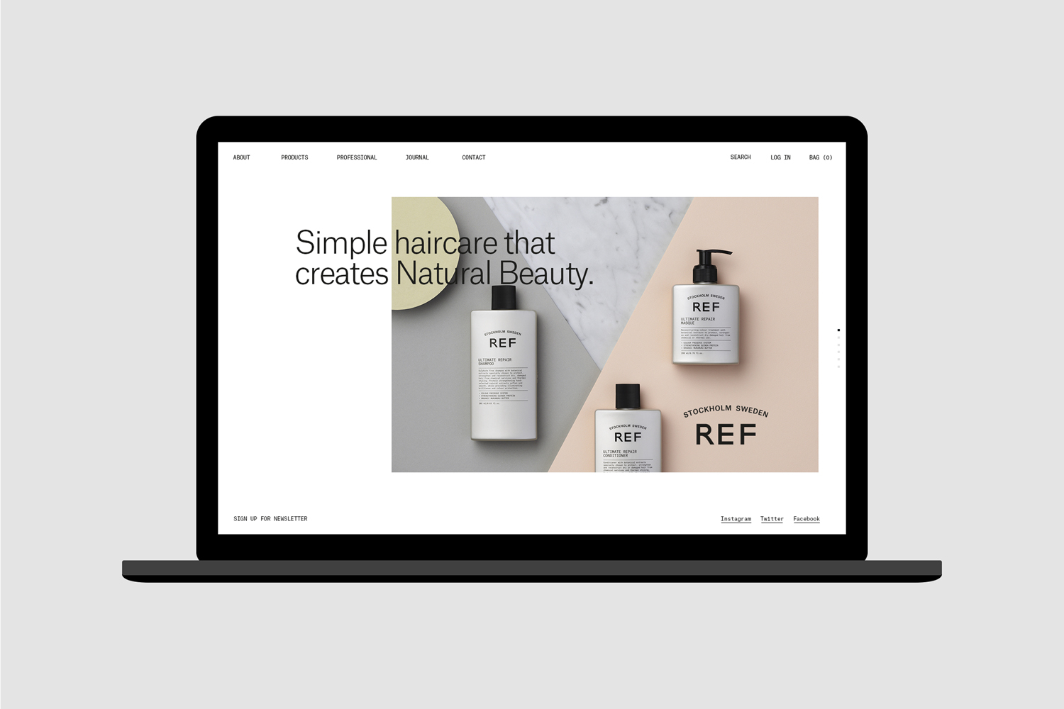
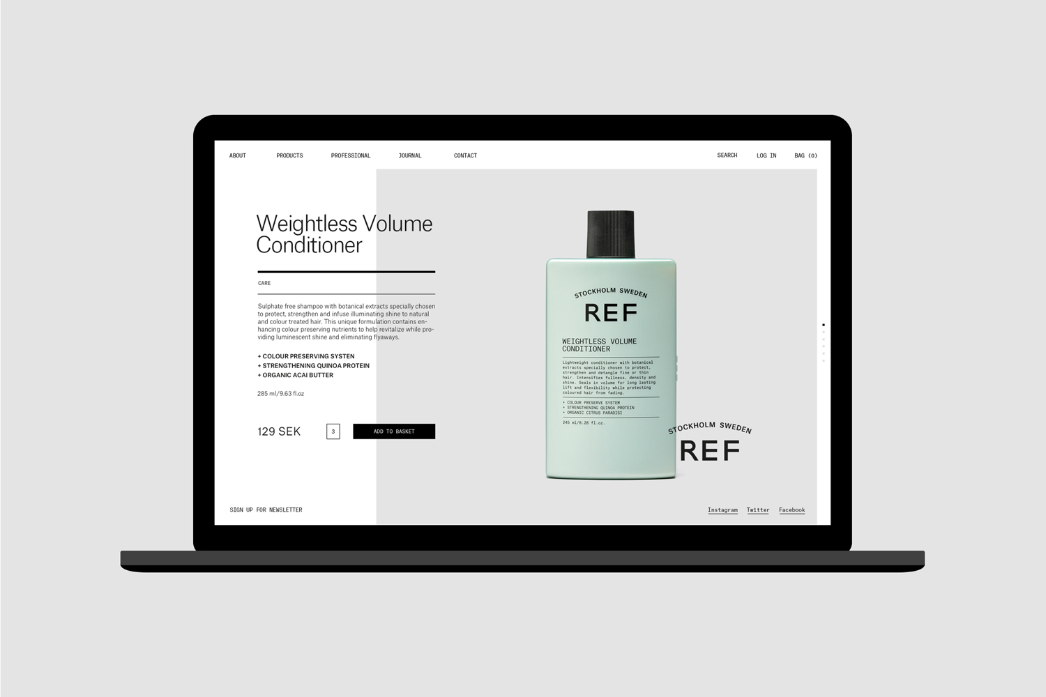
REF is an environmentally conscientious Swedish hair care brand with a range of products that are made from high quality organic ingredients. With a desire to enter the international market of the US and further in the Nordic regions, both dominated by well-established FMCG, Scandinavian design studio Kurppa Hosk were commissioned to rejuvenate REF’s visual identity. This included packaging, art direction, stationery, business cards and web design. These are linked by what the studio describe as a system of simplistic graphic elements and a modest earthy colour palette.
BP&O tends to write about either a singular concept from which each visual element springs from or a confluence of smaller ideas; familiar and conventional communicative cues that build to something distinctive. Kurppa Hosk’s work for REF favours something of the latter.
A Scandinavian legacy, an associated simplicity, and a mindful lifestyle are effectively communicated through a balance of type and colour. Together, these offer a quieter and more concise counterpoint to the visual and linguistic verbosity of the FMCG market.
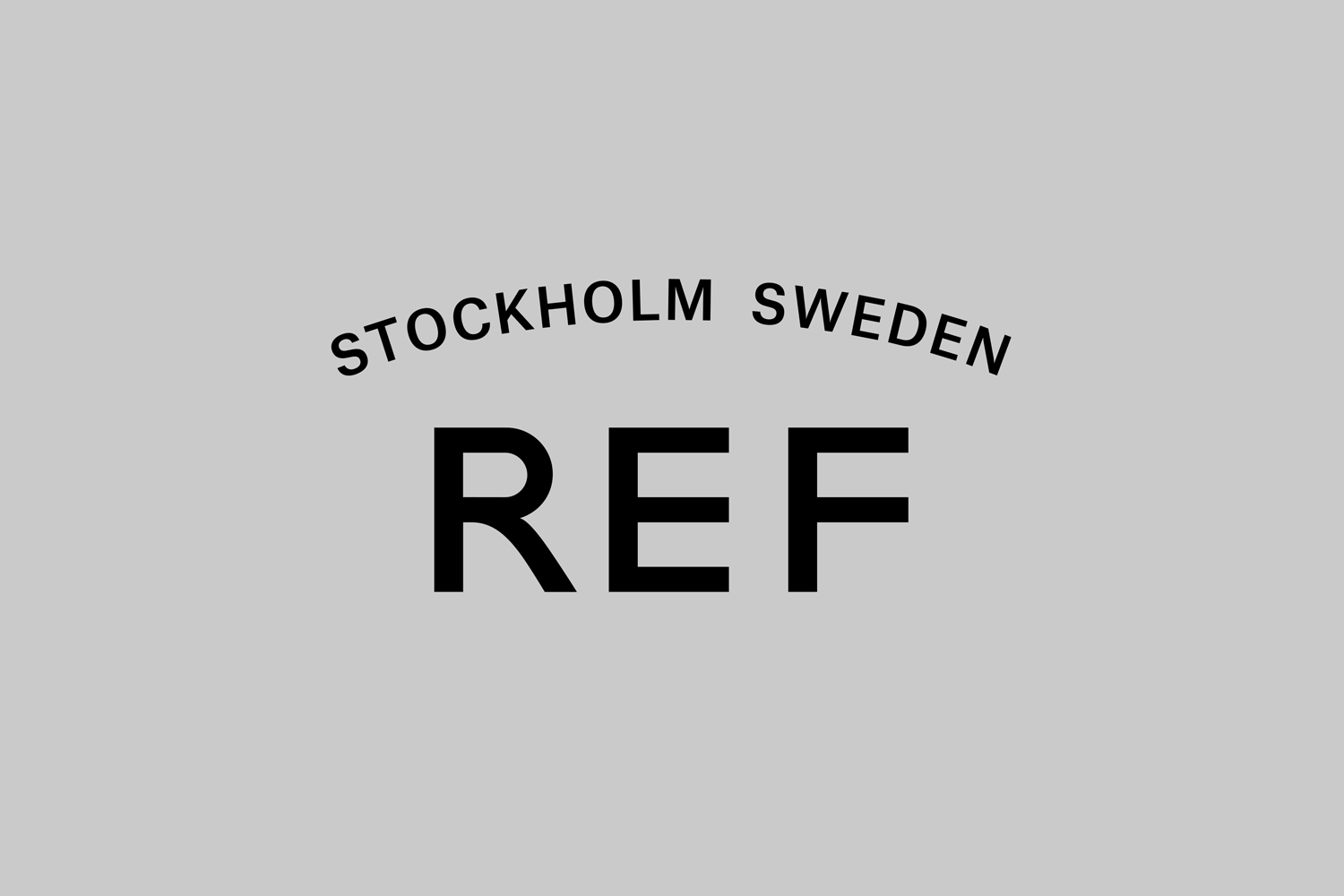
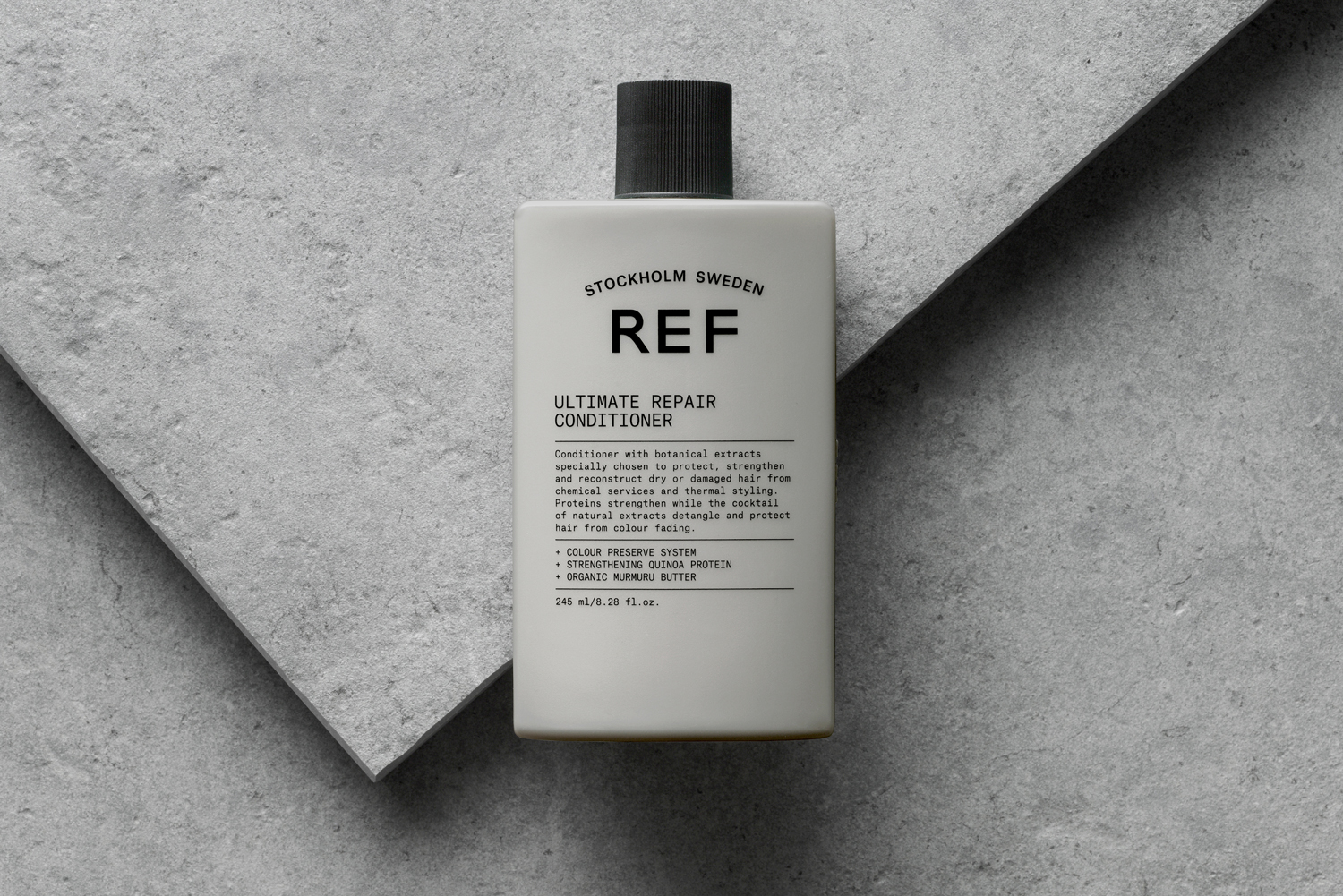
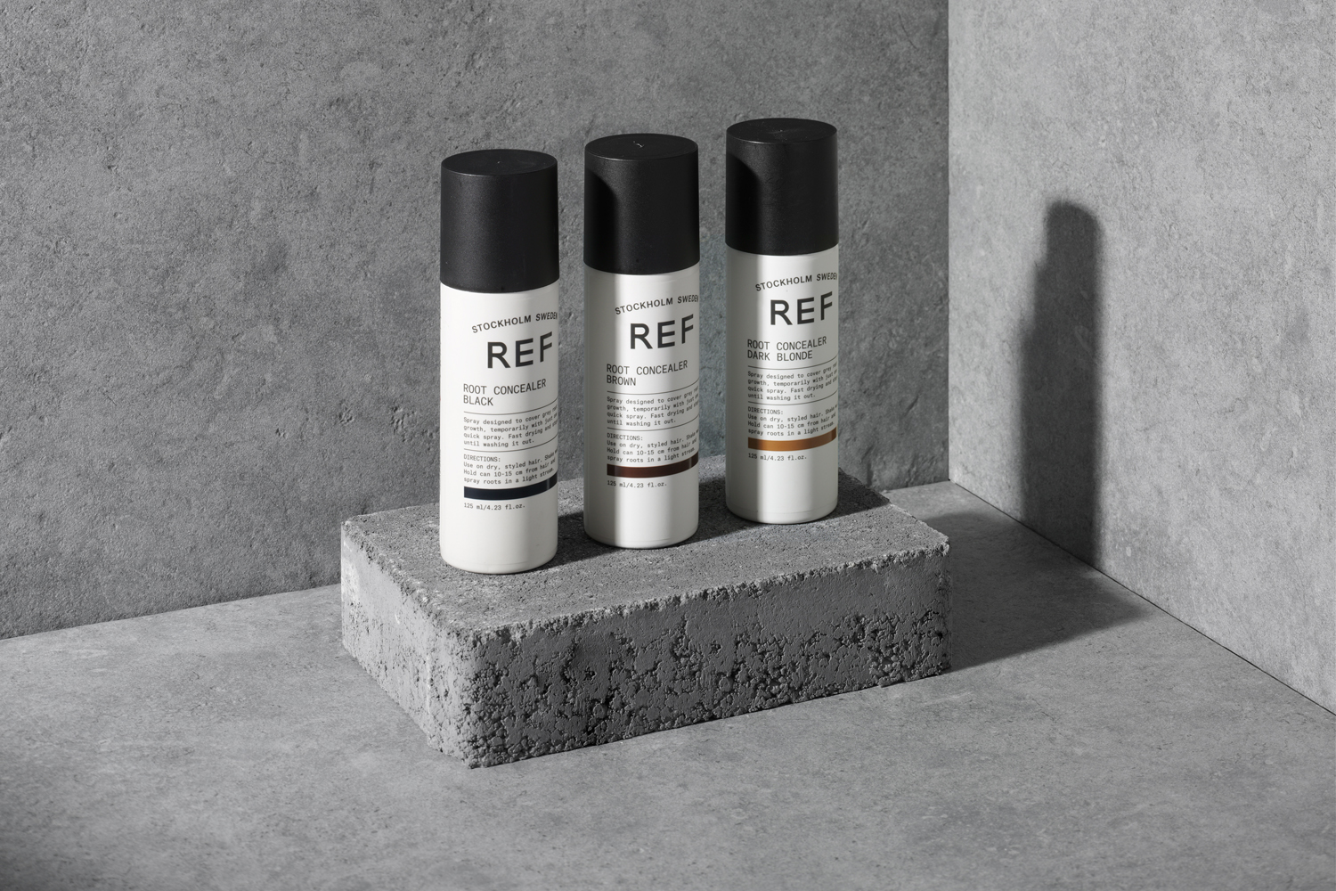
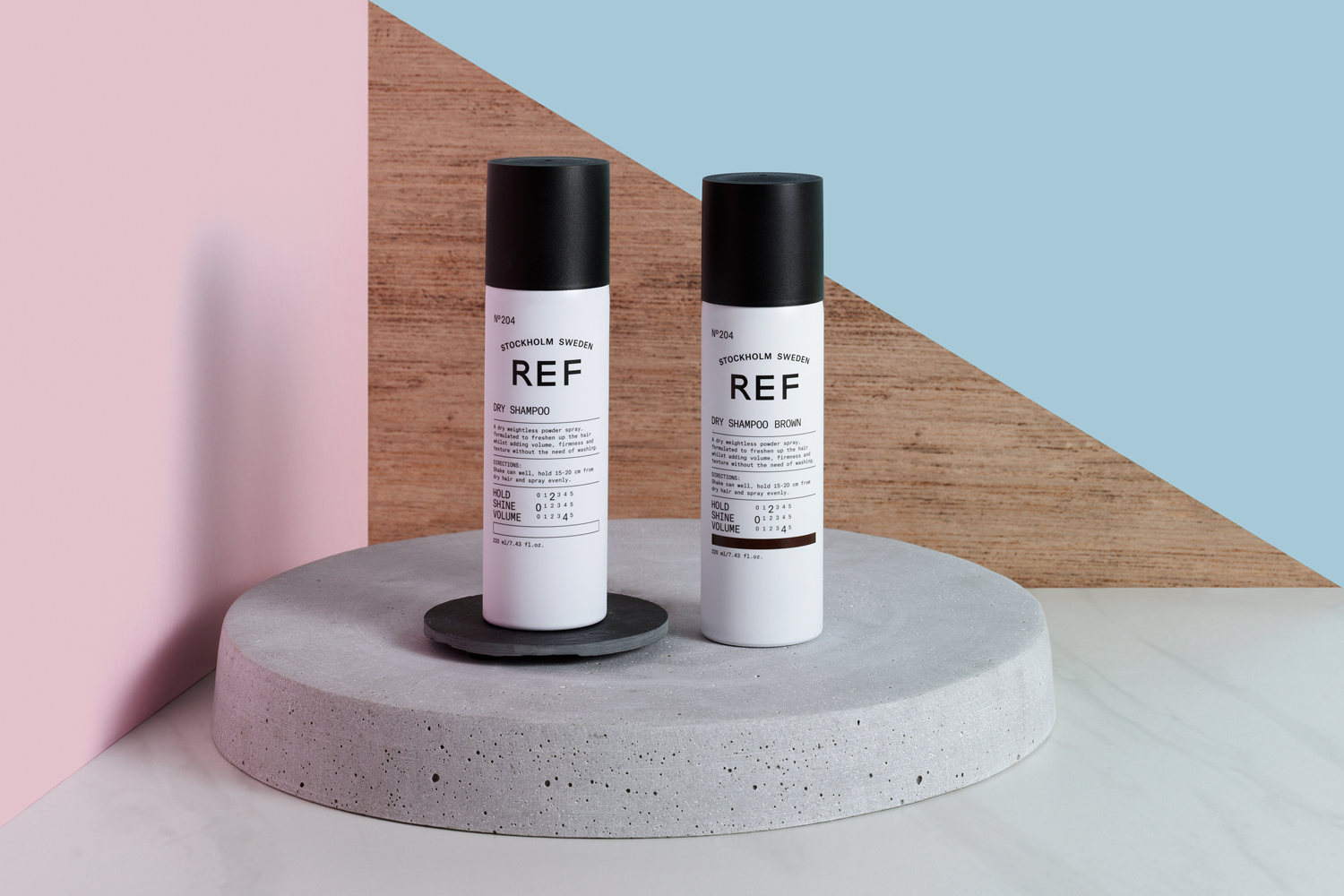
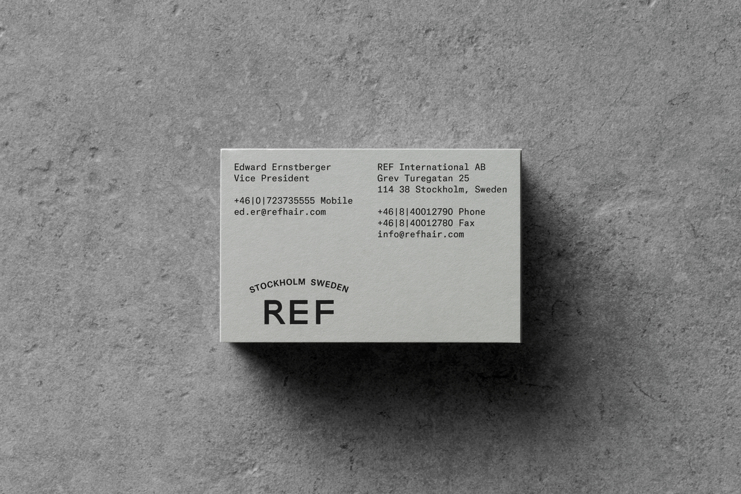
Visual identity and packaging are familiar and precise in their mix of visual cues. Compact name, monospaced secondary type, the curved baseline of provenance and the monolinear lines of logotype speak clearly of a Swedish heritage, Scandinavian simplicity and a modern utility.
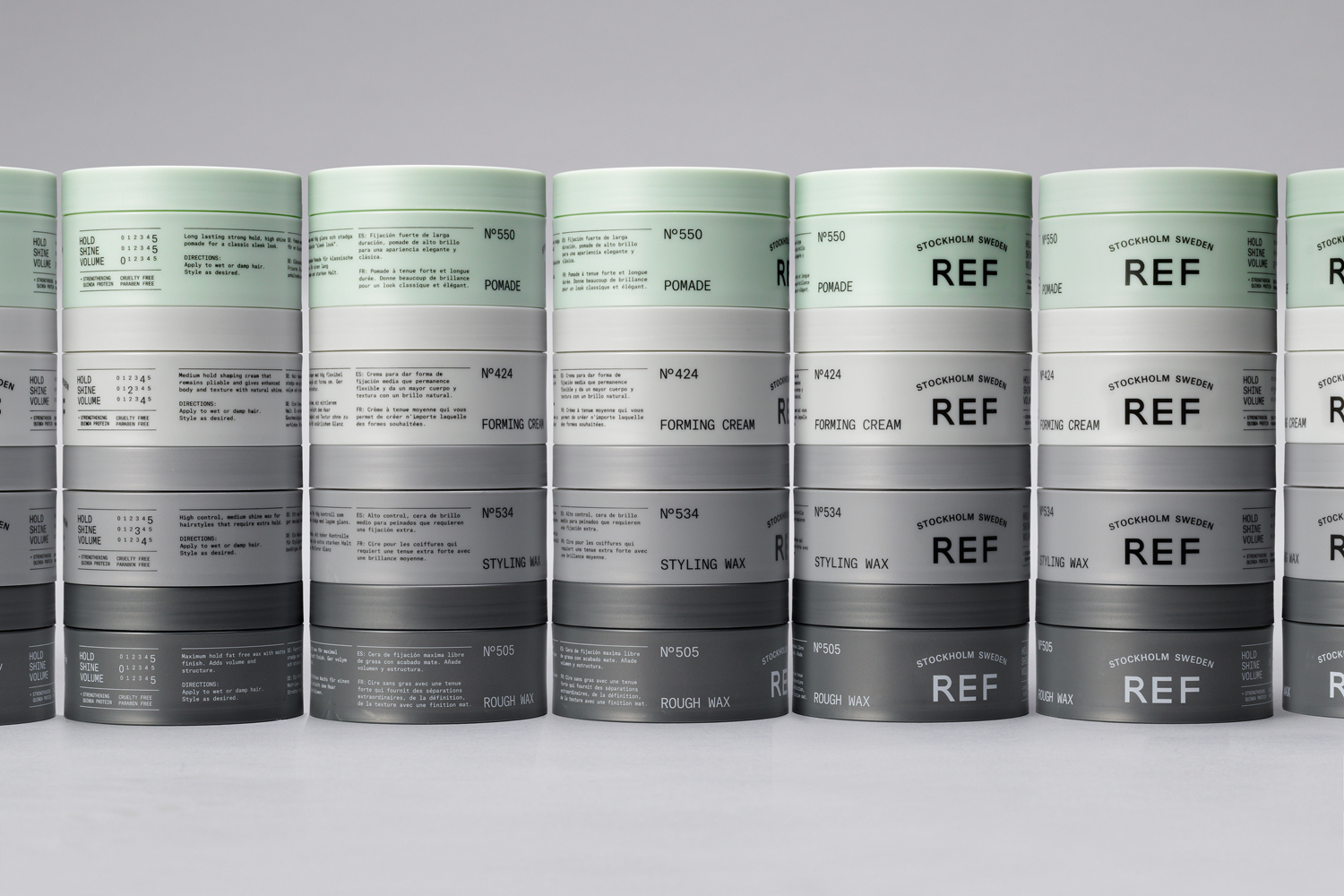
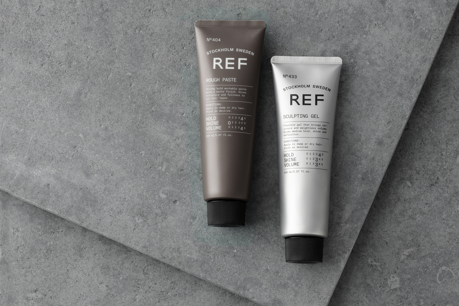
Colour palette feels, for the most part, particularly across the tubs, an interesting and distinctive take on a cool Scandinavian climate and a mossy and rocky geography. This is a particular highlight. Material colour, together with matt surfaces, add value and distinction to shapes that are familiar. Logotype, and its proportion across bottles, tubs and cans, functions to secure a continuity.


Kurppa Hosk work together some clear and communicative elements. There is a modesty and unisex quality in the use of colour and type, but not at the experience of a perceived quality. And the studio take advantage of a current and cross-category visual language of minimal as luxury, space as mindfulness and utility as an expression of effectiveness. The use of colour, rather than image, feels like a more elegant and distinctive approach to nature and provenance.
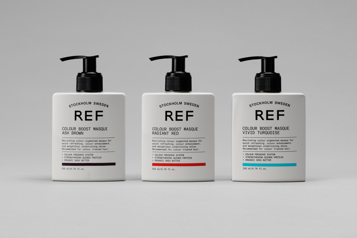
The initial impact through restraint of logotype and colour palette is followed up by a lot of front of pack detail. There is going to be an initial learning phase, as these appear busy, and language starts to fall for the conventional, however, material colour and structure, ink and hierarchy help to divide and large product range.
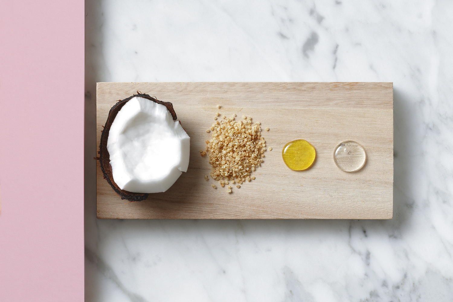
Art direction is made up of two components, the materiality of product and ingredient shots, and the slight austerity of model photography, linked by pastel colours. Much like visual identity and packaging, there is not much in the way of excess here. They function to convey, in a straightforward manner, lifestyle and ingredient simplicity, and compliment the reductive qualities of visual identity in the use of space and colour. These are then worked together across a yet to be launched website, although there does appear to be some typographical compromises.


Kurppa Hosk differentiates REF through the absence of superfluous detail, the glossy (literally and figuratively) and the scientific but leverages some well-established conventions and associations. It is by no means unique in its positioning or in the choice of its individual parts, and straightforward in its visual articulation of modern utility, natural simplicity and Scandinavian origins but builds to something with a distinctiveness and clarity of expression. More from Kurppa Hosk on BP&O.
Design: Kurppa Hosk. Opinion: Richard Baird. Fonts Used: TBC.

What do you think of Kurppa Hosk’s brand identity and packaging for REF? Share your thoughts in the comment section below or get the conversation started on Twitter.

 Новости Союза дизайнеров
Все о дизайне в Санкт-Петербурге.
Новости Союза дизайнеров
Все о дизайне в Санкт-Петербурге.