Обзор лучших ресурсов по разработке бренда, разработке упаковки
contact us | ok@ohmycode.ru
contact us | ok@ohmycode.ru
Opinion by Richard Baird.
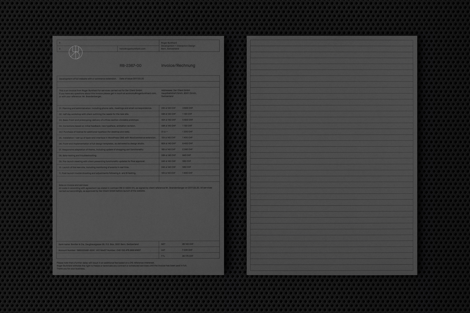
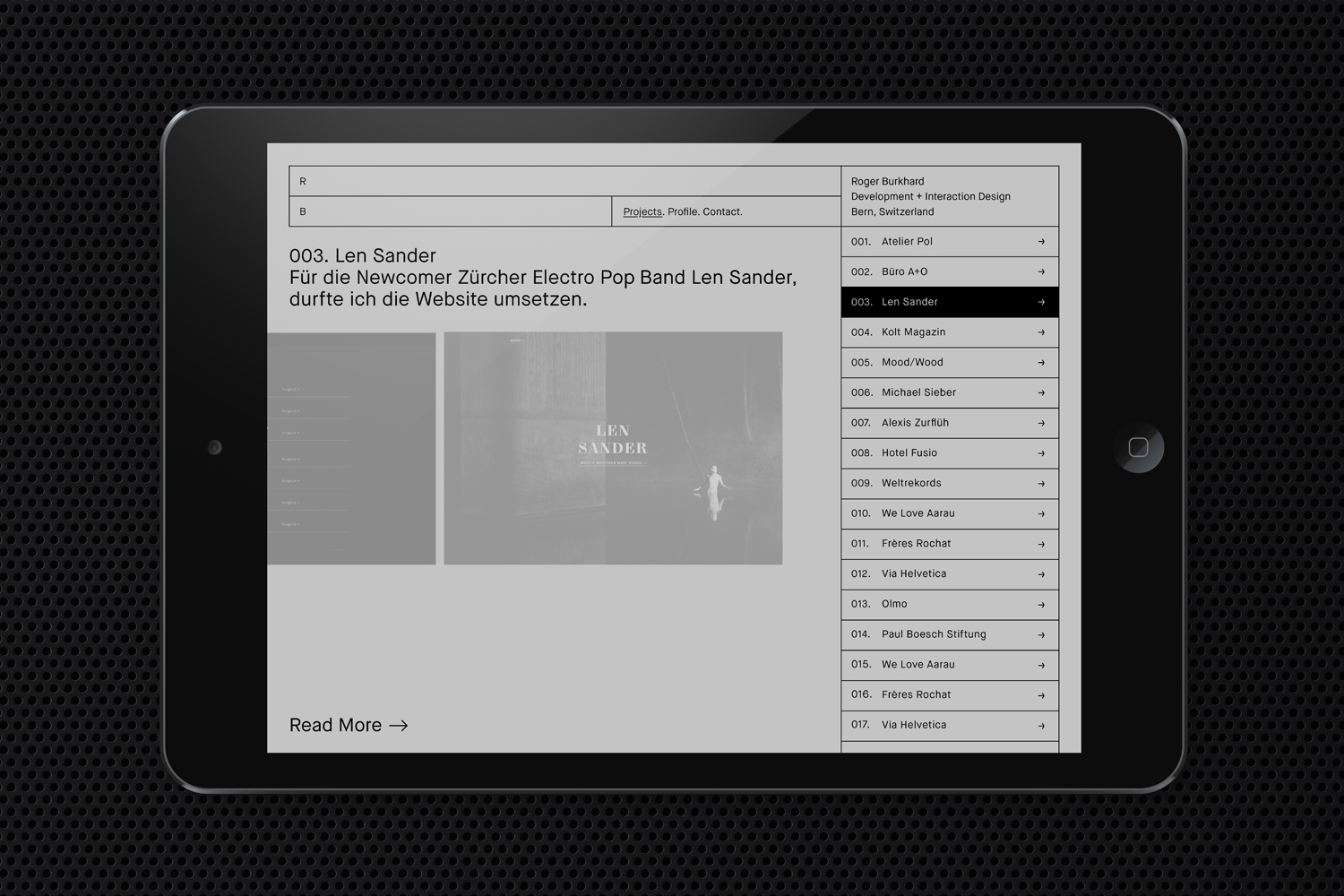
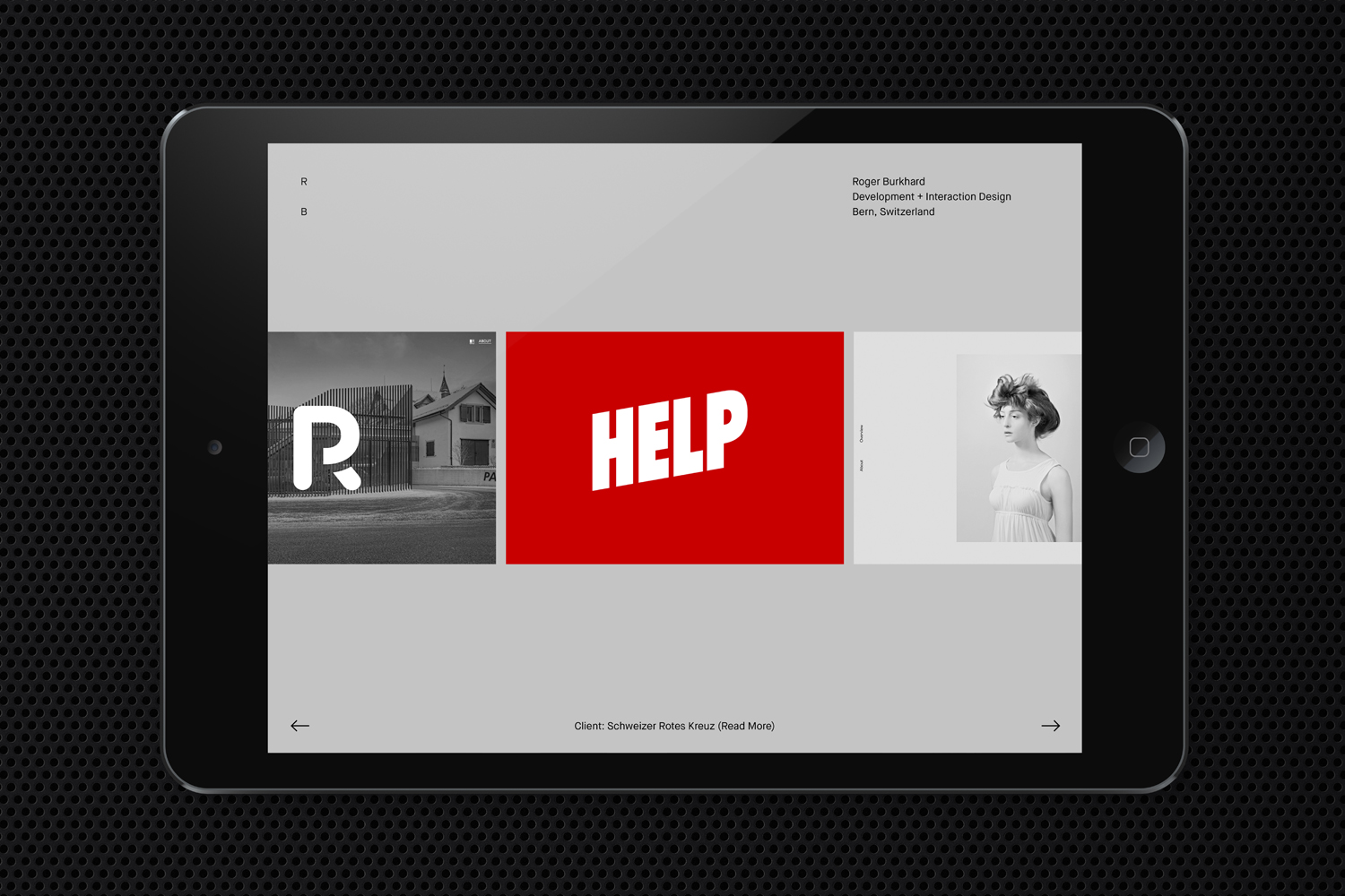
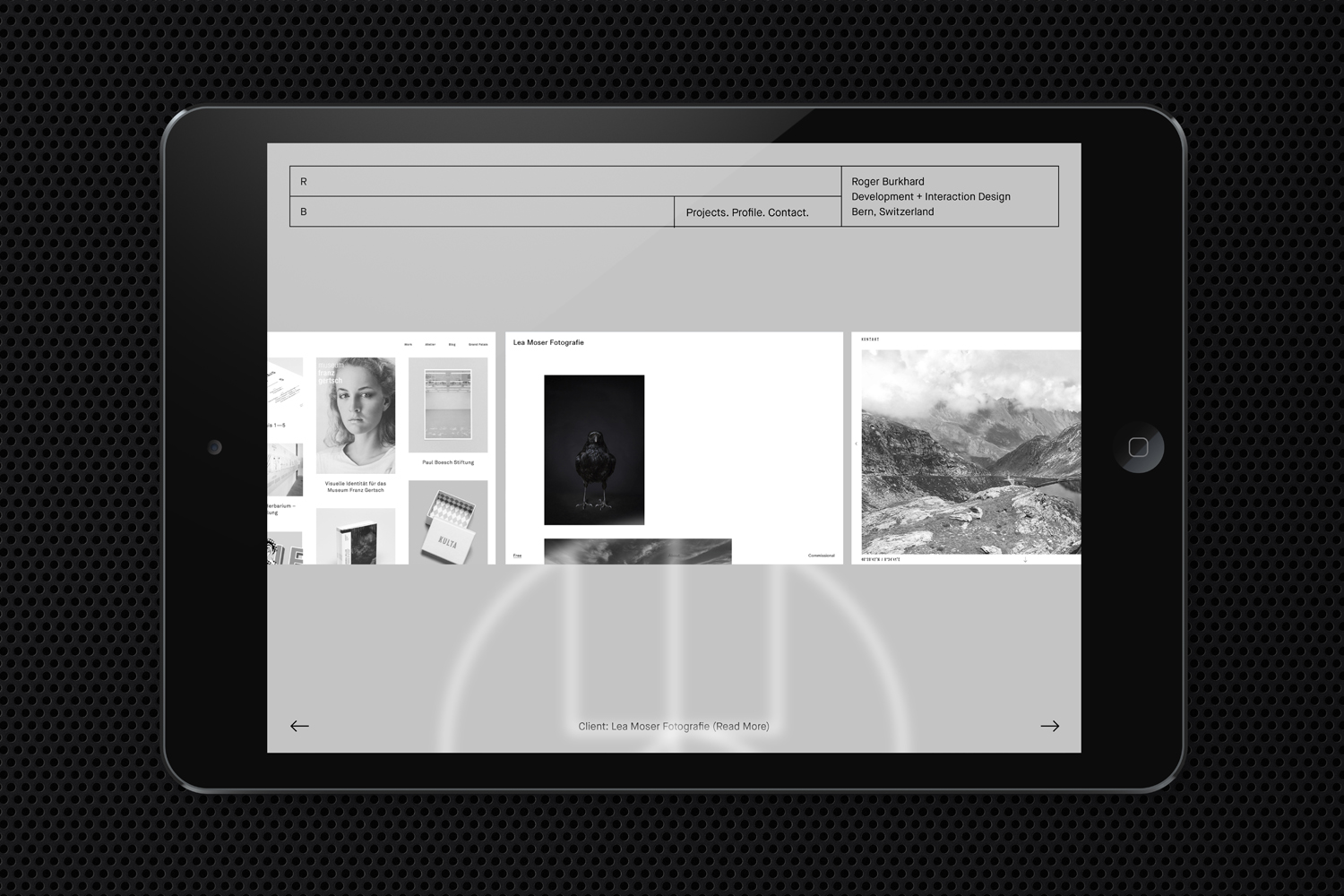
Roger Burkhard is a creative web development and interactive studio based in Bern, Switzerland, with a roster of clients throughout the creative industries. The studio worked with Scandinavian designers Lundgren+Lindqvist on the development of a new brand identity. This included monogram, brand guidelines and website, as well as a stationery set that covered business card and promotional cards, letterhead, invoice and invoice reminder.
Lundgren+Lindqvist, with the intention of avoiding industry convention, brings a thorough material and crafted quality to a service that often favours digital communication, yet layers this with more familiar web-based expressions. These draw on and work together themes such as problem solving, responsive design and creative thinking, conveyed through puzzle pieces, a modular system with a baseline grid and flexible header, and adds a moment of play in the choice of a bright spot colour.
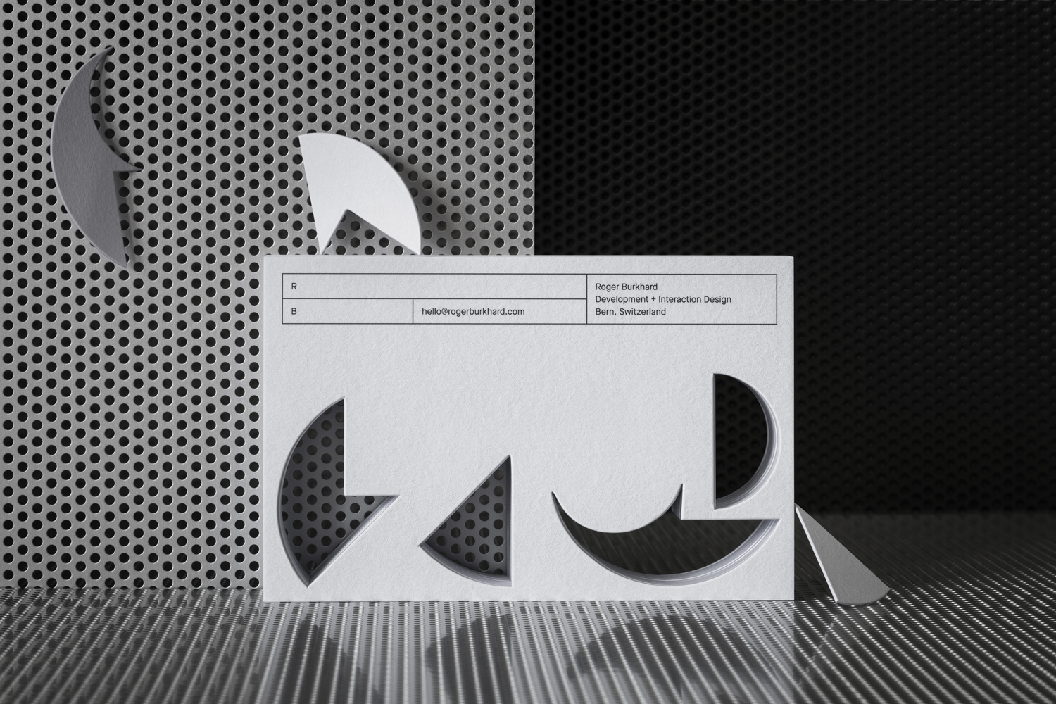
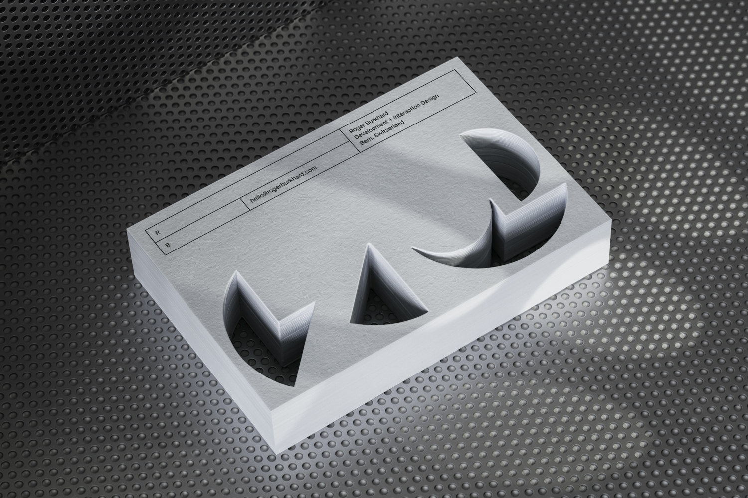
There are a few different ideas that make up Roger Burkhard’s brand identity. There is the dominant modularity and obvious systematic approach to print, which makes a clear connection with website and web development services. Then there is a strong material component and sense of craft throughout the stationery. Both are clear and concise in their expression. There are a couple of extra playful details in die cut forms and fluorescent spot colour.
Where the modularity, structure and utility of type and layout are pragmatic, a variety of papers, textures and finishes deliver an aesthetic pleasure, alongside moments of conceptual thought, aimed squarely at a client base of designers and design studios.
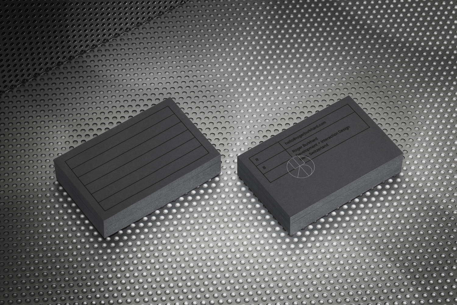
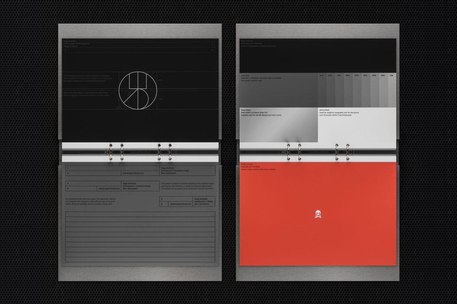
In print, brand identity is made up of Favini’s Graphite, which has an unusual texture and surface that reacts to light. A lighter shade of paper called Chalk. A fluorescent orange spot colour for invoice reminders. Die cut promotional cards. Silver metallic spot colour. And Colorplan Frost White with a Damask emboss.
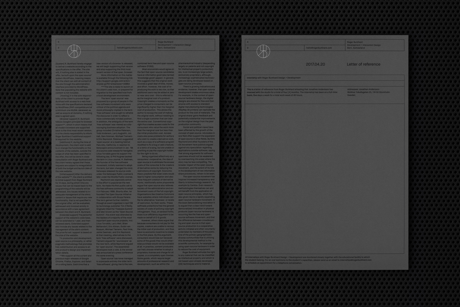
A responsive header, which holds key contact details, is said to be an extension of the brand marque, a monogram featuring a reversed ‘R’ and ‘B’. Much like the lines of code that underpin the precise systems that characterise Roger Burkhard’s work, brand identity intends to find a compelling intersection of form and function. A responsive system of grids, alongside responsive header, extend horizontally to fit format, and establish an aesthetic and useful continuity throughout. This is not unusual, but is given communicative breadth and visual distinction in its application across unusual materials.
As a conventional monogram, logo is abstract but idiosyncratic. It begins to look more interesting broken apart, as puzzle pieces cut from promotional cards, working as playful take on problem solving, and as a paper weight of water-cut and treated steel held together by friction. The monogram’s thin lines across stationery, which share a commonality with grids, are accentuated by a silver spot colour over a dark grey paper.
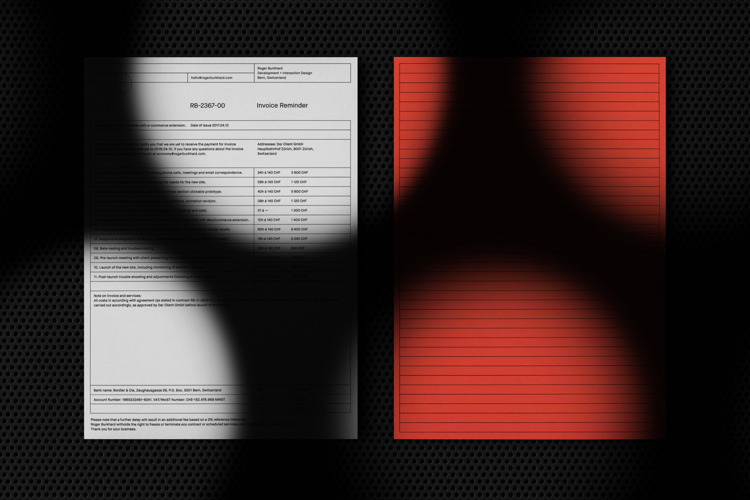
It is a brand identity that touches upon the multi-layered nature of Roger Burkhard’s approach and work. The disparity of the digital and material worlds are well-resolved, and move from the obvious articulation of digital design as craft, to the more subtle problem-solving nature of the die cut puzzle, and finally to the character and tongue in cheek nature of the bright fluorescent orange used across invoice reminder.
![]()
Digital pragmatism meets creative material flourish is perhaps the best way to describe Lundgren+Lindqvist’s concept. It is well-pitched to a client base of graphic designers and studios. Those with a sensitivity to conceptual nuance, blunt and subtle approach to visual langue, an appreciation of material and finish, and the parallel drawn between the work of graphic designers and the practical skill set and creative leaps required of a good web developer. More work by Lundgren+Lindqvist on BP&O.
Design: Lundgren+Lindqvist. Print: Göteborgstryckeriet. Opinion: Richard Baird.
What do you think of Lundgren+Lindqvist’s brand identity for Roger Burkhard? Share your thoughts in the comment section below or get the conversation started on Twitter.

 Новости Союза дизайнеров
Все о дизайне в Санкт-Петербурге.
Новости Союза дизайнеров
Все о дизайне в Санкт-Петербурге.