Обзор лучших ресурсов по разработке бренда, разработке упаковки
contact us | ok@ohmycode.ru
contact us | ok@ohmycode.ru

These are custom sized ceramic jars with a Pantone color matte finish on the outside and matte finish on inside. The matte finish on the inside really helps to keep things clean and free from debris that may stick otherwise. The ceramic jars are baked and cured, painted, then baked again to complete the process. The outside the jar is printed with a silkscreen using a custom-made 'real' gold ink to deliver a shiny effect that can bond to the jar, becoming very durable!
This ink really does have actual gold in it, that fact alone, has double/tripled the cost of the actual packaging in comparison to a regular CMYK screen print! A eco-friendly bamboo lid with the logo etched or debossed on it, with a silicone plunger secured to the bottom of the lid to provide an air-tight seal. While the # of carats in the Gold is undetermined still, this packaging still is the MOST expensive packaging I have ever produced for a client but with the name of their company, this project highly suits this packaging as ultra-luxurious, unique, and one of a kind.
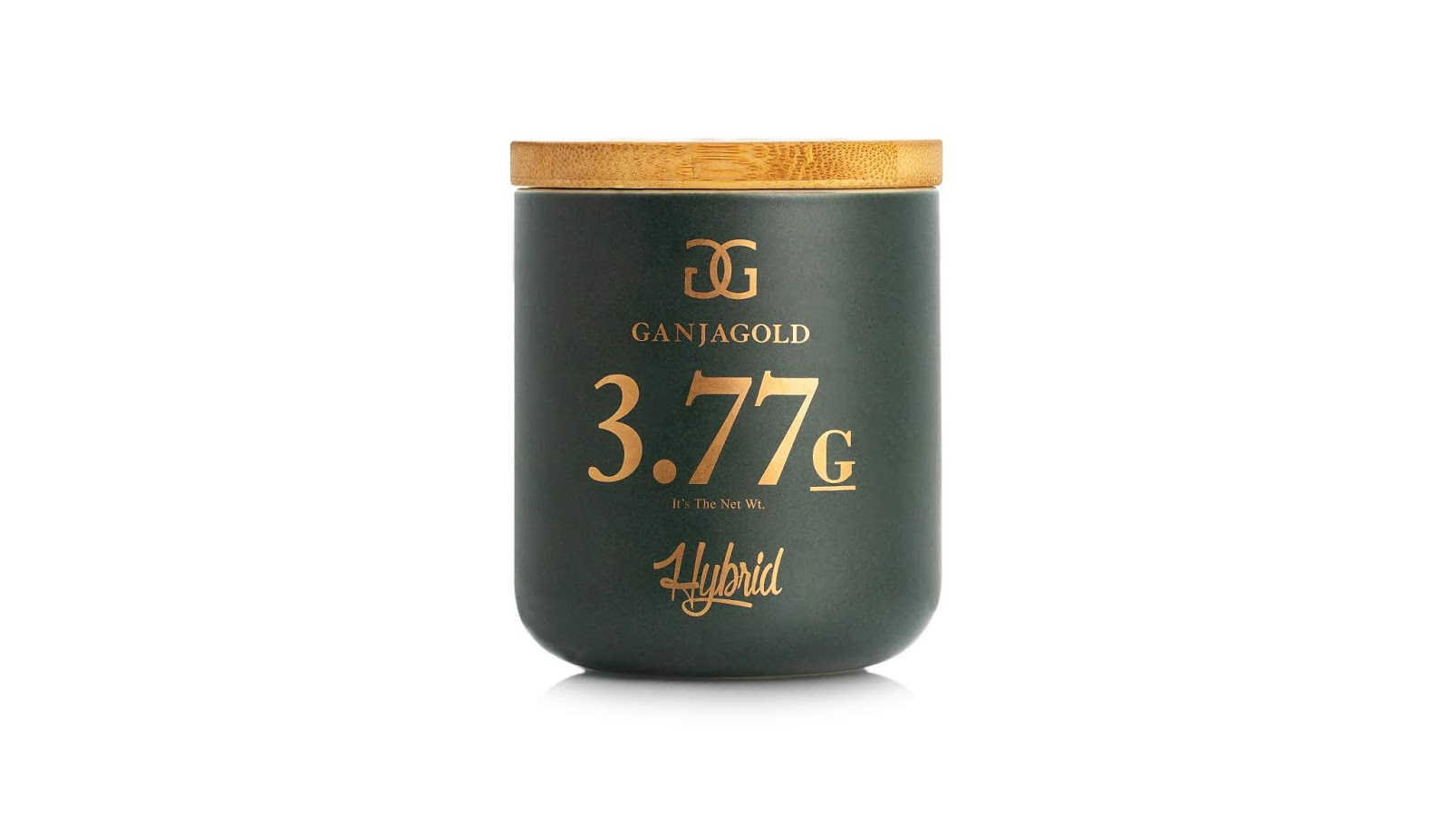
What's Unique?
The most unique aspects of this ceramic jar is the amount of customization that went into this. The perfect size and shape of the base of the ceramic jar, the unorthodox name of the product being '3.77 G' which is unusual for many reasons as that is not really a standard size or weight used within the industry that this company markets in. Now for the most unique aspect, the actual real gold ink that is used to print on these jars. The client wanted a shiny effect on the jar but foils would not work.
We tried gradients/CMYK printing to achieve some sort of simulated shine but those didn't work either. Then I decided to use real gold in the ink which was a bit experimental but did accomplish the task of producing an amazing looking design while giving the label the shine and pop the client sought out for. This is by far the most expensive packaging I have ever produced for a client and am happy they decided to run with it.


 Новости Союза дизайнеров
Все о дизайне в Санкт-Петербурге.
Новости Союза дизайнеров
Все о дизайне в Санкт-Петербурге.