Обзор лучших ресурсов по разработке бренда, разработке упаковки
contact us | ok@ohmycode.ru
contact us | ok@ohmycode.ru
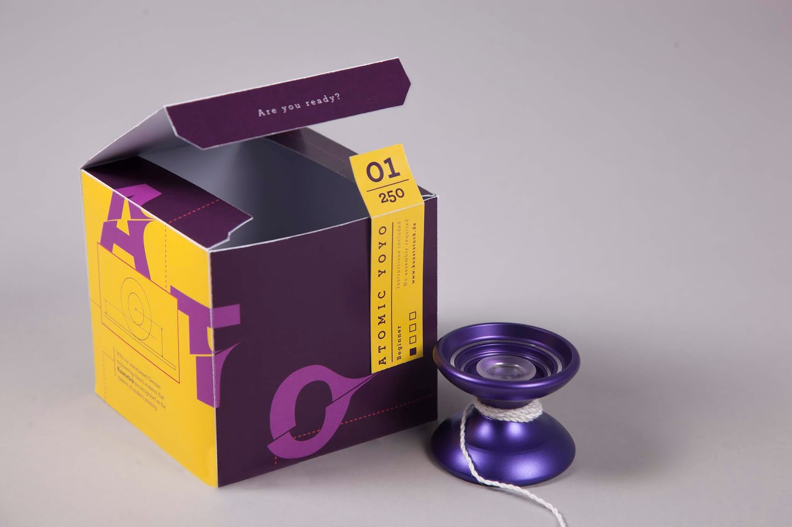
The Brief: To create yoyo packaging for a company who have their roots in clockmaking and were keen to target people new to the hobby but unsure with where to start.
The Solution: This packaging set out to be eye-catching and cool whilst pushing the company's roots in precise and quality engineering. For a start, the colour palette is taken from the trends of Spring / Summer 2018 and feels exciting and fresh - the perfect palette to entice new customers and a change of pace from the neons and metallics found in most yoyo brands . The cut-up letters work their way around the packaging - encouraging people to pick it up and engage with it, giving them a tactile experience which is so important when it comes to influencing people to buy a product. The packaging also features very clear technical diagrams of what makes this product so perfect for beginners.

What's Unique?
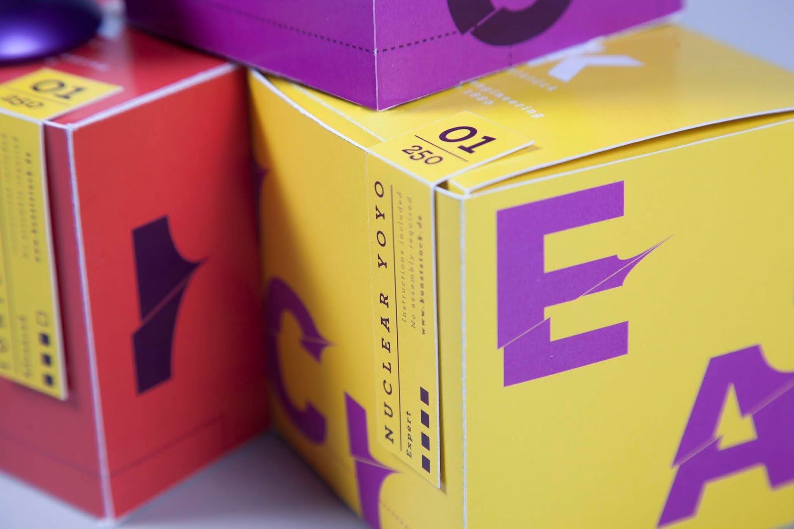
As an individual box, the packaging is eye-catching and effective... but as a set, they are really striking. The yellow sticker a particularly neat touch that works as both a security feature and as a signature look across the series of boxes. It features the difficulty rating of each yoyo so people new to the brand know where to start and can track their progression.

 Новости Союза дизайнеров
Все о дизайне в Санкт-Петербурге.
Новости Союза дизайнеров
Все о дизайне в Санкт-Петербурге.