Обзор лучших ресурсов по разработке бренда, разработке упаковки
contact us | ok@ohmycode.ru
contact us | ok@ohmycode.ru
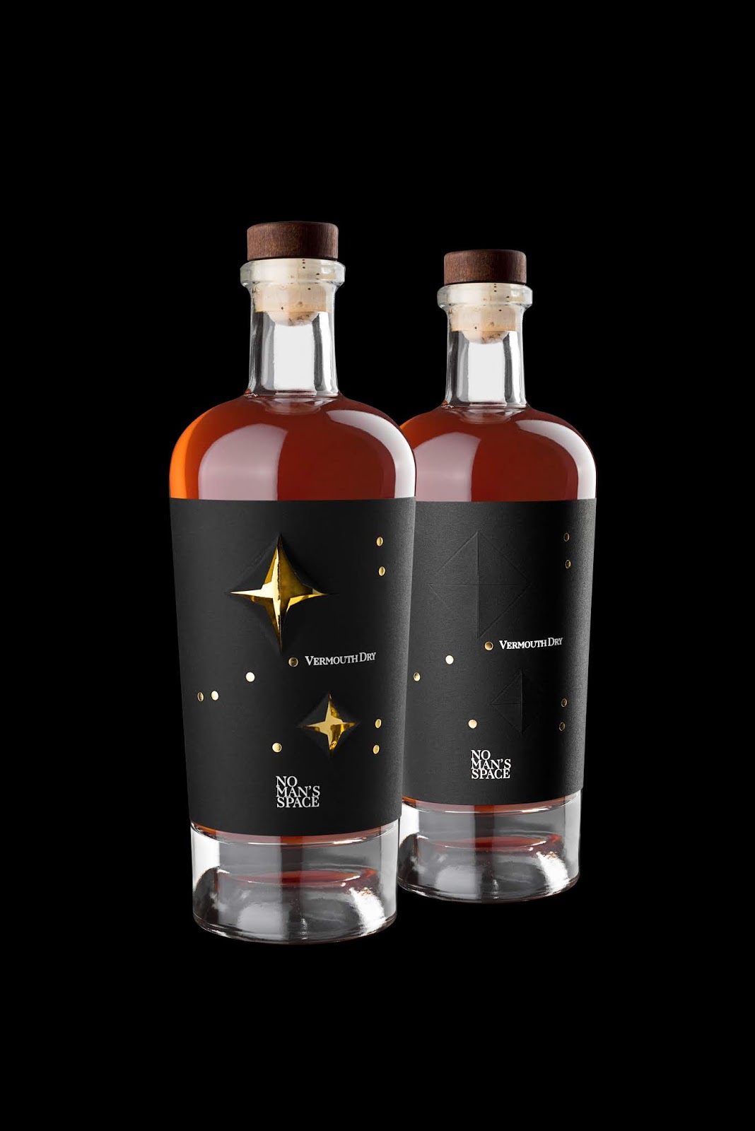
No man's space is a line of spirits born from the meeting between Mario Di Paolo's design and Baldo Baldinini's aromatic chords. The ancestral space, interpreted as a physical space, as a symbol of freedom ad overcoming one's limits as well as men's inspiration and mentor, represents the core of this innovative project.
A Vermouth Dry represented as a constellation of Capricorn, takes shape under an iconic, elegant and refined aspect through innovative printing techniques, easily fitted with automation both for printing and labeling.
The overlapping of material and the use of cutting die let the consumer interact with the design: two stars contain a gold leaf game-enhancing their glow. The packaging is transformed into a three-dimensional object.
The packaging captures the space and becomes three-dimensional, interacting with the user.
The distinct black minimalism, enhanced by the foil brilliance, gets accurately matched by the verticality of the wisely created scents.


 Новости Союза дизайнеров
Все о дизайне в Санкт-Петербурге.
Новости Союза дизайнеров
Все о дизайне в Санкт-Петербурге.