Обзор лучших ресурсов по разработке бренда, разработке упаковки
contact us | ok@ohmycode.ru
contact us | ok@ohmycode.ru

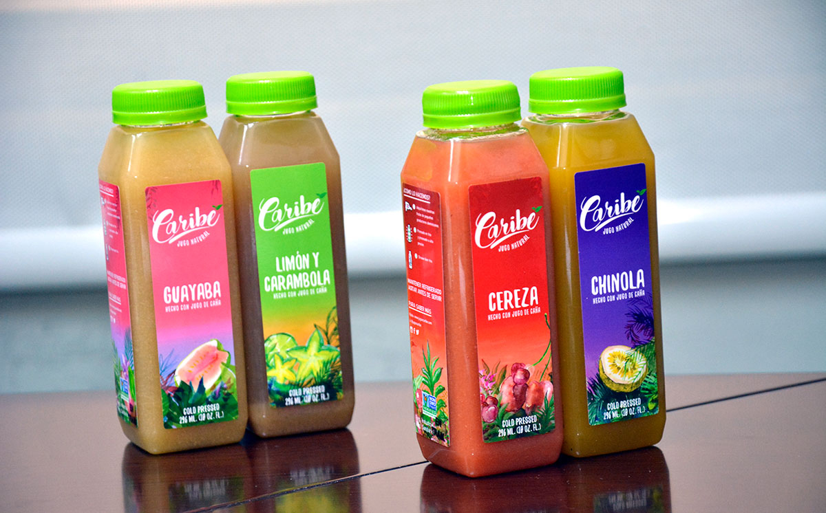
The story of Caribé Juice began when we noticed juice offerings did not match the quality of flavor or experience we had grown accustomed to drinking in the Dominican Republic – where natural, great tasting, nutrient packed juices are a cultural staple. Caribé Juice use Dominican-sourced fruits to make the most delicious juices packed with nutrients.
The symbol consists of ten icons intricately woven together to form a Toucan. The corporate identity of Caribé Juice is based on expressive graphic elements in the form of abstract shapes and recognizable silhouettes of Caribbean nature. Also, we designed illustrations and patterns for each category of flavours and bottles.

What's Unique?
Straight from our kitchen to you, Caribé juice is made with only raw vegetables and fruits; no preservatives, no concentrate, no sugar, no junk. Enjoy juices that taste as fresh and healthy as homemade.


 Новости Союза дизайнеров
Все о дизайне в Санкт-Петербурге.
Новости Союза дизайнеров
Все о дизайне в Санкт-Петербурге.