Обзор лучших ресурсов по разработке бренда, разработке упаковки
contact us | ok@ohmycode.ru
contact us | ok@ohmycode.ru
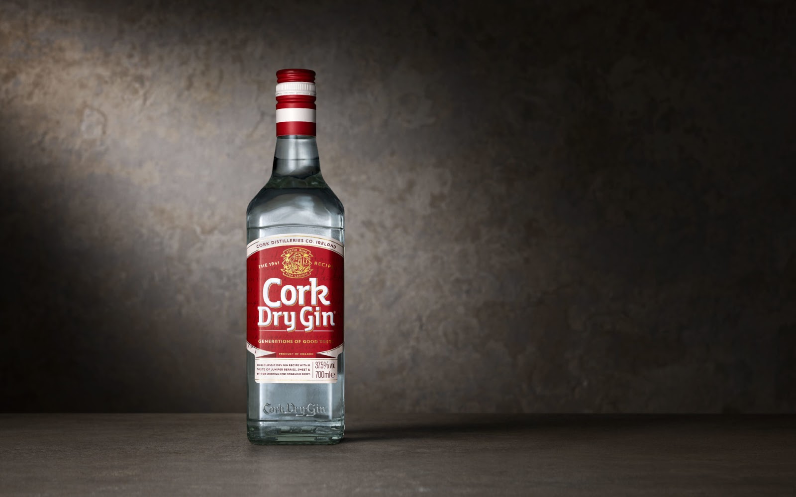
Irish Distillers’ Cork Dry Gin is Irelands No. 1 gin. Cork Dry Gin is furthermore an iconic Irish brand with a strong legacy, long tradition and established credibility. The brand is currently sold in Ireland and in Irish Travel Retail.
Mission
Pond Design was commissioned to rejuvenate the design of Cork Dry Gin iconic bottle without loosing brand recognition and familiarity. The goal was to modernize the design and reclaim the brand’s role as category leader on the domestic market, through appealing to current consumers and attracting new ones. There was a need to strengthen Irish Provenance, create a strong emotional message and strengthen shelf visibility on-, and off-trade.
Insight
Irish consumers love gin and the category is booming. In regards to Cork Dry gin, consumers were telling us that the brand, although an Irish classic, was dated and old-fashioned. As many new brands were introduced on the Irish market, Cork Dry Gin wasn’t telling its story clearly enough to be heard through the clutter. However, as a much-loved brand, consumers were open to embrace it again. They wanted to know more about Cork Dry Gin, feel a renewed pride in its Irish-ness, provenance and the connection to the city of Cork.
Idea
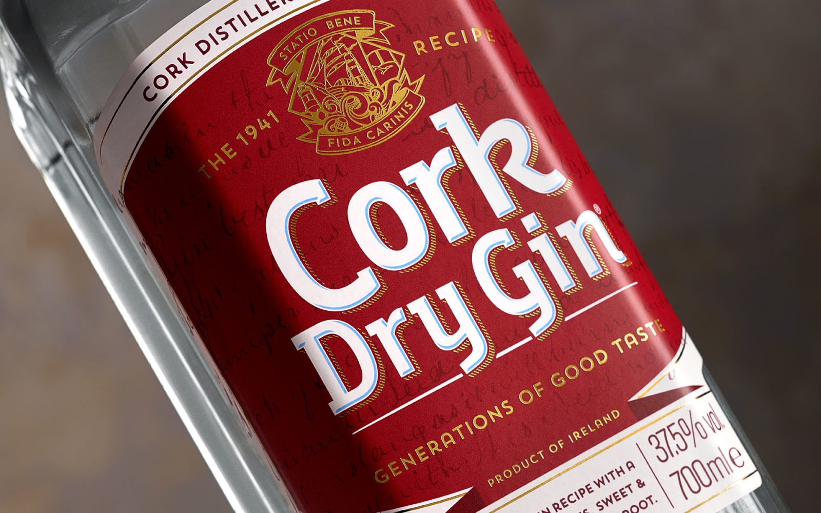
With a new focus on the brand’s proposition, a communication platform that tells the story of “Ireland’s Gin Since 1941” and the rich heritage of gin making in Cork, was created. The background of the label shows original notes from the historic 1941 Max Crocket recipe, which was inspired by the original gin recipe, taken from William Coldwell’s 1793 notebook, when gin was first distilled in the city. To further strengthen the brand’s provenance, the design revives the famous Cork harbour with the city’s old motto on the crest: “a safe harbour for ships”. The red and white colours are Cork’s own city colours. The stripes are inspired by the Cork football and hurling teams, lovingly nicknamed Blood & Bandage, thus paying homage not only to the city’s past but to its present as well. The design and logotype is respectfully modernized with great attention to details and recognisable features to connect to the heritage of “generations of good taste”.

 Новости Союза дизайнеров
Все о дизайне в Санкт-Петербурге.
Новости Союза дизайнеров
Все о дизайне в Санкт-Петербурге.