Обзор лучших ресурсов по разработке бренда, разработке упаковки
contact us | ok@ohmycode.ru
contact us | ok@ohmycode.ru

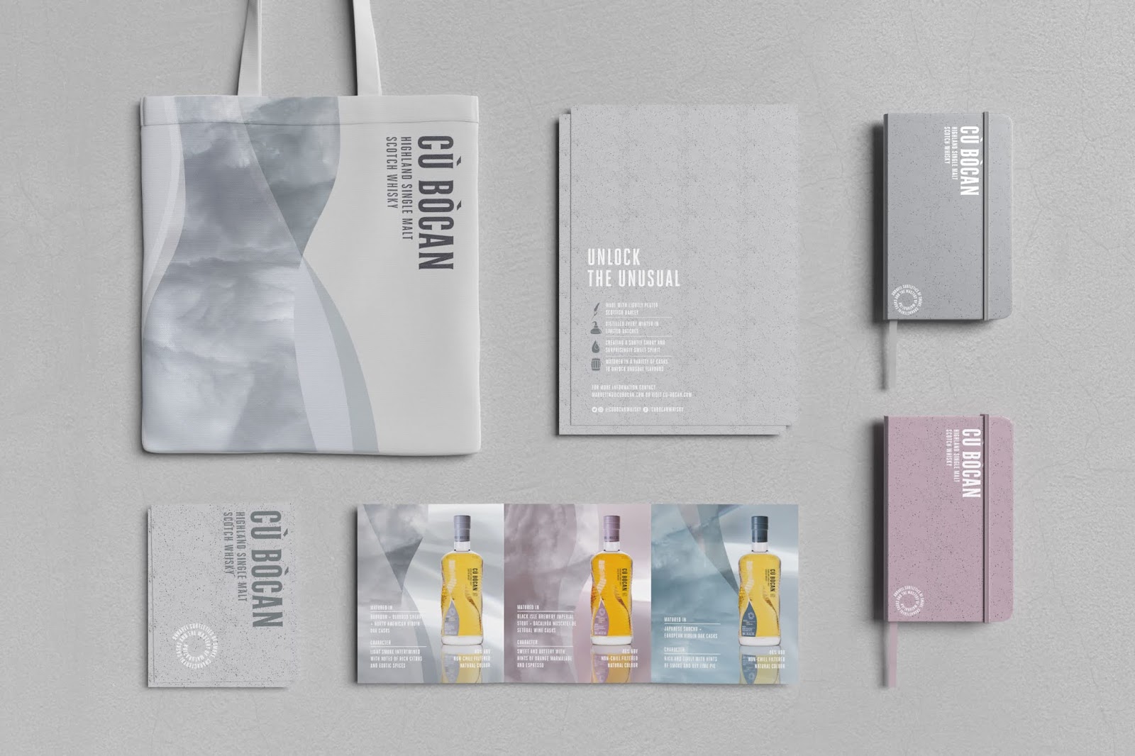
Having been in the market since 2013, Cù Bòcan found itself in need of a complete repositioning. With a previous design that focussed on a myth rather than the product’s merit, this Highland Single Malt needed a new brand that would appeal to a more modern whisky drinker, so partnered with Thirst Craft.
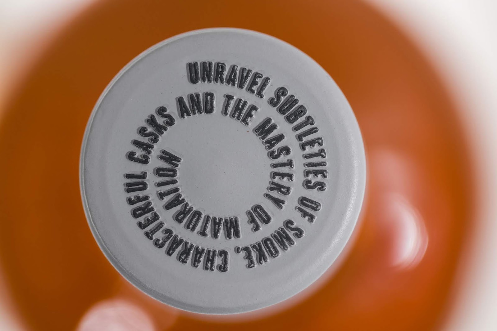
Subtly smoky and surprisingly sweet, Cù Bòcan is made with lightly peated Scottish barley and matured in a variety of interesting casks for an altogether unconventional spirit. With such a strong product story at its heart, Thirst knew the brand needed to do what Cù Bòcan did: it needed to unlock the unusual.

Thirst’s bespoke multi-layered bottle is inspired by the different forces that interweave in order to unlock the unusual: subtle smokiness and surprising sweetness; meticulous preparation and unpredictable nature; lightly peated barley and unusual casks. The organic, curved label suggests Cù Bòcan’s signature wisp of smoke, while the paper’s speckled texture is created by photographing peat granules.
A contemporary, earthy colour palette and touch of gold gives a premium feel, while light refractions add an element of intrigue. These layers and textures transcend seamlessly off pack to create a rich visual and tactile world that unlocks the world of whisky to a whole new audience.


 Новости Союза дизайнеров
Все о дизайне в Санкт-Петербурге.
Новости Союза дизайнеров
Все о дизайне в Санкт-Петербурге.