Обзор лучших ресурсов по разработке бренда, разработке упаковки
contact us | ok@ohmycode.ru
contact us | ok@ohmycode.ru

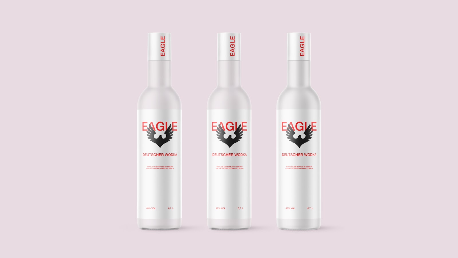
"Eagle" is a vodka that is absolutely harmless to the environment due to its environmentally friendly production. The packaging design is based on this concept about preserving the ecological environment. The bottle is made of glass, an environmentally friendly material that can be recycled an infinite number of times. The dullness of the glass emphasizes the price category of the product, as well as metaphorically shows age restrictions, hiding the contents of the bottle.
The label has a minimalistic design with two-color printing. The main color of the label, white, emphasizes the purity and simplicity of the product. An additional color, red, makes the drink stand out on the shelf. The absence of additional graphic elements focuses the consumer's attention on the product itself, without allowing them to be distracted by details. There is only important information that guides the buyer on the front side.
Everything in the label supports the main idea of the brand — environmental friendliness and simplicity of the drink itself, which contains only a few components. The only typeface that chosen is the different styles of Helvetica, a striking example of the combination of simplicity, uniqueness and rational functionalism. The main graphic element is the eagle, which lives up to the name of the product. This bird is the lord of the air, one of the most common, unambiguous and universal symbols that personify power, speed and other signs of the animal world in all their glory.


 Новости Союза дизайнеров
Все о дизайне в Санкт-Петербурге.
Новости Союза дизайнеров
Все о дизайне в Санкт-Петербурге.