Обзор лучших ресурсов по разработке бренда, разработке упаковки
contact us | ok@ohmycode.ru
contact us | ok@ohmycode.ru

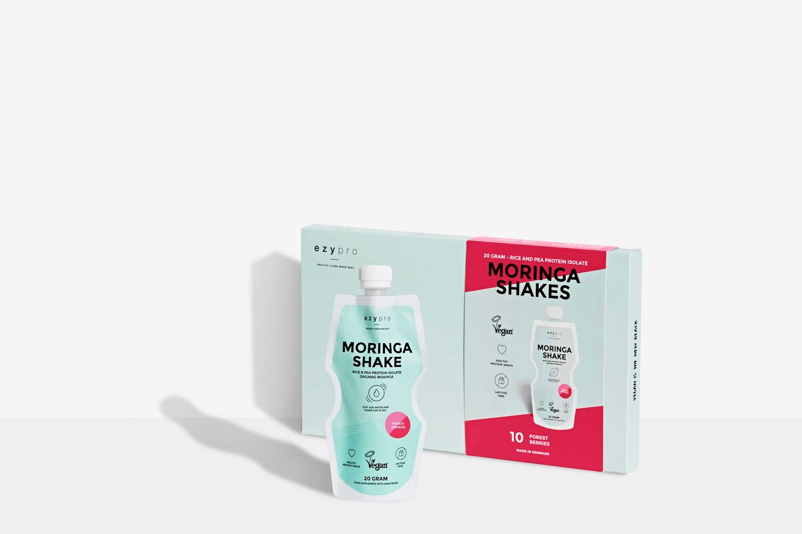
Ezypro is a very clean protein supplement series of products and they wanted to stand out when they started their rebranding process. In a market with protein supplements mostly targeted men whose interest is in fitness.
Ezypro wanted to make a visual identity and packaging that was targeted mostly women and communicating uncomplicated, clean, and convenient. That's why a color palette of light blue and mint with bright colors for the tastes was chosen. It stands very much out on the shelves with supplement foods in a very clean way. Ezypro is a small brand so it was very important that we found creative ways that we could add digitally printed sleeves to the packaging and use stickers for taste variations.


 Новости Союза дизайнеров
Все о дизайне в Санкт-Петербурге.
Новости Союза дизайнеров
Все о дизайне в Санкт-Петербурге.