Обзор лучших ресурсов по разработке бренда, разработке упаковки
contact us | ok@ohmycode.ru
contact us | ok@ohmycode.ru

Catering to the increasing market for the Green Tea, Fabsta a food brand from the house of Tata planned to launch a range of green tea with 3 variants, to begin with - Natural, Honey & Lemon and Mint, Lemon & Ginger.
The brief was to bring out the goodness of the natural tea along with the ingredients and to convince the consumers why this is a better choice of Green Tea Brand. Green tea is a lighter brew compared to the normal tea and its consumer a discerning one, who has an understanding of the subtlety of flavours. So for the container boxes, we chose a light pastel palette of colours varying according to the tea flavours.
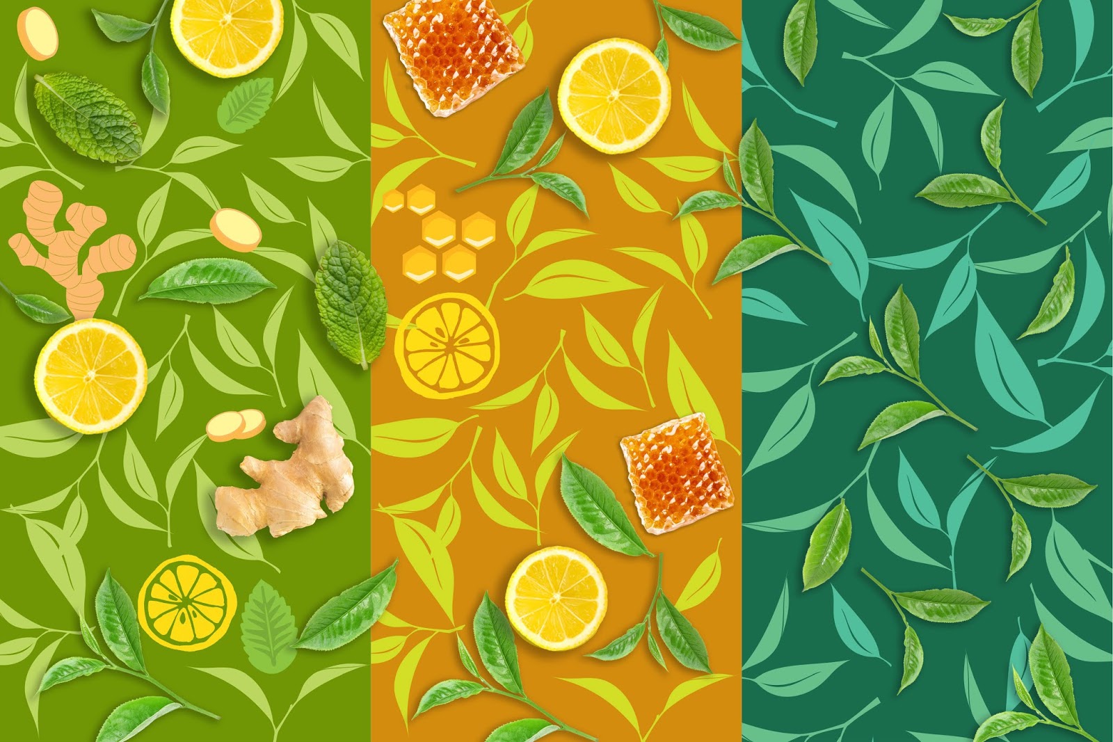
The idea was to bring the essence of the naturally blended fine quality tea leaves along with other ingredients. Though commonly used, we saw a distinctiveness in the form and shapes of the ingredients, especially when placed against the bunch of tea leaves. That lead us to the drawing board where indigenous illustrated patterns were created out of a tabletop composition of the leaves scattered with the ingredients, each unique to the blend.

Using the subtle colour palette, the pattern was then wrapped around the entire carton to give an effect of hand wrapped, exclusive box. We defined the Fabstas’ trademark leaf structure at the centre of the front of the pack, with the product name in the flowy and light typography maintaining the lightness of the whole package. The naturalness of the blend was further emphasised with the use of fresh and appealing images of the ingredients, placed daintily within the leaf so that they stand out and emphasize a bit more on the flavour of the green tea.
A very classy and discerning range of packaging design of the green tea came alive for its equally definitive audience, that expects only the best from the house of TATA.

What's Unique?
An own able style of illustration was developed for the various flavouring ingredients and the tea leaves. These illustrations were converted into a seamless pattern for each box with a well defined color scheme to bring out the flavour story distinctly.

 Новости Союза дизайнеров
Все о дизайне в Санкт-Петербурге.
Новости Союза дизайнеров
Все о дизайне в Санкт-Петербурге.