Обзор лучших ресурсов по разработке бренда, разработке упаковки
contact us | ok@ohmycode.ru
contact us | ok@ohmycode.ru

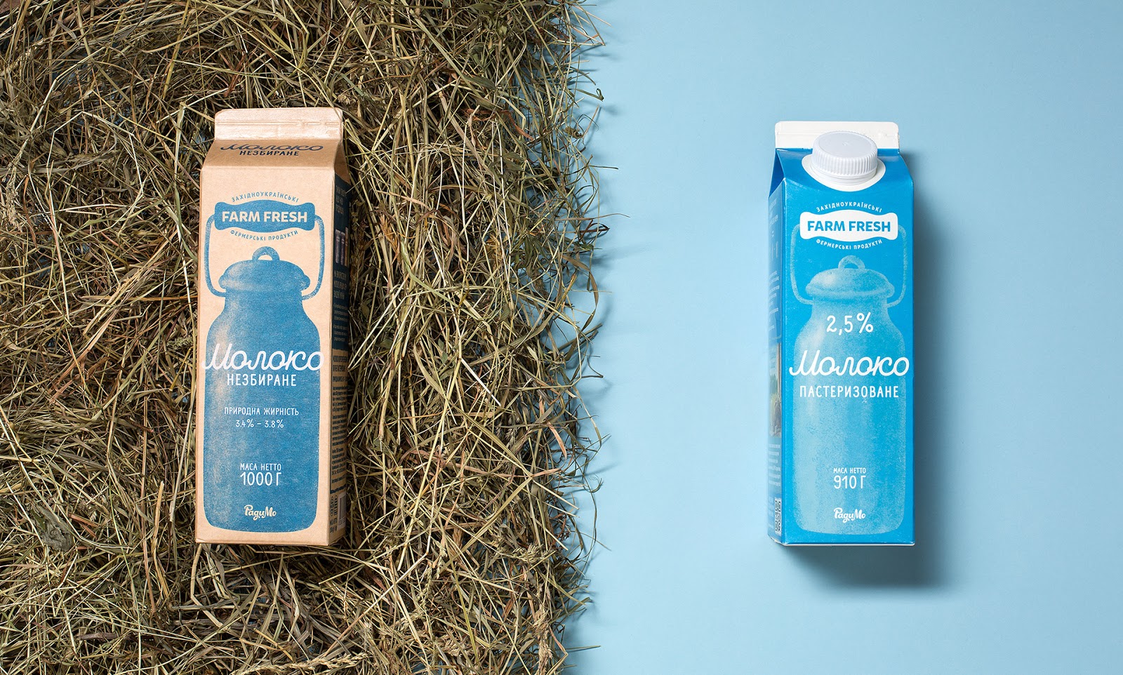
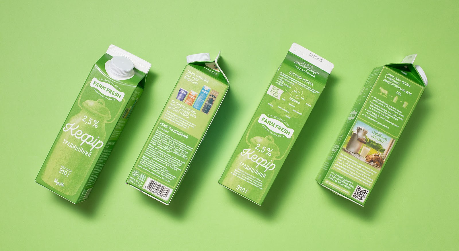
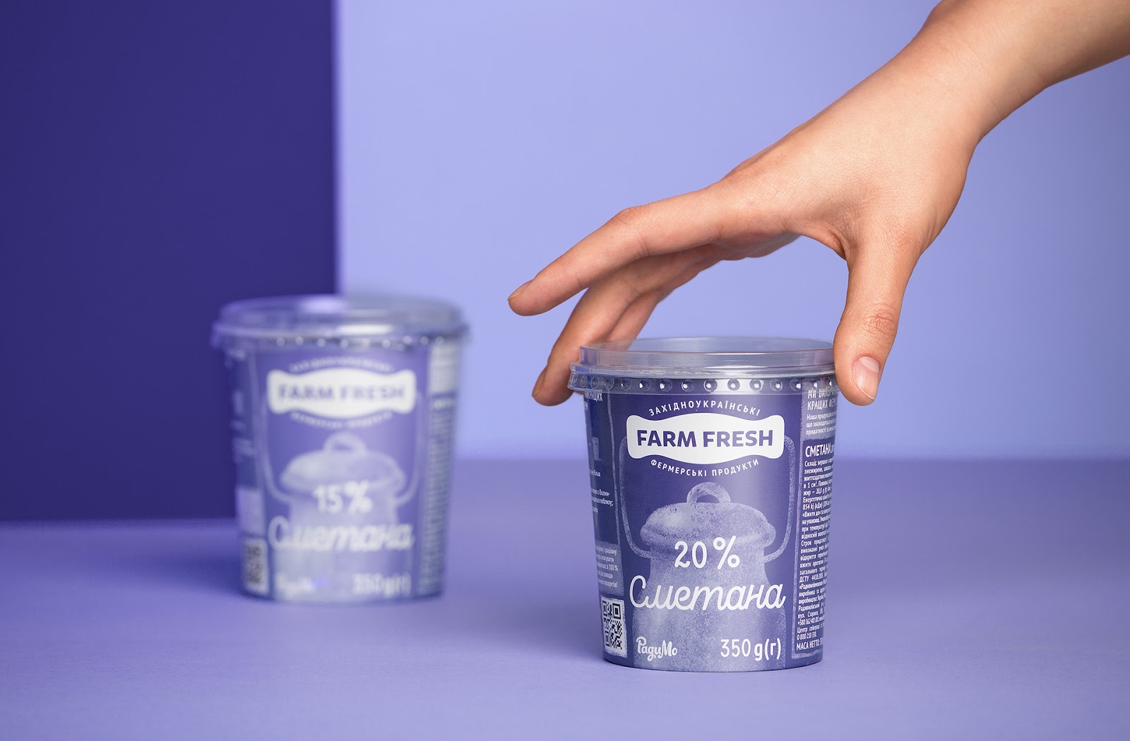
The brand’s greatest strengths are their natural and fresh qualities, and thus Farm Fresh wanted to convey these messages through simple visual associations. The company’s special feature is its craft line, which only uses whole milk with natural fat content. The decision to use a silhouette of an old style milk can was quite logical, because it is associated with natural produce and is a simple and understandable image known from childhood. The logo was created in the context of packaging design, to fit into the design organically and become part of a single holistic image.


 Новости Союза дизайнеров
Все о дизайне в Санкт-Петербурге.
Новости Союза дизайнеров
Все о дизайне в Санкт-Петербурге.