Обзор лучших ресурсов по разработке бренда, разработке упаковки
contact us | ok@ohmycode.ru
contact us | ok@ohmycode.ru

TASK
It was necessary to analyze the snack market, develop a positioning strategy and a brand platform for the new product - wholegrain chips. It was necessary to develop a packaging design on the basis of the strategic stage as well as to think over the brand architecture of the portfolio of "popcorn" brands.
SOLUTION
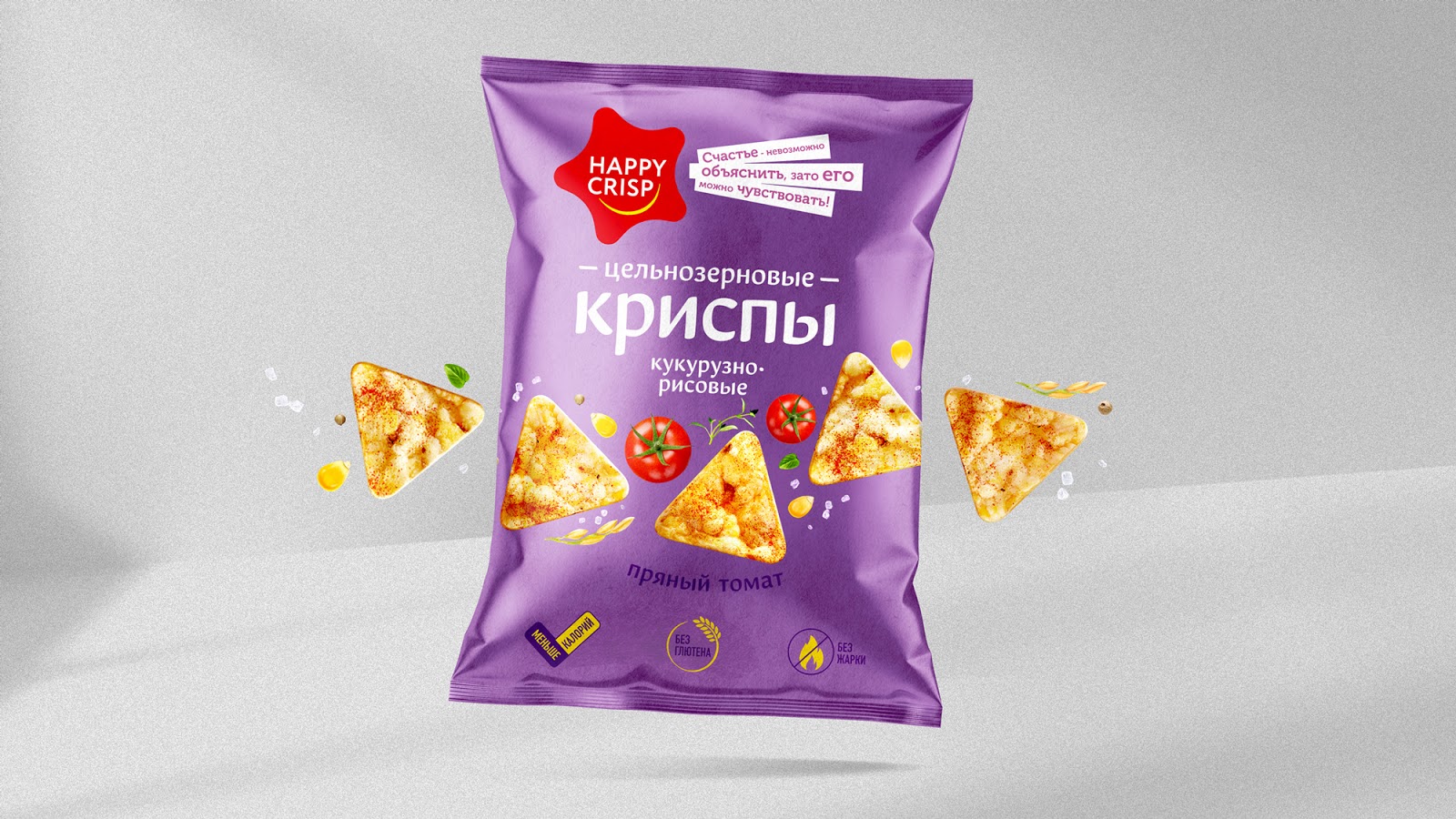
The theme of “little moments of happiness” became the unifying idea that formed the Happy Food brand platform. The first brand in the company's portfolio was the wholegrain crisps Happy Crisp. The logo in the form of a star along with emotional texts translate the idea of happiness embedded in the platform of the brand. A large spelling of the name of the product “Crisps” allows the Consumer to explain that this is a new product in the category of snacks.
The appetizing and juicy food group helps to most clearly show the product. The ingredients laid out around the crisps as well as the bright background colors solve the problem of cultivating tastes among themselves. Symbols and stamps at the bottom of the package indicate that wholegrain chips are a more healthy way to please yourself.


 Новости Союза дизайнеров
Все о дизайне в Санкт-Петербурге.
Новости Союза дизайнеров
Все о дизайне в Санкт-Петербурге.