Обзор лучших ресурсов по разработке бренда, разработке упаковки
contact us | ok@ohmycode.ru
contact us | ok@ohmycode.ru

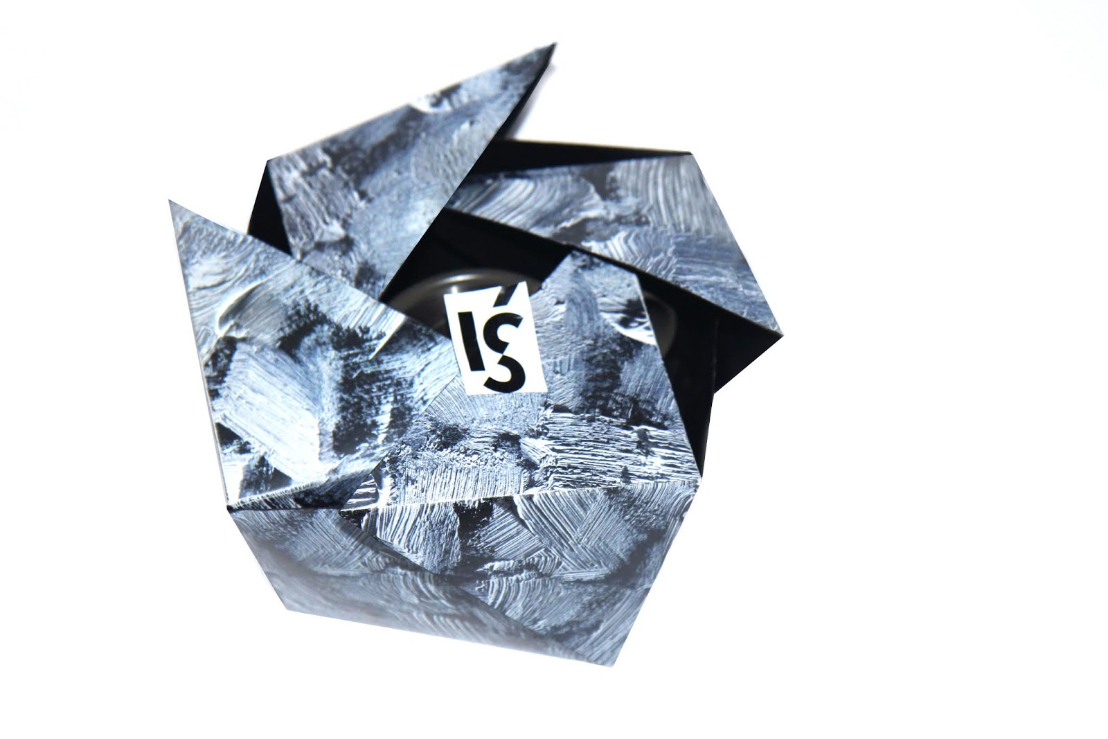
'Iś' is a homeware brand from Iceland. 'Iś' is in Icelandic language which means 'ice' in English. This packaging has been designed for their Volcanic Rock Teapot. Inspired by the Icelandic landscape, the packaging is designed with a strong Nordic minimalist aesthetic and a clean, graphic approach.
The main pattern was created by white oil paints on black paper. Hard flat brushes were used for painting to create a very strong brush texture. The sleeve was printed in white ink to match the brand name what brings a Iceland feeling. Also, there is a booklet with three cards which tells care instructions and knowledge about volcanic rocks. On the back of the cards are three beautiful photos of Iceland.

What's Unique?
The packaging is 100% environmental friendly, using recyclable paper and no glue for its construction. Maintain sustainability in luxury design is not easy. Also, it is designed in a dramatic folding way what increased packaging interactivity. And it has a interesting oil paints pattern.


 Новости Союза дизайнеров
Все о дизайне в Санкт-Петербурге.
Новости Союза дизайнеров
Все о дизайне в Санкт-Петербурге.