Обзор лучших ресурсов по разработке бренда, разработке упаковки
contact us | ok@ohmycode.ru
contact us | ok@ohmycode.ru

Some people drink a lot of coffee cups every day. They get stressed out quickly. Have difficulties to sleep or concentrate. Oh! and also they get yellow teeth!
That is why I absolutely love to drink green tea. Especially Matcha! As you may know, Matcha is well-known for its amazing health effects and being a super food. But that’s not why I drink a Matcha a day. I do it because of the concentration and productivity increasing effects. It helps me to get into a productive focus. Perfect for creative and intensive university work.
In this course, we had to turn our passion into a business model.
Name:
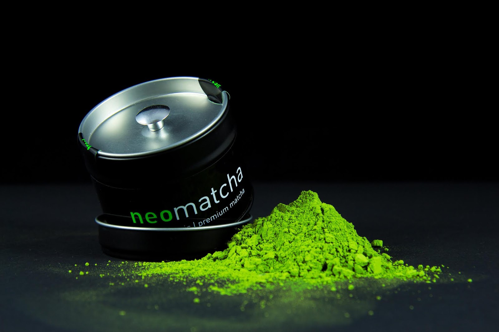
I decided to name it neomatcha because Matcha is a very old traditional Japanese tea that was mainly used in tea ceremonies. However, the way I use it is very new and fits perfectly into modern society. So I wanted a name and a packaging that reflect this rediscovery of ancient Japanese tradition.
Packaging:
[Premium]
Almost all Matcha brands come in the same silver Matcha Tin. There is one huge downside to the traditional Tin: Once opened, there is no way to seal the Matcha again, thus the quality degrades quickly. Which is why I chose to add an inner-lid. Via the inner-lid, the user is able to seal the Matcha again after consumption and thus keeping its quality high for a long period.
Because I found a Matcha producer that produces one of the highest ceremonial qualities I’ve had so far. I choose a black Tin instead of the typical silver:
- Black = High Quality.
- The Matcha-Green works better on black. It really pops. (the greener the Matcha the better the quality)
- Different from the competition.
[Culinary]
The culinary Matcha needed a cheap packaging because it is geared to people that want a good quality Matcha but are concerned about the price. Probably the students that want that energy boost but don’t have the necessary dollars to afford it. So I chose a rather cheap but still stylish doypack:
- Also Black = High Quality
- Featuring an amazing Spacemen artwork = visualization of the meditative focus it can give you
- Different from the competition.
- The idea with that amazing artwork here is to make different artworks and probably make them collectable once the brand generates sales.
Sidenote: on the product pictures I piled up the Matcha to resemble a green version of the Japanese Mount Fujin.
Target:
So far there are 2 groups of people established Matcha sellers are targeting: the fitness/health people or the tea lovers.
I wanted to go another route and target people like me who need a healthy, more effective alternative to coffee. You can clearly see that decision by looking at the website which is absolutely geared at the office working class, developers, designers, marketers, architects, students and only talks about that one benefit of matcha while there are many others too.

What's Unique?
- The packaging as an inner lid to preserve the quality for a long time.
- The packaging is black to better showcase the Matcha-Green
- The Green part was screen printed with special fluorescent green ink (Pantone 802 c) to draw attention
- “Fresh” Stickers to indicate fresh sealing and draw attention
- Amazing Artwork for the Culinary Type
- Minimal Clean design


 Новости Союза дизайнеров
Все о дизайне в Санкт-Петербурге.
Новости Союза дизайнеров
Все о дизайне в Санкт-Петербурге.