Обзор лучших ресурсов по разработке бренда, разработке упаковки
contact us | ok@ohmycode.ru
contact us | ok@ohmycode.ru

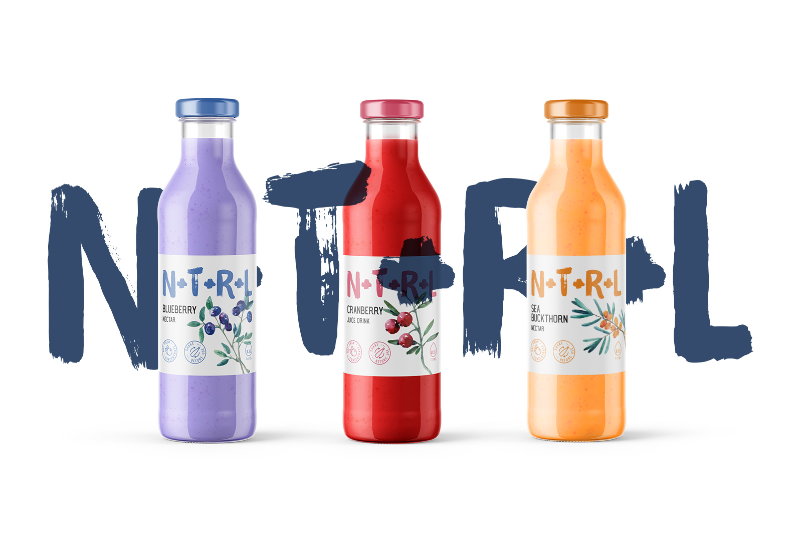
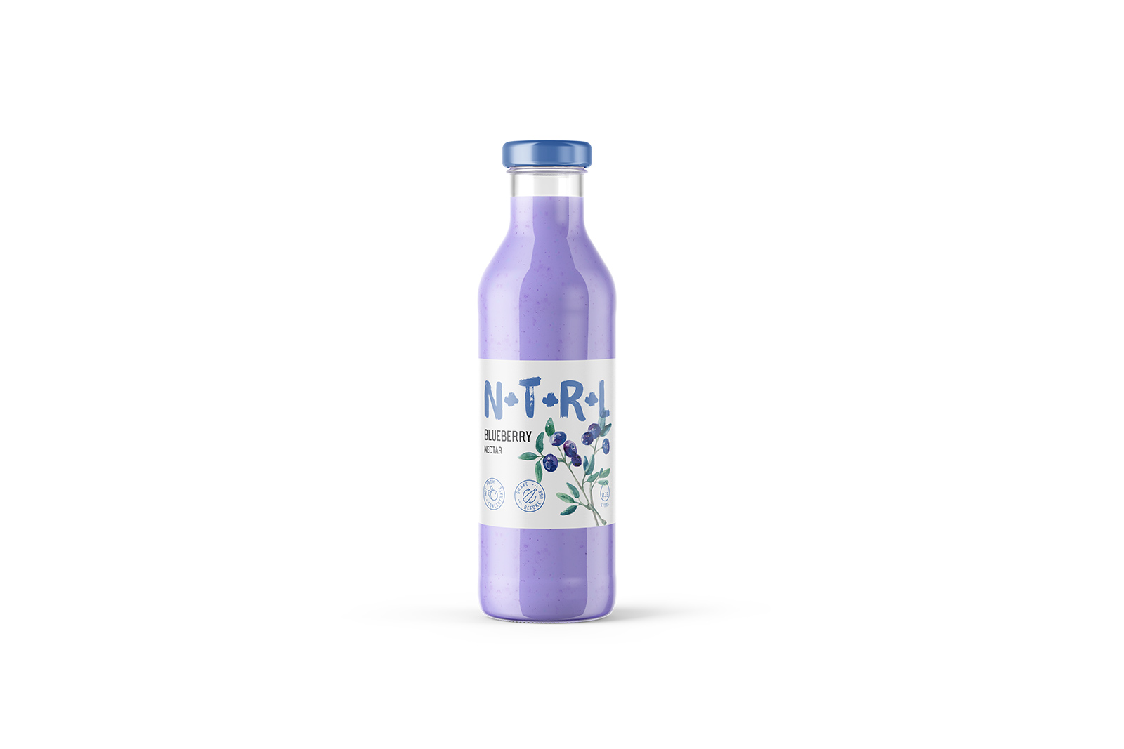
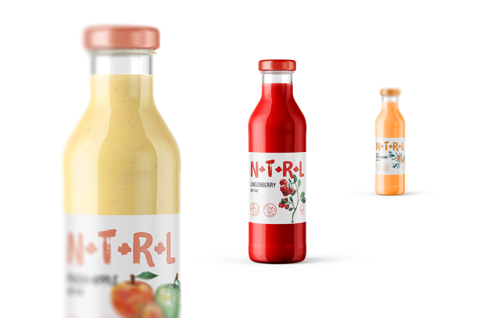
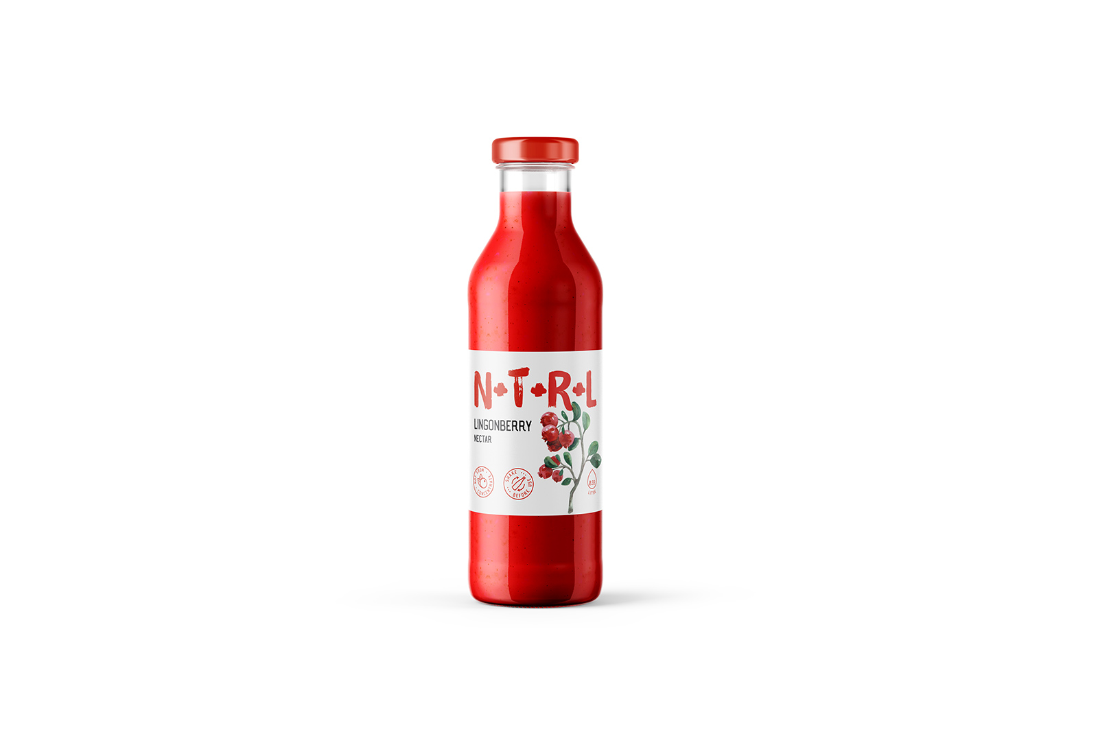
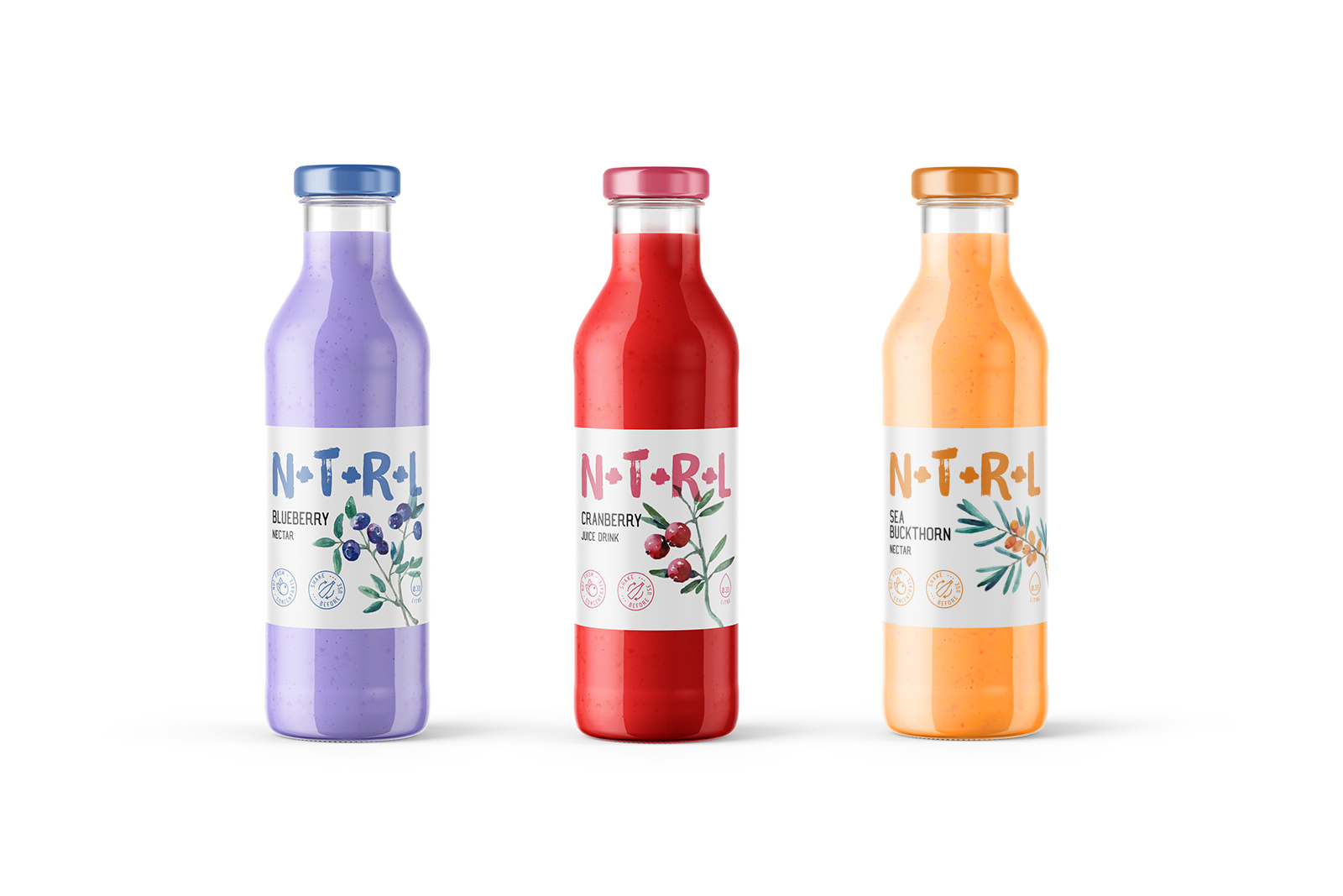
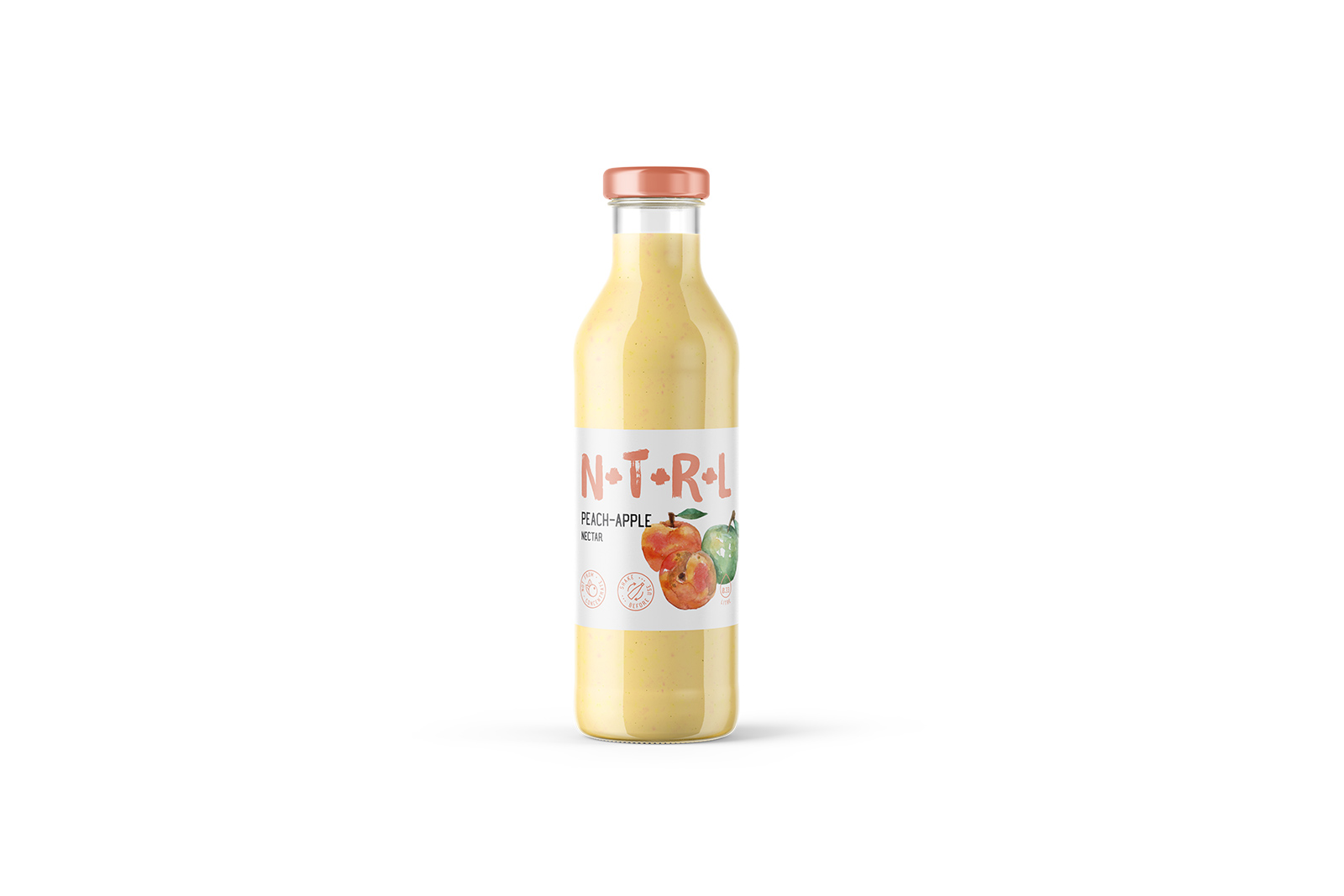
We have developed a new integrated branding strategy of natural drinks specifically for the European market. N+T+R+L — juices and nectars from natural berries and fruits without additives, with minimal sugar and maximum benefit. The product is aimed at the segment of the European audience leading a healthy lifestyle.
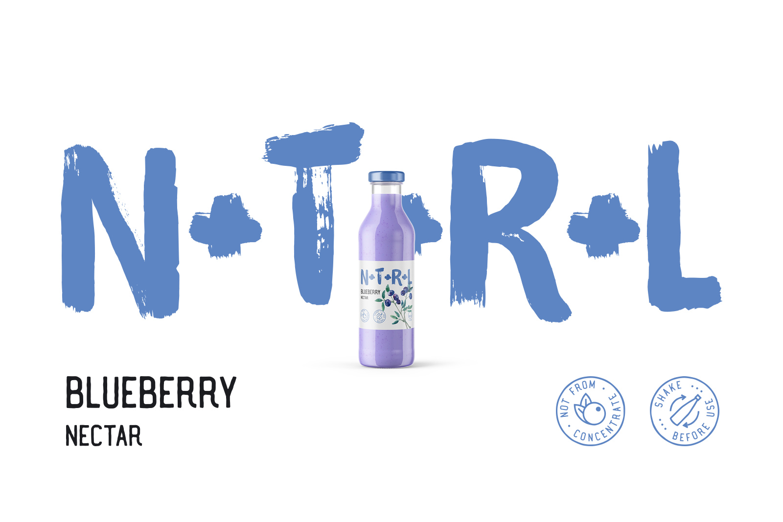
N + T + R + L — a stylized and original brand name, an abbreviation of the word NATURAL. It carries a positive semantics and a formula of natural components.
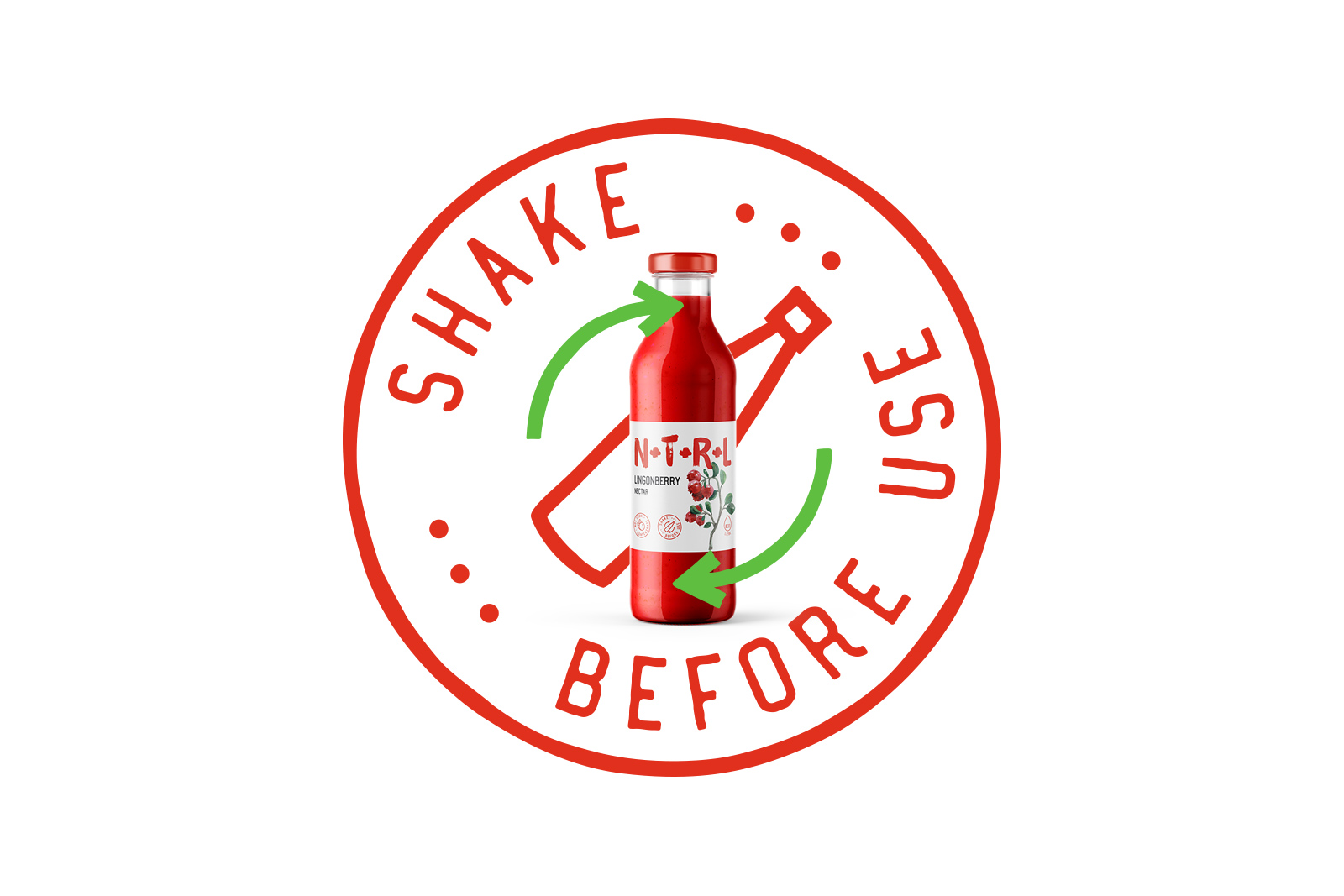
The brandmark — brush lettering, which could have been drawn by a child. Brand image — simple, intuitive, without unnecessary frills and extra images. The logo reflects the natural character of the product and resonates with the target audience. All illustrations harmonize with the logo and give the label fresh and unique image. The design of the label represented by the combination of watercolour graphics, handmade fonts and badges. This graphic emphasizes the naturalness of the product. The label gives the scenes of quality and unique product and stands along among competitors.


 Новости Союза дизайнеров
Все о дизайне в Санкт-Петербурге.
Новости Союза дизайнеров
Все о дизайне в Санкт-Петербурге.