Обзор лучших ресурсов по разработке бренда, разработке упаковки
contact us | ok@ohmycode.ru
contact us | ok@ohmycode.ru
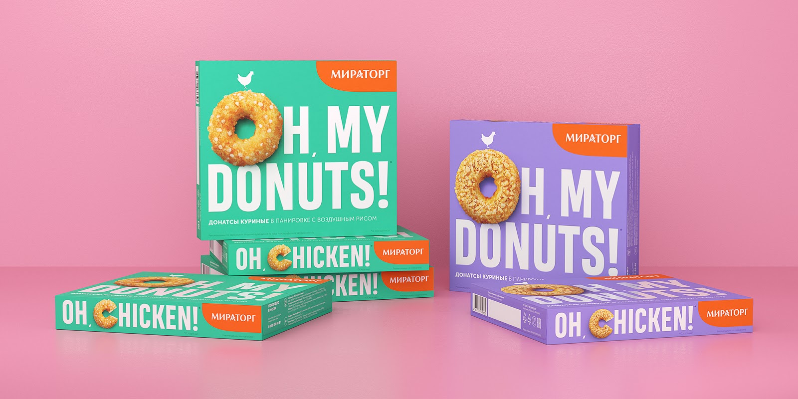
The product is focused on the youth audience and people readiness to consider some degree of experimentation.
We helped Miratorg to present the product on the shelf by developing packaging design for the product line. Bright visual solution reflects the novelty and unusualness of the product. We offered a minimalistic solution with a clean front of the package without any stamps, icons or annotations. All consumer information was placed on the back side and grouped by tasks. The large inscription “Oh my donuts!” draws the consumer’s attention at the store shelf.
Typography takes up most of the packaging, and the product itself is inscribed in one of the letters. We used realistic macro photos for food zone to show the appetency of donuts. The product stands out among competitors due to the pastel color palette and the active typographic composition. Miratorg chicken donuts in new packaging have already been put into production and can be found on store shelves!


 Новости Союза дизайнеров
Все о дизайне в Санкт-Петербурге.
Новости Союза дизайнеров
Все о дизайне в Санкт-Петербурге.