Обзор лучших ресурсов по разработке бренда, разработке упаковки
contact us | ok@ohmycode.ru
contact us | ok@ohmycode.ru
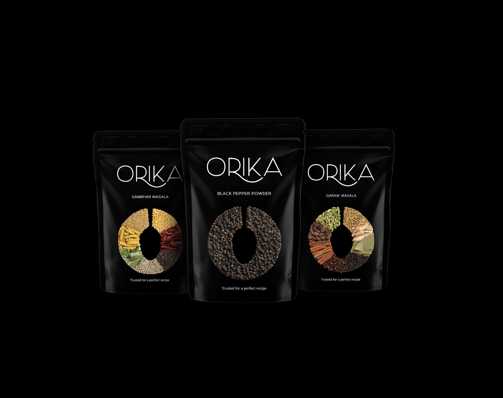
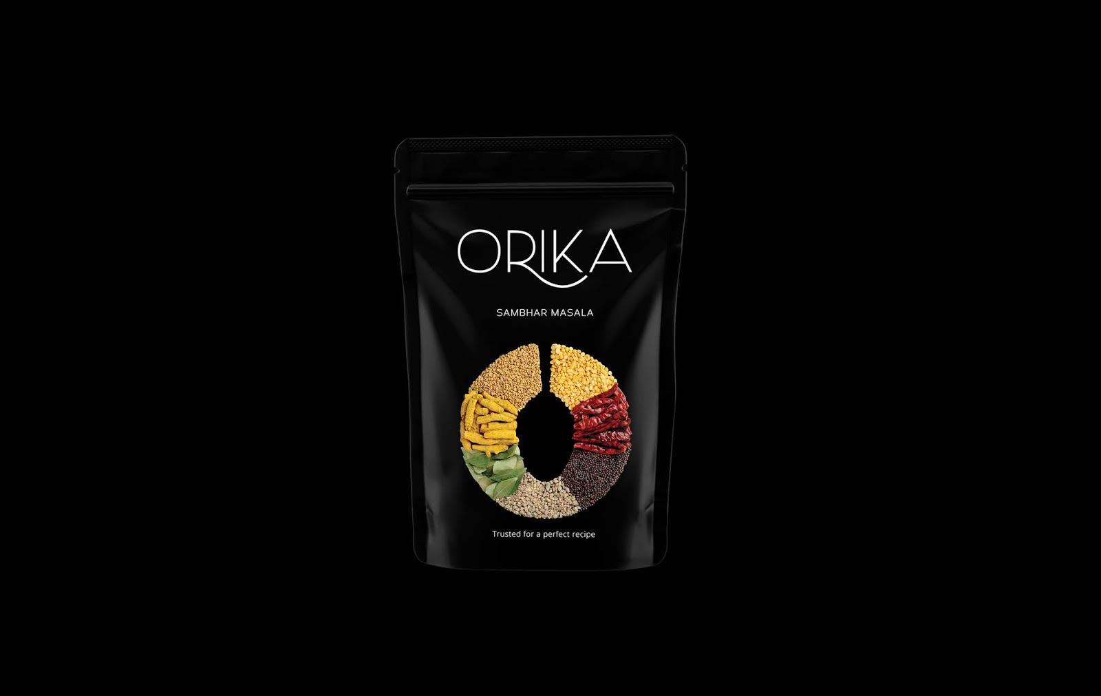
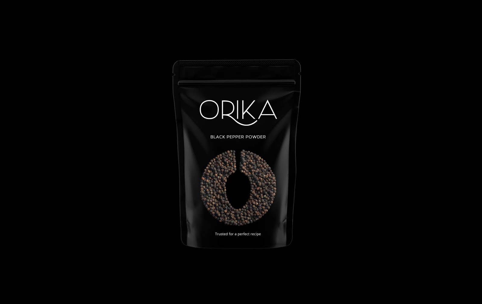
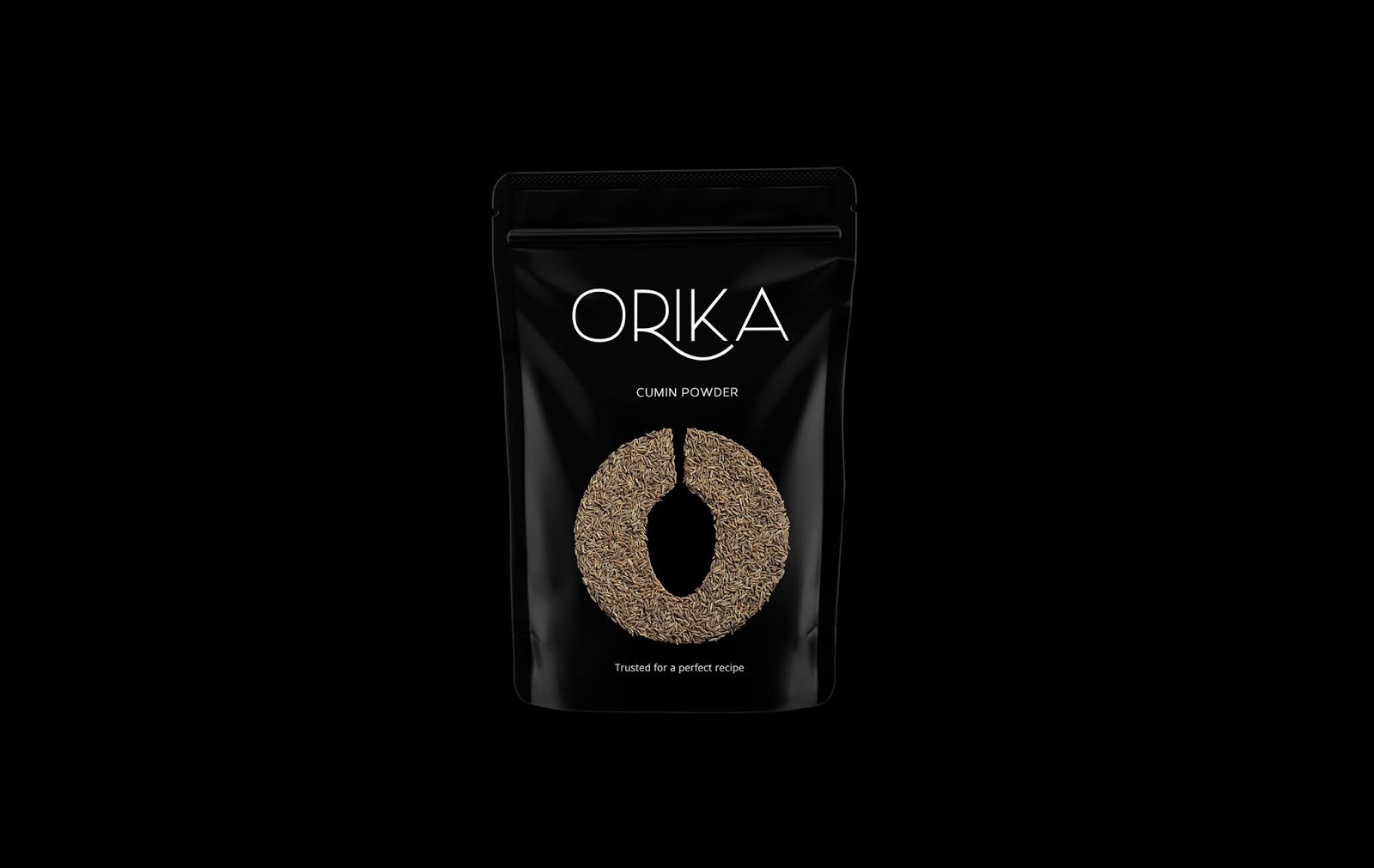
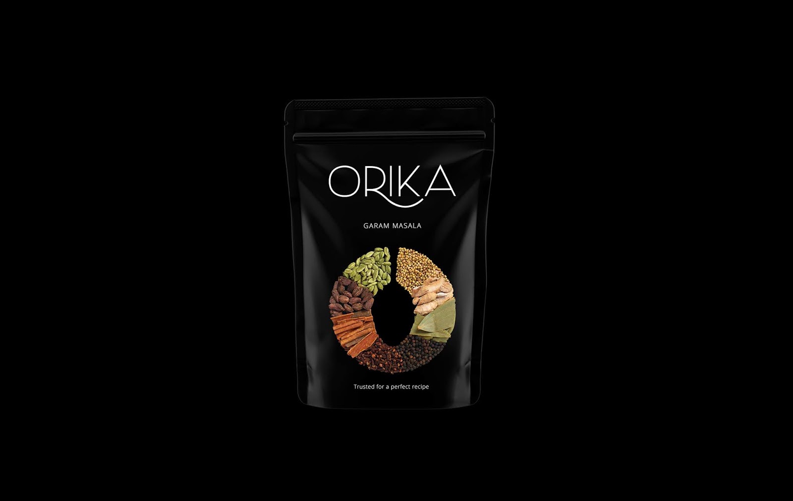
Our brief was to build a brand of Indian spices highlighting the authenticity and the freshness of the products while keeping it very minimalistic.
The ‘O’ on the packaging represents 'Orika.' The contemporary cut in the ‘O’ with a spoon is an intricate way of creating an illusion between ‘O’ and the spoon. This illusion is a powerful tool in helping build a recall for the brand. Going forward, we amalgamated the same design with herbs and spice shots, to give it a clean and defined look. We believe in the power of minimalism and hence wanted to create something clutter breaking in the field of herbs and spices. The modern typography of the font and the extra emphasis on 'O' has made our clients work harder to produce more.
The colour black was chosen after a careful study of the spice industry packaging. We understood that using black will surely create a deafening effect in the market as most other packagings are colour coordinated with the spice it sells. It was a risk and the risk worked.


 Новости Союза дизайнеров
Все о дизайне в Санкт-Петербурге.
Новости Союза дизайнеров
Все о дизайне в Санкт-Петербурге.