Обзор лучших ресурсов по разработке бренда, разработке упаковки
contact us | ok@ohmycode.ru
contact us | ok@ohmycode.ru


MARVEL x THEFACESHOP packaging design
In celebration of the release of marvel comics’ new blockbuster ‘SPIDER-MAN : HOMECOMING’ in 2017, and in keeping with the girl crush trend of K-BEAUTY, THE FACE SHOP announces THE MARVEL COMICS X THE FACE SHOP collaboration, available in limited edition.
Find out more

PizzaHut Delivery - HandCrafted Life Stories box #design by Ogilvy & Mather Malaysia
We believe that Pizza Hut Delivery is part of people’s lives, meaning there’s a story behind every pizza box. To reveal the stories behind Pizza Hut Delivery orders, we crafted a series of insightful thematic posters that were drawn and cut by hand using real Pizza Hut boxes.The Four posters depict situations familiar with everyone, but particularly relatable to the target market of young adults, whether it was being trapped in a hell of work deadlines, turning into a hungry monster, not able to leave the couch or being faced with spiralling bottomless hole of hunger.Use of the Pizza Hut boxes was compelling, quirky and visually arresting, but also brand –and product – relevant, as the promotional poster was actually made of the same material as the product packaging.
Find out more

Pibu - Sex Education Kit for Grown-ups packaging design by Yeonjin Park
Pibu[pee-bu, means skin in korean] is a campaign project that deals with skin to skin contact, namely sexual activity. This started from the issue that educational sexual knowledge has not been sufficiently available to adults, in comparison to teenagers or kids. Therefore the subject of Pibu are grown-ups. Pibu's small boxes contain selected knowledge about sex, aiming to help grown-ups explore and love their own body much more.
Find out more
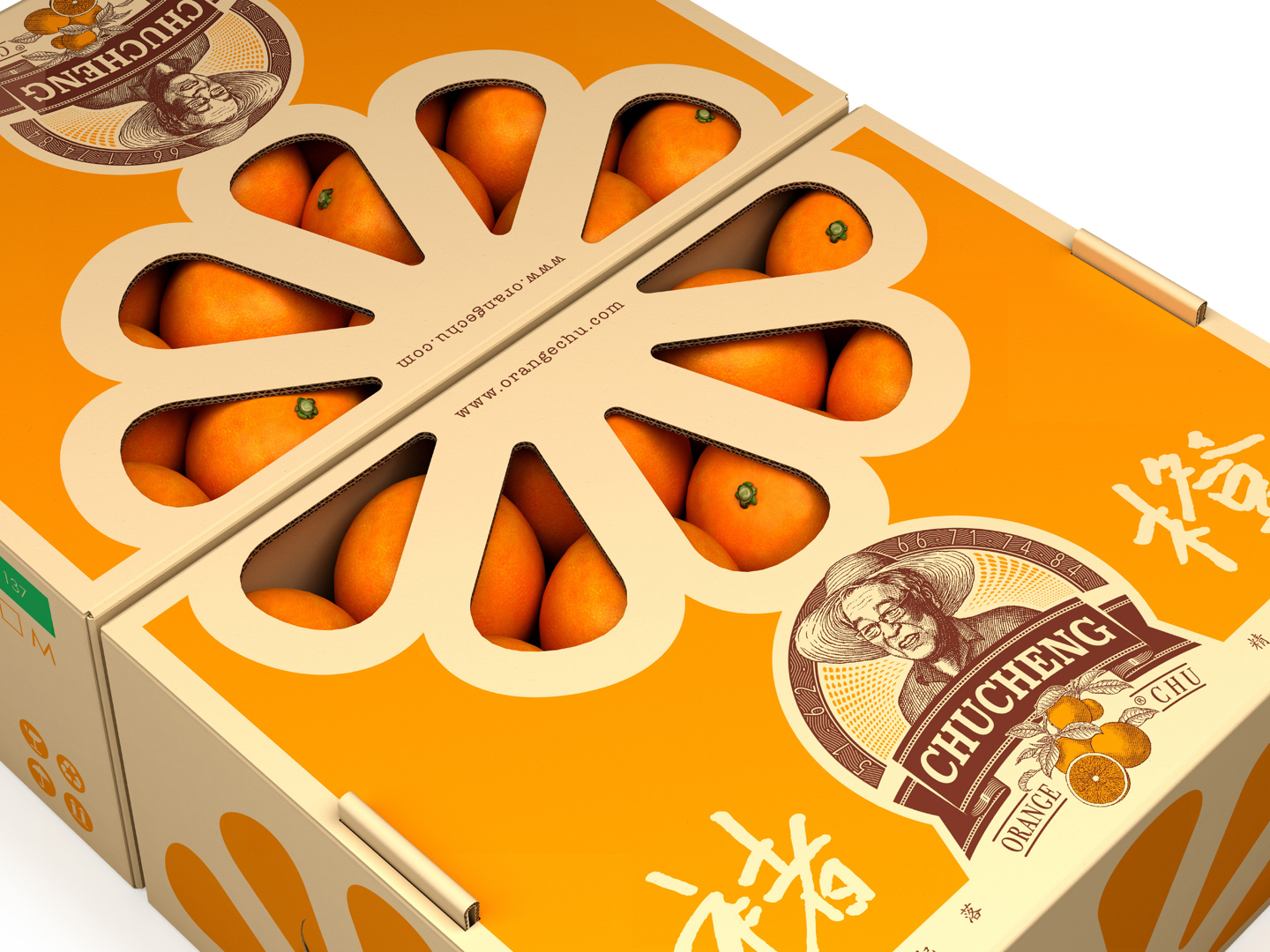
Chu's Orange packaging design by Tigerpan
Mr. Chu Shijian is a legendary character of inspiration. He established the HongtaGroup in the 70’s and was sent to jail before retirement. After being released at age 74, he continued to be a pioneer, and at 88 his sales still exceeded hundreds of millions and he became “Orange King of China”.We used weighted wood carvings to represent this respected old man. With this unique structure, if you lightly pull, oranges will rise. This helps the collection and presentation of oranges, and symbolizes the ups and downs.
Find out more

The Brilliant Madness Of Love #packaging #structure #design by Think Packaging
Bayly & Moore wanted to make sure that the way they handed over a couple’s finished wedding story was a beautiful ‘full-stop’ to that whole adventure. Considering the industry has become heavily digital, dominated by online galleries and social media posts, we aimed for a tactile and experiential way to deliver what was essentially a USB of image files and to bring back the excitement of getting a well-travelled package from the other side of the world.
Find out more

Royal Salute Festive packaging design by Ginger Monkey
Tom Lane developed this limited edition festive pack design for Royal Salute with the team at Pernod Ricard. The idea derived from ‘The Field of the Cloth of Gold’, a 1520 meeting between the kings of England and France. Taking inspiration from the awnings and fabrics of the occasion.
Find out more

Typar Construction product packaging design by Miller Brooks
Typar is a name recognized for protecting homes and buildings with strength, distinction, and an uncompromising consistency of purpose. In simple terms, Typar makes house wrap. House wrap is used on construction sites to protect homes and other buildings from the elements and other job site rigors.
Find out more
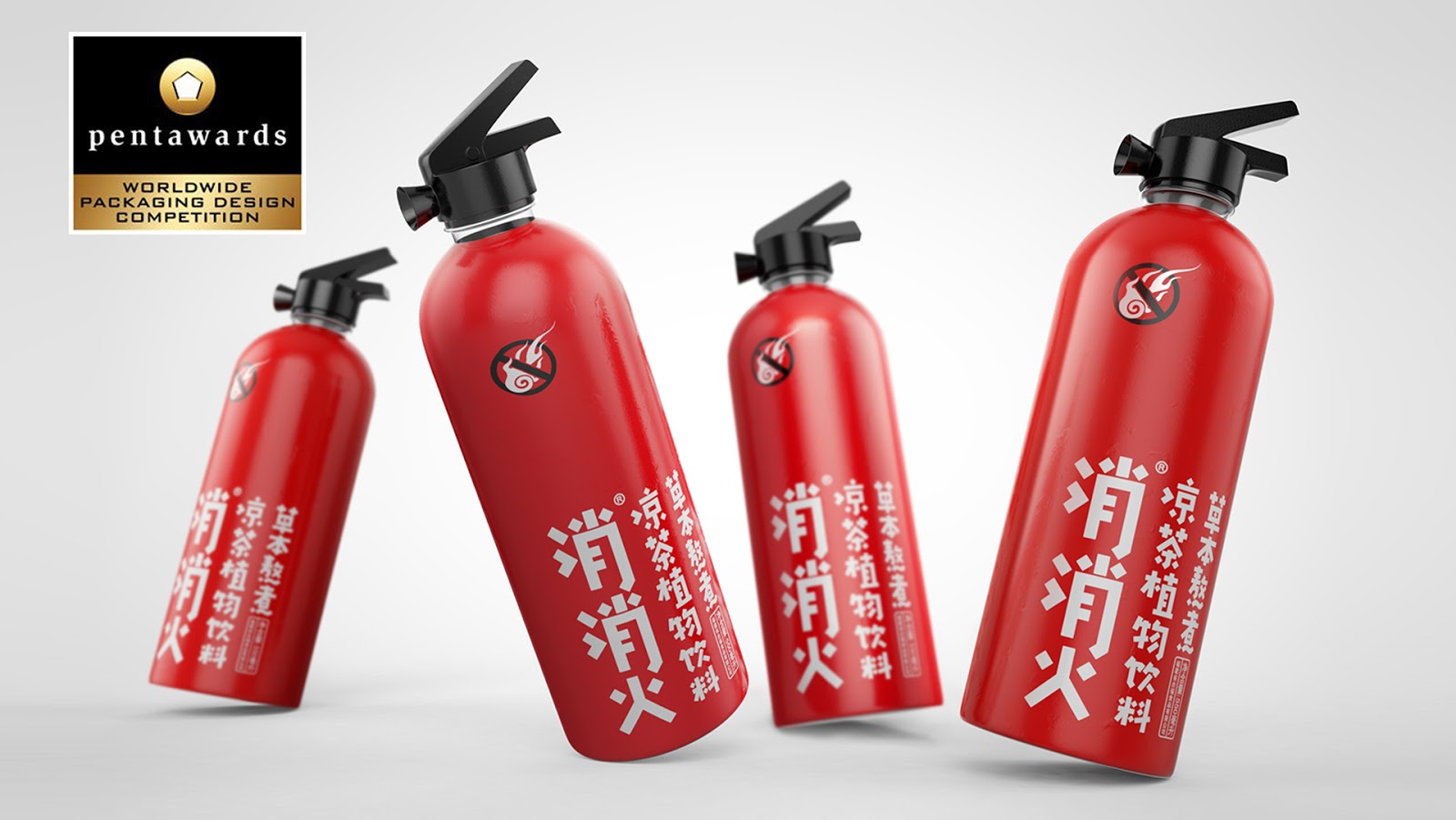
Tea that cools you down! - packaging design by Deng Xiongbo
In China, when people eat too much fired food or hotpot, it’s very possible for them to get sores and pain in mouth, tongue and throat. This symptom is called “get inflamed”. In Chinese, “get inflamed” literally looks almost the same as “on fire”, and can indeed be understood as that the flame is burning. However, it does not indicate the flame that we can actually see, but a Chinese expression for describing physical discomfort. When Chinese people have such discomfort or intend to prevent this physical illness, they will choose to drink herbal tea. Based on the literal meaning of the product name, we adopt a straightforward way to design the fire extinguisher look of the product. The design will enable consumers to realize the strong effectiveness of the product in a shorter time because its appearance has explained everything. Additionally, in the context of Chinese culture, this creative idea is bound to be instantly understood at the first glance of every Chinese.
Find out more

Goodi Dried Fruit packaging design by Redfire
Moving away from the garishly coloured packaging of competitor brands and visually highlight the simplicity of the ingredients within Goodi products - choosing to hero bold, clean, fresh, natural fruit imagery, coupled with clean and simple typography. This bold, clean approach to the pouch designs would help them pop on shelf, and subliminally highlight the simple, clean ingredients contained within each pack.
Find out more

Charaní rum packaging design by Sociedad Anónima
Charanda is a sugar cane distillate, typically from the area of Michoacan, Mexico. One of the pioneering, emblematic brands of Charanda commissioned S.A. to design its new product, targeting a new young market, who will be in charge of preserving the drink's centennial tradition. For the bottle's design, we took inspiration from old formats, using smooth lines. The classic reference label emphasizes the use of Ambroise typeface, which, in contrast to the map applied on the glass bottle using a heat-based technique, creates a contemporary and elegant contrast at the same time.
Find out more

 Новости Союза дизайнеров
Все о дизайне в Санкт-Петербурге.
Новости Союза дизайнеров
Все о дизайне в Санкт-Петербурге.