Обзор лучших ресурсов по разработке бренда, разработке упаковки
contact us | ok@ohmycode.ru
contact us | ok@ohmycode.ru

The Brand
San Camilo is a special coffee brand from Colombia, which cares about delivering the best results of each harvest in an excellent drink. Dedicated to awake the love for coffee beverages that is asleep in each person, through a product that feels Colombian.
For several years San Camilo has been creating opportunities so that special and top quality coffee is available to those who seek to consume a drink from their country, by preserving the main notes of the different beverage’s origins.
Visual Identity
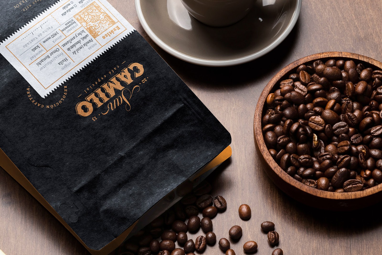
We worked on a strong and forceful identity and packaging, which will clearly focus on the brand’s name, providing a masculine and industrial tone from the letter shapes and inspired by the aesthetics behind the machines and tools that intervene in the beverage´s production processes. We worked with angular shapes, combining the Victorian look with geometriy simplicity and classic calligraphic touches for the logotype and monogram, lurking to preserve the premium and high-quality look found in the high rating of the product.
Finally, we contrasted this industrial letters aesthetic with a system of organic shaped illustrations based on nature, that would provide a narrative to the brand and talk about its relationship with the land where the product is planted, harvested and roasted; the ecosystems and the colombian fauna and flora, in charge of providing people with the magic behind the aroma of its notes and the quality behind its flavor.
Packaging
For @cafesancamilo we also designed and created the primary packaging for their main product: coffee beans and ground coffee.
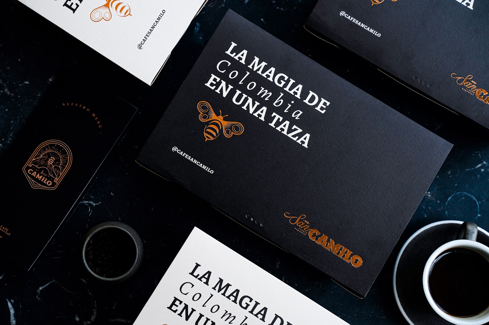
We also created the secondary packaging for the brand's remaining products, such as brunch and bakery, but It can be used for coffee of course. This packaging pieces are designed to work on delivery and "To Go" transactions. The mate black and cooper foil, are some of the main visual assets for the identification. Swipe to see details and some collateral graphics representing the coffee origins.
Classic but strong look, very masculin an clean with industrial touches and classic finishes that give an atemporal identity to the packaging.

What's Unique?
- Ecological materials, such as "earth-pact" paper produced from the sugar cane fiber remaining of the sugar and alcohol production process in Colombia, with no chemical substances that could damage the enviroment or the user itself. Its worth to make clear that THIS PAPER IS NOT PRODUCED BY DEFORESTATION.
- Vegetable based printing inks, so the coffee and and food do not seem exposed to chemical susbstances for user health and enviroment low impact.
- Classic printing methods such as the letterpress hot stamping for the pieces.
- We give a more classic and premium look to waht we are used to see in colombian coffee.


 Новости Союза дизайнеров
Все о дизайне в Санкт-Петербурге.
Новости Союза дизайнеров
Все о дизайне в Санкт-Петербурге.