Обзор лучших ресурсов по разработке бренда, разработке упаковки
contact us | ok@ohmycode.ru
contact us | ok@ohmycode.ru

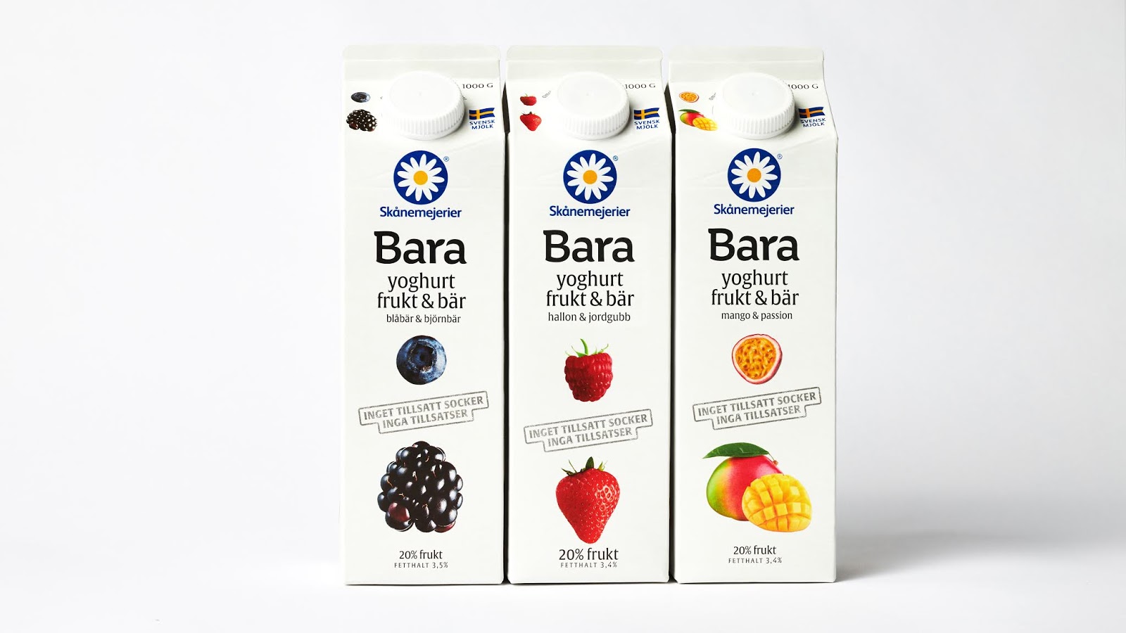
Skånemejerier as one of the most present and consistent brands of dairy products in Sweden, decided to develop a yogurt that is based essentially on fruit. This high percentage of fruit present in each pack, allowed them to name Bara, which translating from Swedish means Only. This was the motto for creating a packaging that would make the fruit (flavours of each pack) the hero objects on the front and sides of the pack, pronounced by the clarity and smoothness of the off-white present in the entire design.
This chromatic characteristic enhances the pack on the shelf of this industry (in Scandinavia) that contrasts with an environment that is guided by dominant tones related to the flavours of the competitors. This strategy, which appears to be paradoxical in terms of the position of the product, has become a strong visual reference, reaching a high success in terms of consumer choice but also in the universe of packaging for dairy products in Sweden. Several new flavours followed after the launch of these 3 initial products, from Lactose-free, to Sour in 2 different sizes.


 Новости Союза дизайнеров
Все о дизайне в Санкт-Петербурге.
Новости Союза дизайнеров
Все о дизайне в Санкт-Петербурге.