Обзор лучших ресурсов по разработке бренда, разработке упаковки
contact us | ok@ohmycode.ru
contact us | ok@ohmycode.ru
In the Indian market, handmade soaps are often viewed as items of luxury and are usually associated with Ayurveda. The existing brands target a niche segment of the society, the older audience that falls into the high income bracket. As soap positioning is slowly moving towards skin care from just cleaning, the scope for the handmade soap industry is booming. The benefits of handmade soap need to be made available to the general public and encourage daily use for adapting a healthy lifestyle.
With this brand, I wanted to target the young audience (16-28 years old) because it is always better to engage in a healthy lifestyle at a young age. The brand would appeal to the youngsters, have a fresh and contemporary look, and at the same time convey its authenticity through natural ingredients.
Brand Statement: A range of handmade soaps that are specially designed to attract the young urban audience, encouraging them to use the soaps on a daily basis.
Brand keywords: Quirky, Fresh, Bold, Abstract, Colorful.
Brand experience: The process of bathing in comparison to 'surfing' in the ocean.
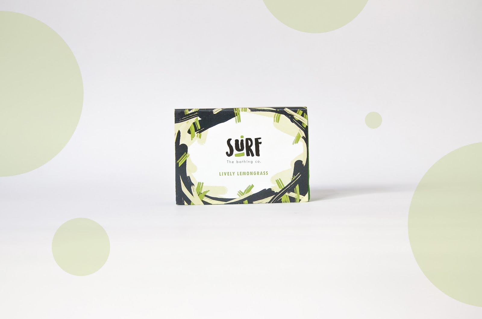
Soap Variations: Contemporary ingredients like Lavender, Peppermint, Lemongrass and Orange. The names of the soaps are obtained by using the alliteration technique to make it fun and easy to remember.
The packaging is done with simple paper labels wrapped around these colorful handmade soaps to avoid increase in production cost. The gift box is also made of thick art paper that can retain the weight of the soaps.

What's Unique?
The visual language is a mix of different strokes that are put together to visualize a bathing experience. The mixture of strokes represent water, lather and hints of the ingredients.


 Новости Союза дизайнеров
Все о дизайне в Санкт-Петербурге.
Новости Союза дизайнеров
Все о дизайне в Санкт-Петербурге.